Astryx Design System: Meta's Open-Source React UI Kit
 /astryx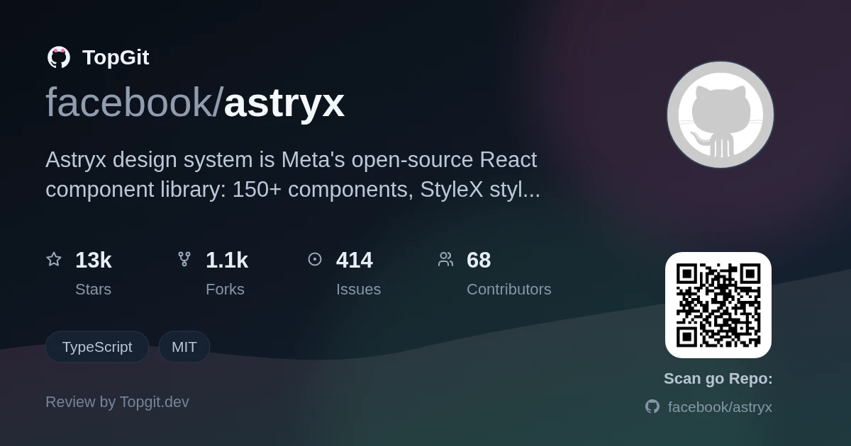
Reach for Astryx if you're on React and want a large, batteries-included component set with real theming and a CLI, and you like that its internals are open enough to swizzle a component's source into your project when you outgrow the API. Skip it if you're not on React, need a stable release today (it's still Beta, and the chart packages ship only under a @canary tag), or you'd rather adopt a smaller, more established system like Radix or shadcn/ui.
Closed API or Build-From-Primitives — Why Choose?
Most component libraries force a trade-off: either you take a closed top-level API and fight it when your design diverges, or you assemble everything from unstyled primitives yourself. Teams also get locked into whatever styling approach the library picked. Astryx exists to give you a full, opinionated set of components you can still open up — composing at any level, overriding styles with your own className, and ejecting source when you need to own it.
150+ Components From Eight Years Inside Meta
Astryx design system is an open-source React component library from Meta, built on React and StyleX. It bundles 150+ accessible components, a theme system driven by CSS custom property overrides, dark mode, ready-to-ship templates, and a CLI for docs, scaffolding, themes, and codemods. You import pre-built CSS and typed React components — no build plugin or PostCSS/Babel config for the basic setup — and the README frames it so a person and an AI assistant build the same way from the same reference.
Built So People and AI Assistants Share One API
Astryx is drawing attention because it's a Meta open-source release with a track record behind it — the README says it grew inside the company for around eight years and powers 13,000+ apps. It also leans into the 'agent-ready' angle: the API, docs, and CLI are designed so an AI assistant and a developer use the same tooling, which is a live topic right now. At 7,800+ stars shortly after going public, it's landing with React teams.
CSS-Variable Theming and a Swizzle Escape Hatch
- ✓150+ accessible React components with full TypeScript typing
- ✓Theming through CSS custom property overrides — restyle without forking or wrapping component source
- ✓A swizzle command that ejects a component's full source into your project when you need to own it
- ✓Style overrides via className using Tailwind, CSS modules, or plain CSS, despite StyleX under the hood
- ✓Seven ready-made themes (neutral, butter, chocolate, matcha, stone, gothic, y2k) plus dark mode
- ✓A CLI for component docs, templates, scaffolding, themes, and codemods
- ✓Designed so people and AI assistants build from the same API, docs, and CLI (the README's framing)
Adding Core, a Theme, and the CLI
Install the core package, a theme, and the CLI. With npm: `npm install @astryxdesign/core @astryxdesign/theme-neutral` and `npm install -D @astryxdesign/cli` (pnpm and yarn work too). The README says the basic setup is a few CSS imports plus a theme provider — no PostCSS or Babel config. It also recommends adding an `"astryx": "node node_modules/@astryxdesign/cli/bin/astryx.mjs"` script so CLI calls don't hit path errors.
Importing Components and Ejecting One When You Need To
Import the pre-built CSS and use the typed React components inside a theme provider. Run the CLI through your package script — for example `npm run astryx -- component --list` to list components. Use `swizzle` to eject a component's source when you need to customize beyond the API, and override individual styles with `className`. The @astryxdesign/core README has framework-specific guides (Next.js, Tailwind, Vite, and CDN).
Fast UI, Rebrands, and Agent-Built Interfaces
- •Standing up a React app's UI fast with a large, pre-built component set instead of assembling primitives
- •Rebranding an app by overriding CSS custom properties rather than forking component code
- •Letting an AI coding assistant scaffold and build UI using the same CLI and conventions a developer uses
- •Owning a specific component's behavior by swizzling its source out of the library
What a Batteries-Included System Buys You
- ✓A large component set (150+) plus templates and a CLI as one coherent system, not scattered packages
- ✓Theming by CSS variables means a redesign doesn't require forking component code
- ✓swizzle gives you an escape hatch to own a component's source instead of fighting a closed API
- ✓StyleX stays invisible to consumers — you can style with Tailwind, CSS modules, or plain CSS
- ✓MIT-licensed, with a real internal track record behind it per the README
Still Beta, and Charts Are Canary-Only
- △Still in Beta, so APIs can shift; the chart packages (@astryxdesign/vega and @astryxdesign/charts) publish only under a @canary tag with no stable release yet
- △React-only — there's no Vue, Svelte, or web-component build, so adopting it is a firm commitment to React
- △'Agent ready' and the 13,000+-app, eight-year track record are Meta's own claims from the README, not independently verified, and the public project is young
- △Authored with StyleX, and @astryxdesign/build ships StyleX build plugins — so contributing to or deeply extending the internals means dealing with StyleX even though consuming it doesn't
- △Conventions are shaped by Meta's internal needs, which may not match how your team builds
Astryx vs shadcn/ui, Radix, and MUI
Who Should Adopt Astryx
React teams that want a large, opinionated component set with real theming and a CLI, and who value being able to swizzle source when the API isn't enough. It also suits teams leaning into AI-assisted UI work, since the CLI and docs are built for agents and people to share. If you're not on React, need a stable (non-Beta) release, or prefer a smaller system like Radix or shadcn/ui, look elsewhere.
Astryx FAQ
Astryx is Meta's open-source design system for React — a library of 150+ accessible components with a CSS-variable theme system, dark mode, templates, and a CLI. The README says it grew inside Meta over about eight years and is the company's largest, most widely adopted design system.
It's labeled Beta, so treat the APIs as subject to change. The core components are usable, but the chart packages ship only under a @canary tag with no stable release yet, so weigh that if you need charts.
Per the README, the API, docs, and CLI are designed so a person and an AI assistant build the same way from the same reference. It's a design goal Meta states — not a separate AI feature you switch on.
Yes. Astryx authors its own styles with StyleX, but that's invisible to you — the README says you can override styles with className using Tailwind, CSS modules, or plain CSS.
For consuming components, no — styling is done via className with whatever CSS approach you already use. StyleX only surfaces if you build or deeply extend the internals, where @astryxdesign/build provides StyleX build plugins.
Want a second opinion on astryx?
Ask an AI that can read this page — one click and you get its take on astryx.