A mobile-focused entry in TopGit's GitHub warehouse: google/flexbox-layout, 18.3k stars, Mobile, Kotlin. Flexbox for Android
Snapshot summary built from the project's own GitHub metadata — there's no written TopGit review yet. The page will update automatically when a full review is published.
WHY NO REVIEW YET
TopGit writes full reviews for the most-starred, most-requested repositories. This page is a snapshot until then — see the READ ME tab for the original README in full.
Starting from 3.0.0, the groupId is changed to com.google.android.flexbox in preparation to uploading the artifacts to google maven.
You can still download the artifacts from jcenter for the past versions with the prior groupId (com.google.android), but migrating the library 3.0.0 is recommended.
Note that the default values for alignItems and alignContent for FlexboxLayout have been changed from stretch to flex_start starting from 2.0.0, it may break the existing apps.
Please make sure to set stretch explicitly if you want to apply the behavior of stretch.
Note that starting from 1.1.0, the library is expeced to use with AndroidX. Please migrate to AndroidX if you use 1.1.0 or above.
Please use 1.0.0 if you haven't migrated to AndroidX.
Usage
There are two ways of using Flexbox in your layout.
FlexboxLayout
The first one is FlexboxLayout that extends the ViewGroup like LinearLayout and RelativeLayout.
You can specify the attributes from a layout XML like:
The advantage of using FlexboxLayoutManager is that it recycles the views that go off the screen
for reuse for the views that are appearing as the user scrolls instead of inflating every individual view,
which consumes much less memory especially when the number of items contained in the Flexbox container is large.
Supported attributes/features comparison
Due to some characteristics of RecyclerView, some Flexbox attributes are not available/not implemented
to the FlexboxLayoutManager.
Here is a quick overview of the attributes/features comparison between the two implementations.
Attribute / Feature
FlexboxLayout
FlexboxLayoutManager (RecyclerView)
flexDirection
flexWrap
(except wrap_reverse)
justifyContent
alignItems
alignContent
-
layout_order
-
layout_flexGrow
layout_flexShrink
layout_alignSelf
layout_flexBasisPercent
layout_(min/max)Width
layout_(min/max)Height
layout_wrapBefore
Divider
View recycling
-
Scrolling
*1
*1 Partially possible by wrapping it with ScrollView. But it isn't likely to work with a large set
of views inside the layout. Because it doesn't consider view recycling.
Supported attributes
Attributes for the FlexboxLayout:
flexDirection
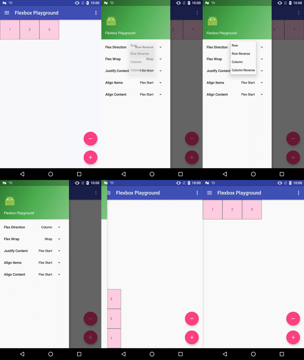
This attribute determines the direction of the main axis (and the cross axis, perpendicular to the main axis). The direction children items are placed inside the Flexbox layout.
Possible values are:
row (default)
row_reverse
column
column_reverse
flexWrap
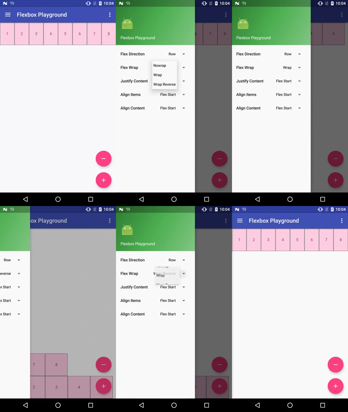
This attribute controls whether the flex container is single-line or multi-line, and the
direction of the cross axis. Possible values are:
nowrap (default for FlexboxLayout)
wrap (default for FlexboxLayoutManager)
wrap_reverse (not supported by FlexboxLayoutManager)
justifyContent
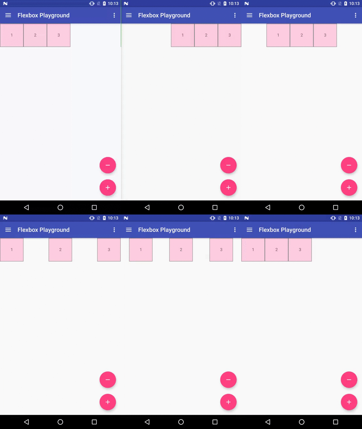
This attribute controls the alignment along the main axis. Possible values are:
flex_start (default)
flex_end
center
space_between
space_around
space_evenly
alignItems
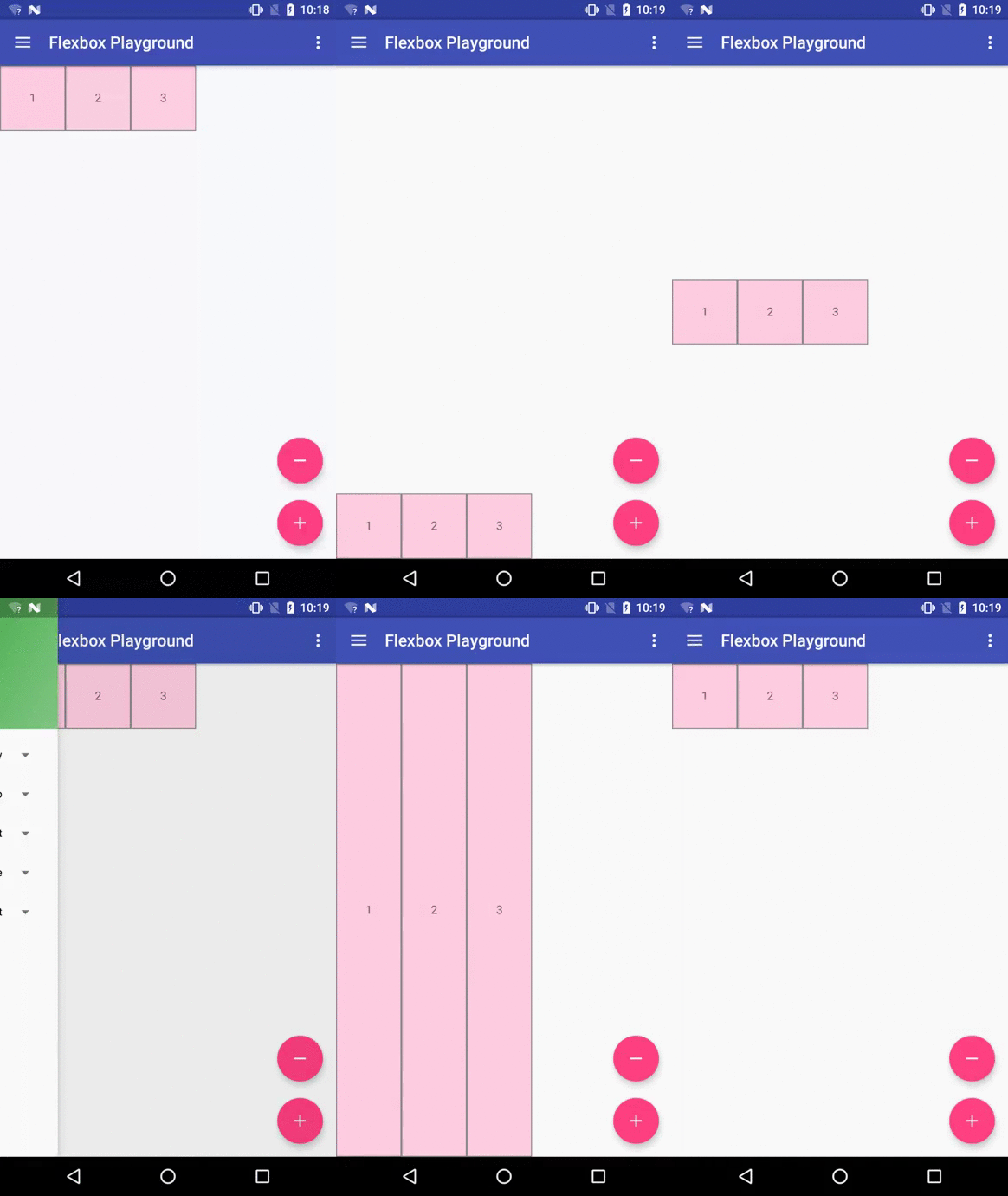
This attribute controls the alignment along the cross axis. Possible values are:
flex_start (default for FlexboxLayout)
flex_end
center
baseline
stretch (default for FlexboxLayoutManager)
alignContent
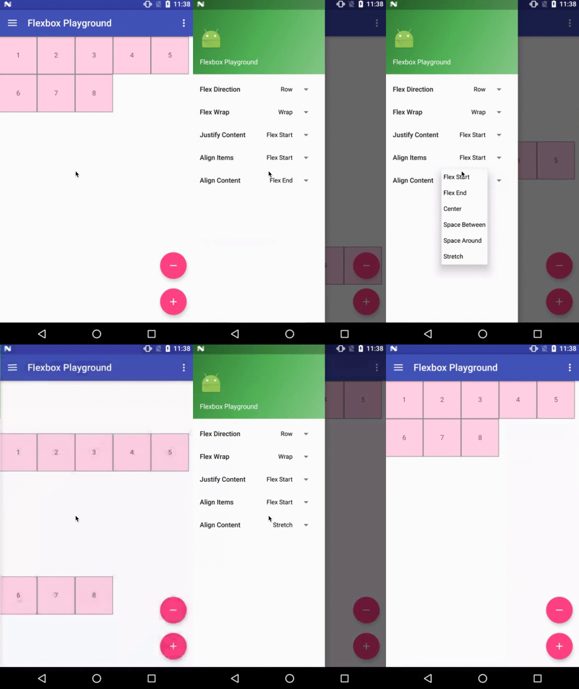
This attribute controls the alignment of the flex lines in the flex container. Possible values
are:
flex_start (default)
flex_end
center
space_between
space_around
stretch
showDividerHorizontal (one or more of none | beginning | middle | end)
dividerDrawableHorizontal (reference to a drawable)
Puts horizontal dividers between flex lines (or flex items when flexDirection
is set to column or column_rebase).
showDividerVertical (one or more of none | beginning | middle | end)
dividerDrawableVertical (reference to a drawable)
Puts vertical dividers between flex items (or flex lines when flexDirection
is set to column or column_rebase).
showDivider (one or more of none | beginning | middle | end)
dividerDrawable (reference to a drawable)
Shorthand for setting both horizontal and vertical dividers. Note that if used with other attributes
(such as justifyContent="space_around" or alignContent="space_between" ... etc) for putting
spaces between flex lines or flex items, you may see unexpected spaces. Please avoid using these
at the same time.
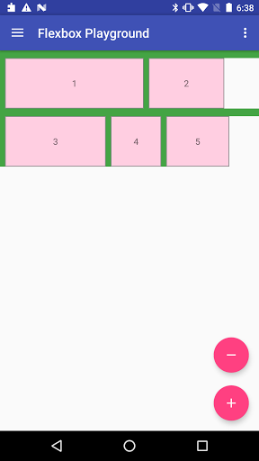
Example of putting both vertical and horizontal dividers.
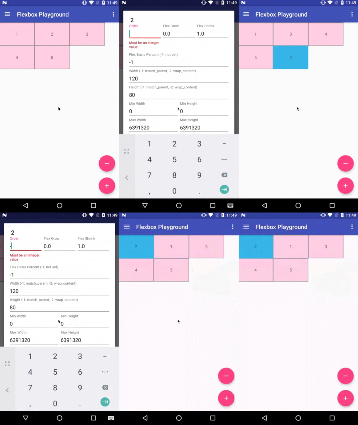
This attribute can change how the ordering of the children views are laid out.
By default, children are displayed and laid out in the same order as they appear in the
layout XML. If not specified, 1 is set as a default value.
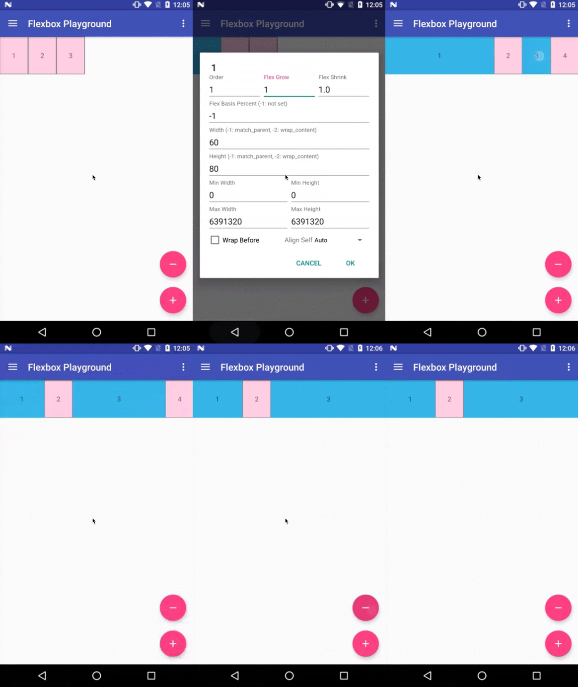
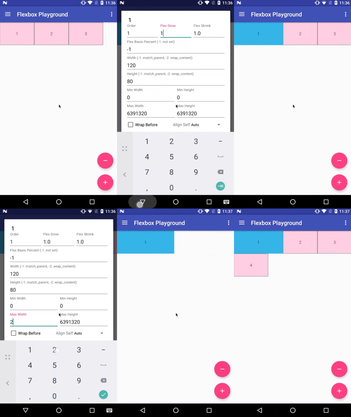
layout_flexGrow (float)
This attribute determines how much this child will grow if positive free space is
distributed relative to the rest of other flex items included in the same flex line.
If a flex item has a positive layout_flexGrow value, the item will take up the remaining
space in the flex line. If multiple flex items in the same flex line have positive layout_flexGrow
values, the remaining free space is distributed depending on the proportion of their declared
layout_flexGrow value. (Similar to the layout_weight attribute in the LinearLayout)
If not specified, 0 is set as a default value.
layout_flexShrink (float)
This attribute determines how much this child will shrink if negative free space is
distributed relative to the rest of other flex items included in the same flex line.
If not specified, 1 is set as a default value.
layout_alignSelf
This attribute determines the alignment along the cross axis (perpendicular to the
main axis). The alignment in the same direction can be determined by the
alignItems in the parent, but if this is set to other than
auto, the cross axis alignment is overridden for this child. Possible values are:
auto (default)
flex_start
flex_end
center
baseline
stretch
layout_flexBasisPercent (fraction)
The initial flex item length in a fraction format relative to its parent.
The initial main size of this child view is trying to be expanded as the specified
fraction against the parent main size.
If this value is set, the length specified from layout_width
(or layout_height) is overridden by the calculated value from this attribute.
This attribute is only effective when the parent's length is definite (MeasureSpec mode is
MeasureSpec.EXACTLY). The default value is -1, which means not set.
layout_minWidth / layout_minHeight (dimension)
These attributes impose minimum size constraints for the children of FlexboxLayout.
A child view won't shrink less than the value of these attributes (varies based on the
flexDirection attribute as to which attribute imposes the size constraint along the
main axis) regardless of the layout_flexShrink attribute.
layout_maxWidth / layout_maxHeight (dimension)
These attributes impose maximum size constraints for the children of FlexboxLayout.
A child view won't be expanded more than the value of these attributes (varies based on the
flexDirection attribute as to which attribute imposes the size constraint along the
main axis) regardless of the layout_flexGrow attribute.
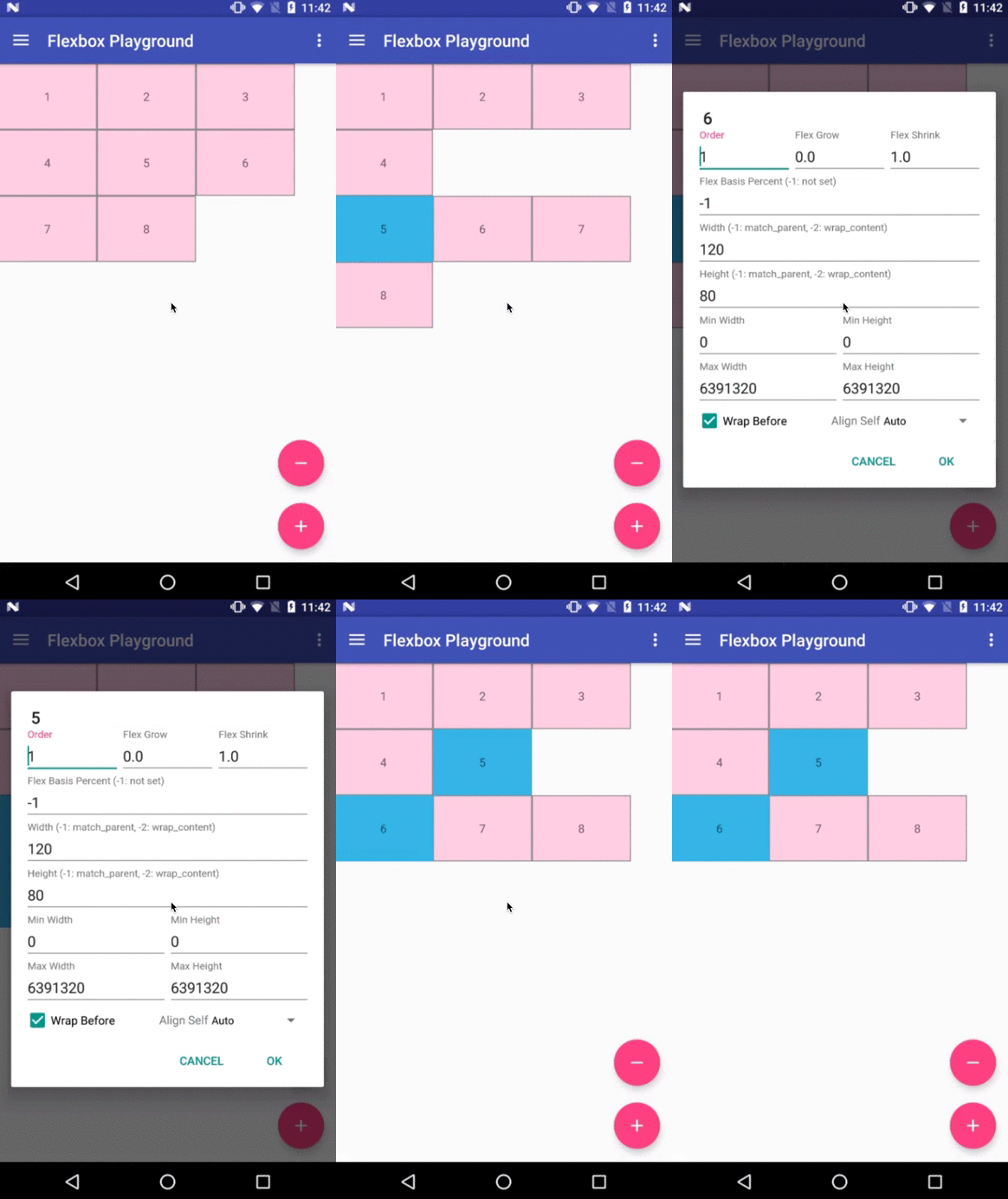
layout_wrapBefore (boolean)
This attribute forces a flex line wrapping, the default value is false.
i.e. if this is set to true for a
flex item, the item will become the first item of a flex line. (A wrapping happens
regardless of the flex items being processed in the previous flex line)
This attribute is ignored if the flex_wrap attribute is set to nowrap.
The equivalent attribute isn't defined in the original CSS Flexible Box Module
specification, but having this attribute is useful for Android developers. For example, to flatten
the layouts when building a grid-like layout or for a situation where developers want
to put a new flex line to make a semantic difference from the previous one, etc.
Others
Known differences from the original CSS specification
This library tries to achieve the same capabilities of the original
Flexible Box specification as much as possible,
but due to some reasons such as the way specifying attributes can't be the same between
CSS and Android XML, there are some known differences from the original specification.
(1) There is no flex-flow
equivalent attribute
Because flex-flow is a shorthand for setting the flex-direction and flex-wrap properties,
specifying two attributes from a single attribute is not practical in Android.
(2) There is no flex equivalent attribute
Likewise flex is a shorthand for setting the flex-grow, flex-shrink and flex-basis,
specifying those attributes from a single attribute is not practical.
(3) layout_flexBasisPercent is introduced instead of
flexBasis
Both layout_flexBasisPercent in this library and flex-basis property in the CSS are used to
determine the initial length of an individual flex item. The flex-basis property accepts width
values such as 1em, 10px, and content as strings as well as percentage values such as
10% and 30%. layout_flexBasisPercent only accepts percentage values.
However, specifying initial fixed width values can be done by specifying width (or height) values in
layout_width (or layout_height, varies depending on the flexDirection). Also, the same
effect can be done by specifying "wrap_content" in layout_width (or layout_height) if
developers want to achieve the same effect as 'content'. Thus, layout_flexBasisPercent only
accepts percentage values, which can't be done through layout_width (or layout_height) for
simplicity.
(4) layout_wrapBefore is introduced.
The equivalent attribute doesn't exist in the CSS Flexible Box Module specification,
but as explained above, Android developers will benefit by having this attribute for having
more control over when a wrapping happens.
(5) Default values for alignItems and alignContent are set to flex_start instead of stretch.
Setting stretch for the alignItems is expensive because the children of FlexboxLayout are measured more than twice. The difference is more obvious when the layout hierarchy is deeply nested.
Xamarin Binding
Xamarin binding is now available on NuGet thanks to @btripp
Demo apps
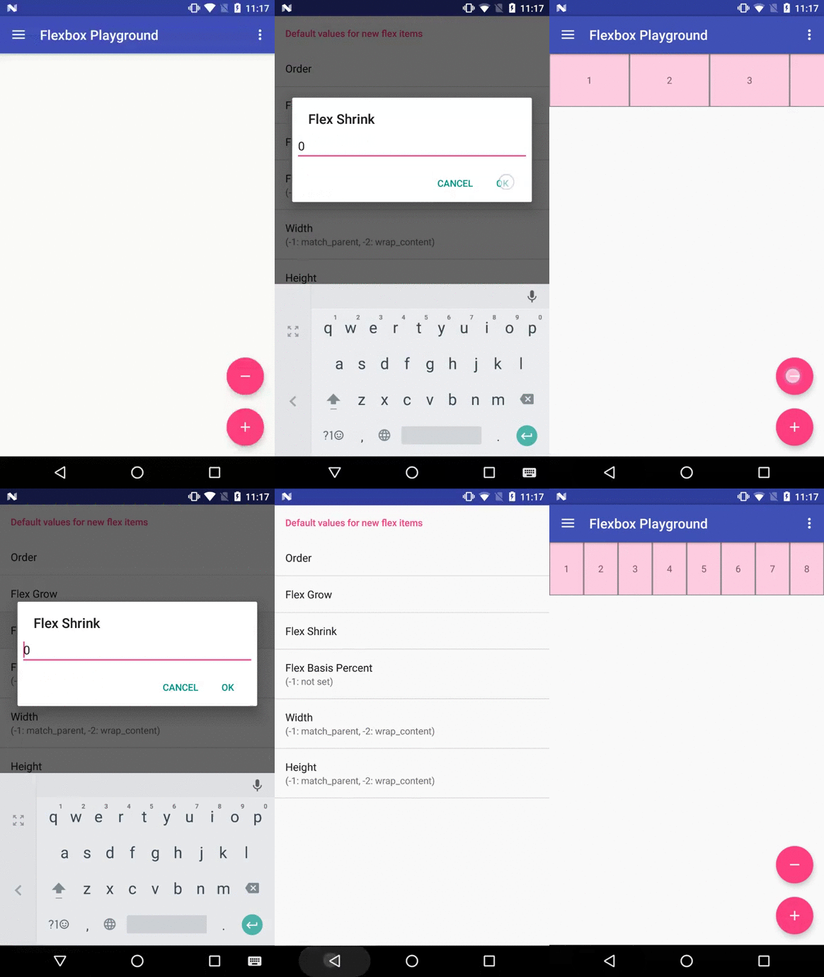
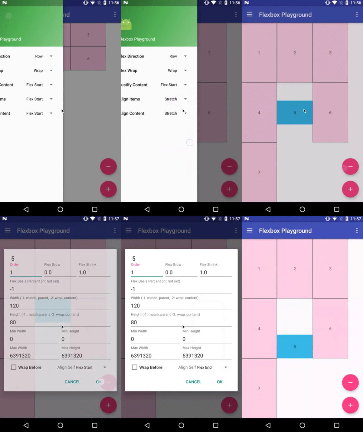
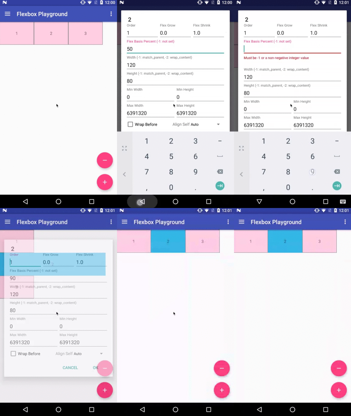
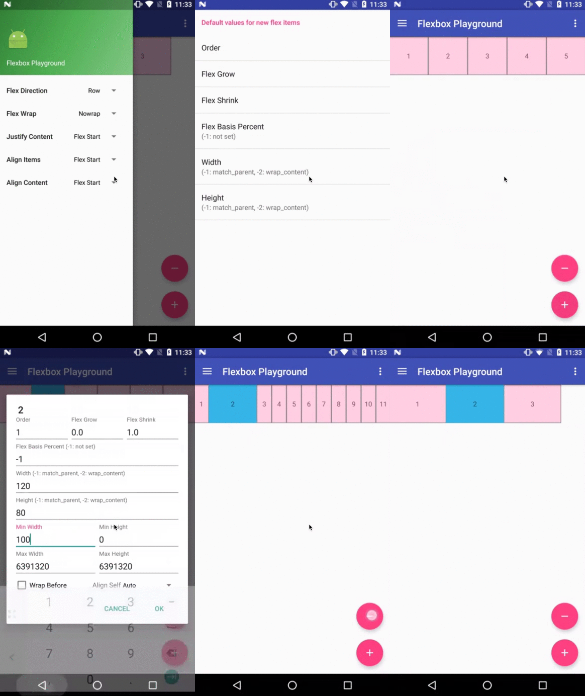
Flexbox Playground demo app
The demo-playground module works as a playground demo app for trying various values for the supported attributes.
You can install it by
./gradlew demo-playground:installDebug
Cat gallery demo app
The demo-cat-gallery module showcases the usage of the FlexboxLayoutManager inside the RecyclerView
that handles various sizes of views aligned nicely regardless of the device width like the
Google Photo app without loading all the images on the memory.
Thus compared to using the {@link FlexboxLayout}, it's much less likely to abuse the memory,
which sometimes leads to the OutOfMemoryError.
./gradlew demo-cat-gallery:installDebug
How to make contributions
Please read and follow the steps in CONTRIBUTING.md
How active is development on google/flexbox-layout?
The most recent commit recorded on google/flexbox-layout was 2.3 years ago, based on the GitHub push timestamp. The repository has 1.8k forks — one of the better signals of community interest.
How many stars does google/flexbox-layout have?
google/flexbox-layout has 18.3k GitHub stars — refresh the page for the live number, or check github.com/google/flexbox-layout. TopGit mirrors GitHub's count but does not claim minute-by-minute accuracy.
Is google/flexbox-layout open source?
Yes — google/flexbox-layout ships under the Apache-2.0 license, which makes its source code freely readable (and, depending on license terms, forkable and reusable). Source: github.com/google/flexbox-layout.
What else is in the Mobile space?
google/flexbox-layout is tracked by TopGit under the Mobile category, alongside 3 GitHub-tagged topics. Trending and Topics pages list peer repositories of comparable stars and language.
What is google/flexbox-layout?
google/flexbox-layout (google/flexbox-layout) is a Kotlin project on GitHub. From the project's own README: Flexbox for Android
What language is google/flexbox-layout written in?
google/flexbox-layout is written primarily in Kotlin. GitHub's language field is based on the largest share of bytes in the default branch.
What license does google/flexbox-layout use?
google/flexbox-layout is released under the Apache-2.0 license. Always verify the LICENSE file directly on GitHub for the authoritative terms — license strings can be edited out of sync with a project's actual stance.
Where do I read more about google/flexbox-layout?
This TopGit page is a snapshot — the READ ME tab shows the project's own README content (links stripped, images preserved). The GitHub repository at github.com/google/flexbox-layout is the definitive source.
Read full README in the tab above.
Still deciding about flexbox-layout?
One click hands the question to an AI along with this page — see what it says about flexbox-layout.
 /flexbox-layout