
moroshko/react-autosuggest

moroshko/react-autosuggest is a JavaScript project with 5.9k stars in the Frontend space. WAI-ARIA compliant React autosuggest component
Snapshot summary built from the project's own GitHub metadata — there's no written TopGit review yet. The page will update automatically when a full review is published.
TopGit writes full reviews for the most-starred, most-requested repositories. This page is a snapshot until then — see the READ ME tab for the original README in full.
Snapshot
Top contributors
Show top contributors




React Autosuggest
Project Status
Looking for maintainers!
Unfortunately, I don't have the time to maintain this project anymore. If you are interested to help, please reach out to me on Twitter @moroshko.
React-Autosuggest AI Bot
React-Autosuggest Bot will help you understand this repository better. You can ask for code examples, installation guide, debugging help and much more.
Demo
Check out the Homepage and the Codepen examples.
Features
- WAI-ARIA compliant, with support for ARIA attributes and keyboard interactions
- Mobile friendly
- Plugs in nicely to Flux and Redux applications
- Full control over suggestions rendering
- Suggestions can be presented as plain list or multiple sections
- Suggestions can be retrieved asynchronously
- Highlight the first suggestion in the list if you wish
- Supports styling using CSS Modules, Radium, Aphrodite, JSS, and more
- You decide when to show suggestions (e.g. when user types 2 or more characters)
- Always render suggestions (useful for mobile and modals)
- Pass through arbitrary props to the input (e.g. placeholder, type, onChange, onBlur, or any other), or take full control on the rendering of the input (useful for integration with other libraries)
- Thoroughly tested
Installation
yarn add react-autosuggest
or
npm install react-autosuggest --save
You can also use the standalone UMD build:
<script src="https://unpkg.com/react-autosuggest/dist/standalone/autosuggest.js"></script>
Basic Usage
import React from 'react';
import Autosuggest from 'react-autosuggest';

// Imagine you have a list of languages that you'd like to autosuggest.
const languages = [
  {
    name: 'C',
    year: 1972
  },
  {
    name: 'Elm',
    year: 2012
  },
  ...
];

// Teach Autosuggest how to calculate suggestions for any given input value.
const getSuggestions = value => {
  const inputValue = value.trim().toLowerCase();
  const inputLength = inputValue.length;

  return inputLength === 0 ? [] : languages.filter(lang =>
    lang.name.toLowerCase().slice(0, inputLength) === inputValue
  );
};

// When suggestion is clicked, Autosuggest needs to populate the input
// based on the clicked suggestion. Teach Autosuggest how to calculate the
// input value for every given suggestion.
const getSuggestionValue = suggestion => suggestion.name;

// Use your imagination to render suggestions.
const renderSuggestion = suggestion => (
  <div>
    {suggestion.name}
  </div>
);

class Example extends React.Component {
  constructor() {
    super();

    // Autosuggest is a controlled component.
    // This means that you need to provide an input value
    // and an onChange handler that updates this value (see below).
    // Suggestions also need to be provided to the Autosuggest,
    // and they are initially empty because the Autosuggest is closed.
    this.state = {
      value: '',
      suggestions: []
    };
  }

  onChange = (event, { newValue }) => {
    this.setState({
      value: newValue
    });
  };

  // Autosuggest will call this function every time you need to update suggestions.
  // You already implemented this logic above, so just use it.
  onSuggestionsFetchRequested = ({ value }) => {
    this.setState({
      suggestions: getSuggestions(value)
    });
  };

  // Autosuggest will call this function every time you need to clear suggestions.
  onSuggestionsClearRequested = () => {
    this.setState({
      suggestions: []
    });
  };

  render() {
    const { value, suggestions } = this.state;

    // Autosuggest will pass through all these props to the input.
    const inputProps = {
      placeholder: 'Type a programming language',
      value,
      onChange: this.onChange
    };

    // Finally, render it!
    return (
      <Autosuggest
        suggestions={suggestions}
        onSuggestionsFetchRequested={this.onSuggestionsFetchRequested}
        onSuggestionsClearRequested={this.onSuggestionsClearRequested}
        getSuggestionValue={getSuggestionValue}
        renderSuggestion={renderSuggestion}
        inputProps={inputProps}
      />
    );
  }
}
Props
| Prop | Type | Required | Description |
|---|---|---|---|
suggestions | Array | ✓ | These are the suggestions that will be displayed. Items can take an arbitrary shape. |
onSuggestionsFetchRequested | Function | ✓ | Will be called every time you need to recalculate suggestions. |
onSuggestionsClearRequested | Function | ✓* | Will be called every time you need to set suggestions to []. |
getSuggestionValue | Function | ✓ | Implement it to teach Autosuggest what should be the input value when suggestion is clicked. |
renderSuggestion | Function | ✓ | Use your imagination to define how suggestions are rendered. |
inputProps | Object | ✓ | Pass through arbitrary props to the input. It must contain at least value and onChange. |
containerProps | Object | Pass through arbitrary props to the container. Useful if you need to override the default props set by Autowhatever, for example, for accessibility. | |
onSuggestionSelected | Function | Will be called every time suggestion is selected via mouse or keyboard. | |
onSuggestionHighlighted | Function | Will be called every time the highlighted suggestion changes. | |
shouldRenderSuggestions | Function | When the input is focused, Autosuggest will consult this function when to render suggestions. Use it, for example, if you want to display suggestions when input value is at least 2 characters long. | |
alwaysRenderSuggestions | Boolean | Set it to true if you'd like to render suggestions even when the input is not focused. | |
highlightFirstSuggestion | Boolean | Set it to true if you'd like Autosuggest to automatically highlight the first suggestion. | |
focusInputOnSuggestionClick | Boolean | Set it to false if you don't want Autosuggest to keep the input focused when suggestions are clicked/tapped. | |
multiSection | Boolean | Set it to true if you'd like to display suggestions in multiple sections (with optional titles). | |
renderSectionTitle | Function | ✓ when multiSection={true} | Use your imagination to define how section titles are rendered. |
getSectionSuggestions | Function | ✓ when multiSection={true} | Implement it to teach Autosuggest where to find the suggestions for every section. |
renderInputComponent | Function | Use it only if you need to customize the rendering of the input. | |
renderSuggestionsContainer | Function | Use it if you want to customize things inside the suggestions container beyond rendering the suggestions themselves. | |
theme | Object | Use your imagination to style the Autosuggest. | |
id | String | Use it only if you have multiple Autosuggest components on a page. |
suggestions (required)
Array of suggestions to display. The only requirement is that suggestions is an array. Items in this array can take an arbitrary shape.
For a plain list of suggestions, every item in suggestions represents a single suggestion. It's up to you what shape every suggestion takes. For example:
const suggestions = [
  {
    text: "Apple"
  },
  {
    text: "Banana"
  },
  {
    text: "Cherry"
  },
  {
    text: "Grapefruit"
  },
  {
    text: "Lemon"
  }
];
For multiple sections, every item in suggestions represents a single section. Again, it's up to you what shape every section takes. For example:
const suggestions = [
  {
    title: "A",
    suggestions: [
      {
        id: "100",
        text: "Apple"
      },
      {
        id: "101",
        text: "Apricot"
      }
    ]
  },
  {
    title: "B",
    suggestions: [
      {
        id: "102",
        text: "Banana"
      }
    ]
  },
  {
    title: "C",
    suggestions: [
      {
        id: "103",
        text: "Cherry"
      }
    ]
  }
];
onSuggestionsFetchRequested (required)
This function will be called every time you might need to update suggestions. It has the following signature:
function onSuggestionsFetchRequested({ value, reason })
where:
value- the current value of the inputreason- string describing whyonSuggestionsFetchRequestedwas called. The possible values are:'input-changed'- user typed something'input-focused'- input was focused'escape-pressed'- user pressed Escape to clear the input (and suggestions are shown for empty input)'suggestions-revealed'- user pressed Up or Down to reveal suggestions'suggestion-selected'- user selected a suggestion whenalwaysRenderSuggestions={true}
onSuggestionsClearRequested (required unless alwaysRenderSuggestions={true})
This function will be called every time you need to clear suggestions.
All you have to do in this function is to set suggestions to [].
Note: When alwaysRenderSuggestions={true}, you don't have to implement this function.
getSuggestionValue (required)
When user navigates the suggestions using the Up and Down keys, the input value should be set according to the highlighted suggestion. You design how suggestion is modelled. Therefore, it's your responsibility to tell Autosuggest how to map suggestions to input values.
This function gets the suggestion in question, and it should return a string. For example:
function getSuggestionValue(suggestion) {
  return suggestion.text;
}
renderSuggestion (required)
Use your imagination to define how suggestions are rendered.
The signature is:
function renderSuggestion(suggestion, { query, isHighlighted })
where:
suggestion- The suggestion to renderquery- Used to highlight the matching string. As user types in the input,querywill be equal to the trimmed value of the input. Then, if user interacts using the Up or Down keys, the input will get the value of the highlighted suggestion, butquerywill remain to be equal to the trimmed value of the input prior to the Up and Down interactions.isHighlighted- Whether or not the suggestion is highlighted.
It should return a string or a ReactElement. For example:
function renderSuggestion(suggestion) {
  return <span>{suggestion.text}</span>;
}
Important: renderSuggestion must be a pure function (we optimize rendering performance based on this assumption).
inputProps (required)
Autosuggest is a controlled component. Therefore, you MUST pass at least a value and an onChange callback to the input. You can pass any other props as well. For example:
const inputProps = {
  value, // usually comes from the application state
  onChange, // called every time the input value changes
  onBlur, // called when the input loses focus, e.g. when user presses Tab
  type: "search",
  placeholder: "Enter city or postcode"
};
inputProps.onChange (required)
The signature is:
function onChange(event, { newValue, method })
where:
newValue- the new value of the inputmethod- string describing how the change has occurred. The possible values are:'down'- user pressed Down'up'- user pressed Up'escape'- user pressed Escape'enter'- user pressed Enter'click'- user clicked (or tapped) on suggestion'type'- none of the methods above (usually means that user typed something, but can also be that they pressed Backspace, pasted something into the input, etc.)
inputProps.onBlur (optional)
The signature is:
function onBlur(event, { highlightedSuggestion })
where:
highlightedSuggestion- the suggestion that was highlighted just before the input lost focus, ornullif there was no highlighted suggestion.
containerProps
Provides arbitrary properties to the outer div container of Autosuggest. Allows the override of accessibility properties.
const containerProps = {
  dataId: 'my-data-id'
  // ... any other properties
};
onSuggestionSelected (optional)
This function is called when suggestion is selected. It has the following signature:
function onSuggestionSelected(event, { suggestion, suggestionValue, suggestionIndex, sectionIndex, method })
where:
suggestion- the selected suggestionsuggestionValue- the value of the selected suggestion (equivalent togetSuggestionValue(suggestion))suggestionIndex- the index of the selected suggestion in thesuggestionsarraysectionIndex- when rendering multiple sections, this will be the section index (insuggestions) of the selected suggestion. Otherwise, it will benull.method- string describing how user selected the suggestion. The possible values are:'click'- user clicked (or tapped) on the suggestion'enter'- user selected the suggestion using Enter
onSuggestionHighlighted (optional)
This function is called when the highlighted suggestion changes. It has the following signature:
function onSuggestionHighlighted({ suggestion })
where:
suggestion- the highlighted suggestion, ornullif there is no highlighted suggestion.
shouldRenderSuggestions (optional)
By default, suggestions are rendered when the input isn't blank. Feel free to override this behaviour.
This function gets the current value of the input and the reason why the suggestions might be rendered, and it should return a boolean.
For example, to display suggestions only when input value is at least 3 characters long, do:
function shouldRenderSuggestions(value, reason) {
  return value.trim().length > 2;
}
You can use the second reason argument to finely control exactly when the suggestions are rendered. The possible values are closely related to those for onSuggestionsFetchRequested, plus a few extra cases:
'input-changed'- user typed something'input-focused'- input was focused'input-blurred'- input was un-focused'escape-pressed'- user pressed Escape to clear the input (and suggestions are shown for empty input)'suggestions-revealed'- user pressed Up or Down to reveal suggestions'suggestions-updated'- the suggestions were updated'render'- the component is re-rendering
When shouldRenderSuggestions returns true, suggestions will be rendered only when the input is focused.
If you would like to render suggestions regardless of whether the input is focused or not, set alwaysRenderSuggestions={true} (shouldRenderSuggestions is ignored in this case).
alwaysRenderSuggestions (optional)
Set alwaysRenderSuggestions={true} if you'd like to always render the suggestions.
Important: Make sure that the initial value of suggestions corresponds to the initial value of inputProps.value. For example, if you'd like to show all the suggestions when the input is empty, your initial state should be something like:
this.state = {
  value: "",
  suggestions: allSuggestions
};
highlightFirstSuggestion (optional)
When highlightFirstSuggestion={true}, Autosuggest will automatically highlight the first suggestion. Defaults to false.
focusInputOnSuggestionClick (optional)
By default, focusInputOnSuggestionClick={true}, which means that, every time suggestion is clicked (or tapped), the input keeps the focus.
On mobile devices, when the input is focused, the native keyboard appears. You'll probably want to lose the focus when suggestion is tapped in order to hide the keyboard.
You can do something like this:
<Autosuggest focusInputOnSuggestionClick={!isMobile} ... />
where isMobile is a boolean describing whether Autosuggest operates on a mobile device or not. You can use kaimallea/isMobile, for example, to determine that.
multiSection (optional)
By default, Autosuggest renders a plain list of suggestions.
If you'd like to have multiple sections (with optional titles), set multiSection={true}.
renderSectionTitle (required when multiSection={true})
When rendering multiple sections, you need to tell Autosuggest how to render a section title.
This function gets the section to render (an item in the suggestions array), and it should return a string or a ReactElement. For example:
function renderSectionTitle(section) {
  return <strong>{section.title}</strong>;
}
If renderSectionTitle returns null or undefined, section title is not rendered.
getSectionSuggestions (required when multiSection={true})
When rendering multiple sections, you need to tell Autosuggest where to find the suggestions for a given section.
This function gets the section to render (an item in the suggestions array), and it should return an array of suggestions to render in the given section. For example:
function getSectionSuggestions(section) {
  return section.suggestions;
}
Note: Sections with no suggestions are not rendered.
renderInputComponent (optional)
You shouldn't specify renderInputComponent unless you want to customize the rendering of the input.
To keep Autosuggest accessible, renderInputComponent MUST:
- render an input
- pass through all the provided
inputPropsto the input
Example:
const renderInputComponent = inputProps => (
  <div>
    <input {...inputProps} />
    <div>custom stuff</div>
  </div>
);
Note: When using renderInputComponent, you still need to specify the usual inputProps. Autosuggest will merge the inputProps that you provide with other props that are needed for accessibility (e.g. 'aria-activedescendant'), and will pass the merged inputProps to renderInputComponent.
renderSuggestionsContainer (optional)
You shouldn't specify renderSuggestionsContainer unless you want to customize the content or behaviour of the suggestions container beyond rendering the suggestions themselves. For example, you might want to add a custom text before/after the suggestions list, or to customize the scrolling behaviour of the suggestions container.
The signature is:
function renderSuggestionsContainer({ containerProps, children, query })
where:
containerProps- props that you MUST pass to the topmost element that is returned fromrenderSuggestionsContainer.children- the suggestions themselves. It's up to you where to render them.query- Same asqueryinrenderSuggestion.
For example:
function renderSuggestionsContainer({ containerProps, children, query }) {
  return (
    <div {...containerProps}>
      {children}
      <div>
        Press Enter to search <strong>{query}</strong>
      </div>
    </div>
  );
}
When renderSuggestionsContainer returns a composite component (e.g. <IsolatedScroll ... /> as opposed to a DOM node like <div ... />), you MUST call containerProps.ref with the topmost element that the composite component renders.
For example:
import IsolatedScroll from "react-isolated-scroll";

function renderSuggestionsContainer({ containerProps, children }) {
  const { ref, ...restContainerProps } = containerProps;
  const callRef = isolatedScroll => {
    if (isolatedScroll !== null) {
      ref(isolatedScroll.component);
    }
  };

  return (
    <IsolatedScroll ref={callRef} {...restContainerProps}>
      {children}
    </IsolatedScroll>
  );
}
theme (optional)
Autosuggest comes with no styles.
It uses react-themeable that allows you to style your Autosuggest component using CSS Modules, Radium, Aphrodite, JSS, Inline styles, and global CSS.
For example, to style the Autosuggest using CSS Modules, do:
/* theme.css */

.container { ... }
.input { ... }
.suggestionsContainer { ... }
.suggestion { ... }
.suggestionHighlighted { ... }
...
import theme from "theme.css";
<Autosuggest theme={theme} ... />
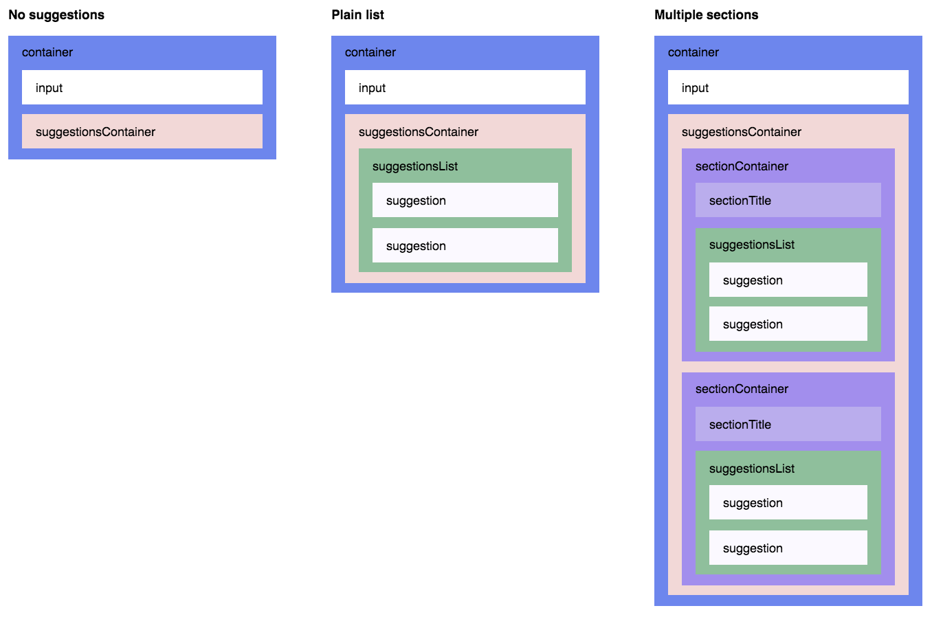
When not specified, theme defaults to:
{
  container:                'react-autosuggest__container',
  containerOpen:            'react-autosuggest__container--open',
  input:                    'react-autosuggest__input',
  inputOpen:                'react-autosuggest__input--open',
  inputFocused:             'react-autosuggest__input--focused',
  suggestionsContainer:     'react-autosuggest__suggestions-container',
  suggestionsContainerOpen: 'react-autosuggest__suggestions-container--open',
  suggestionsList:          'react-autosuggest__suggestions-list',
  suggestion:               'react-autosuggest__suggestion',
  suggestionFirst:          'react-autosuggest__suggestion--first',
  suggestionHighlighted:    'react-autosuggest__suggestion--highlighted',
  sectionContainer:         'react-autosuggest__section-container',
  sectionContainerFirst:    'react-autosuggest__section-container--first',
  sectionTitle:             'react-autosuggest__section-title'
}
The following picture illustrates how theme keys correspond to Autosuggest DOM structure:
id (required when multiple Autosuggest components are rendered on a page)
The only reason id exists, is to set ARIA attributes (they require a unique id).
When rendering a single Autosuggest, don't set the id (it will be set to '1', by default).
When rendering multiple Autosuggest components on a page, make sure to give them unique ids. For example:
<Autosuggest id="source" ... />
<Autosuggest id="destination" ... />
Development
npm install
npm start
Now, open http://localhost:3000/demo/dist/index.html and start hacking!
License
MIT
Related repositories
freeCodeCamp is a free, self-paced curriculum for learning to code, published as open source at freeCodeCamp/freeCodeCamp. It's a 501(c)(3) nonprofit funded by donor support, structured around six certifications in its Full-Stack Developer Curriculum, each gated by required projects instead of open-book quizzes. The repository also carries beta language certifications for developers, interview-prep resources, and the code that runs the live freecodecamp.org platform.
Next.js is a React framework from Vercel for building full-stack web applications, with file-based routing, server rendering, and static generation built in. Instead of wiring a router, bundler, and rendering strategy onto plain React yourself, you get those decisions made for you and pick a rendering mode per route.
Ant Design is an open-source React UI library and design language maintained at ant-design/ant-design on GitHub. Its README describes pre-built TypeScript components, a CSS-in-JS theme-customization system, and locale support spanning dozens of languages, aimed at enterprise-class web apps. The project is released under the MIT license.
Storybook is a frontend workshop maintained at storybookjs/storybook. It renders UI components and pages in isolation from your main application. Core renderers include React, Angular, Vue 3, Web Components, HTML, Ember, Svelte, and Preact, plus React Native and community support for Qwik and SolidJS. It's released under the MIT license.
Quick answers
How does moroshko/react-autosuggest compare to other Frontend projects?
moroshko/react-autosuggest is tracked by TopGit in the Frontend category, with 5.9k GitHub stars and written in JavaScript. Browse the Frontend topic page on TopGit to compare it against similar projects by stars and activity.
Is moroshko/react-autosuggest open source?
Yes — moroshko/react-autosuggest ships under the MIT license, which makes its source code freely readable (and, depending on license terms, forkable and reusable). Source: github.com/moroshko/react-autosuggest.
What else is in the Frontend space?
moroshko/react-autosuggest is tracked by TopGit under the Frontend category, alongside 5 GitHub-tagged topics. Trending and Topics pages list peer repositories of comparable stars and language.
What is moroshko/react-autosuggest?
moroshko/react-autosuggest (moroshko/react-autosuggest) is a JavaScript project on GitHub. From the project's own README: WAI-ARIA compliant React autosuggest component
Where do I read more about moroshko/react-autosuggest?
This TopGit page is a snapshot — the READ ME tab shows the project's own README content (links stripped, images preserved). The GitHub repository at github.com/moroshko/react-autosuggest is the definitive source.
Why is moroshko/react-autosuggest categorized under Frontend?
TopGit places moroshko/react-autosuggest in the Frontend category based on its GitHub topics and description (tagged: "accessible", "autocomplete", "autosuggest"). Categories are assigned from real repository metadata, not editorial guesswork.
Read full README in the tab above.
Is react-autosuggest worth your time?
ChatGPT, Claude and Perplexity can all read this page. Ask one of them what it makes of react-autosuggest.