Semantic UI: a CSS framework built like natural language
 /Semantic-UI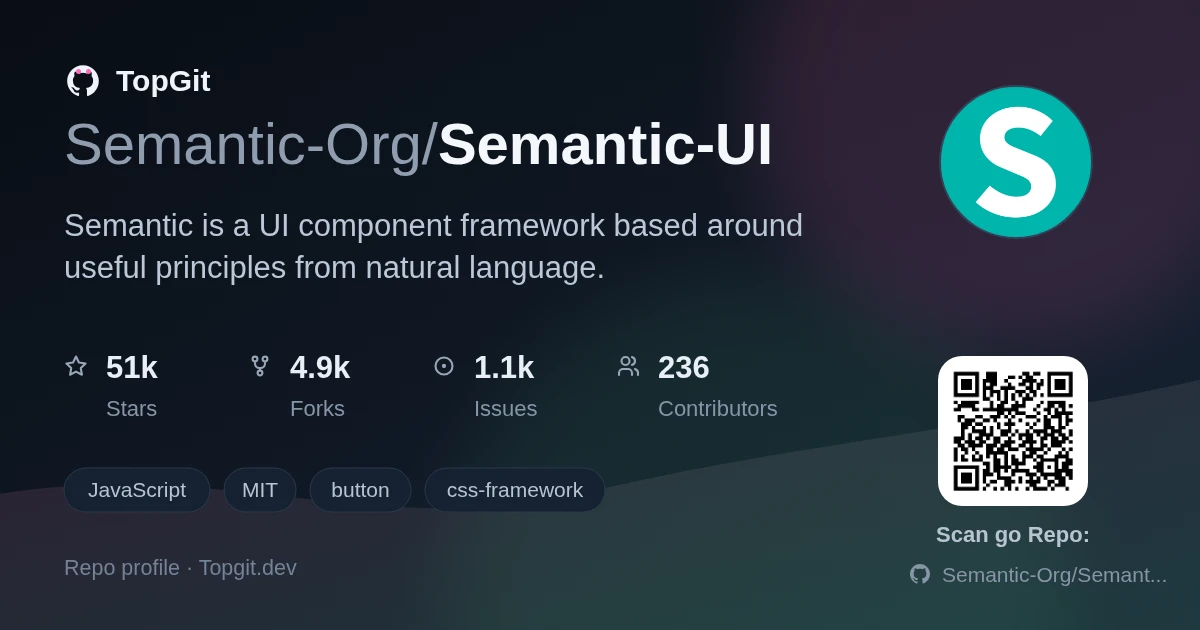
Semantic UI is a CSS framework that themes every component through inheritance-based LESS variables instead of one flat override file. Reach for it if you want deep, systematic theming across 50+ components and don't mind a Gulp-based build step; skip it if you need active upstream development, since the README's last dated release note is 2.5.0 from Oct 6, 2022.
What Is Semantic UI
Semantic UI is a CSS and JavaScript UI framework whose class names read like natural-language phrases — 'ui inverted button', 'ui three column grid' — rather than abbreviated utility classes. It ships 50+ UI elements built on flexbox and EM-based sizing, themed through a three-level LESS variable inheritance system the docs compare to Sublime Text's settings cascade, and includes integration paths for React, Angular, Meteor, and Ember.
Core Features: 50+ Components and a Strong Theming System
- ✓50+ prebuilt UI elements — buttons, dropdowns, popups, sidebars, grids, and more — covering most common interface patterns out of the box.
- ✓3,000+ CSS variables with three levels of override (global, site, element), so a single button instance can be restyled without touching the whole theme.
- ✓Flexbox-based grids and EM-sized components, built for responsive layouts rather than fixed pixel breakpoints.
- ✓An interactive npm installer that scaffolds a Gulp-based build and theming setup automatically.
- ✓Official integration paths for React, Angular, Meteor, and Ember, plus standalone `semantic-ui-css` and `semantic-ui-less` packages for teams that skip the Gulp build entirely.
- ✓RTL (right-to-left) builds available directly from the install script's `rtl` option.
How to Install Semantic UI
The recommended path is `npm install semantic-ui`, which pulls in an interactive installer and sets up Gulp build tasks so you can compile your own theme. If you don't want a build step, install pre-compiled output directly with `npm install semantic-ui-css`, or grab the LESS source with `npm install semantic-ui-less`. Semantic UI is also distributed via `bower install semantic-ui`, as a Meteor package (`meteor add semantic:ui`), and as an Ember addon (`ember install:addon semantic-ui-ember`). No CDN path is documented. Installs go through npm, Bower, or a framework-specific package manager instead.
What You Can Build with Semantic UI
- •A UI layer bolted onto an existing React, Angular, Meteor, or Ember app, using Semantic UI purely for markup and styling while your framework handles logic.
- •A CSS-only front end for a static site or server-rendered app via the `semantic-ui-css` package, with no build step at all.
- •A themed component library for internal tools or admin dashboards where consistent buttons, forms, and grids matter more than hand-rolled CSS.
- •A custom LESS-based theme built through the three-level variable system for a product that needs its own visual identity, not the stock look.
Strengths of Semantic UI
- ✓Browser support extends down to IE11, Android 4.4+, and iOS Safari 7+ — the README lists this explicitly rather than leaving it to guesswork.
- ✓Built-in RTL (right-to-left) builds are available straight from the install script, without a separate theme or fork.
- ✓MIT license, no usage restrictions to worry about.
- ✓Class names read as natural-language phrases ('ui inverted button'), which cuts down on time spent cross-referencing a separate style guide while writing markup.
Known Limitations of Semantic UI
- △The README's last dated release note is 2.5.0, released Oct 6, 2022 — there's no changelog entry after that, so treat feature and browser-support claims as current only as of that release.
- △IE support tops out at IE11, and the README warns that grids and other flexbox-based components will render incorrectly or fail outright on IE9 — anything targeting older IE needs its own testing.
- △This repo doesn't ship prebuilt React or Vue components — integration means using Semantic UI as CSS classes inside your framework's markup, not importing framework-native components.
- △The default install pulls in Gulp-based build tooling, which is one more toolchain to configure if your project doesn't already use Gulp.
Alternatives to Semantic UI
Is Semantic UI the Right Choice for Your Project
Choose Semantic UI if you want opinionated, readable class names and don't mind a LESS-based build step to access the theming system — it suits teams building admin panels, dashboards, or internal tools where consistent styling matters more than a bleeding-edge component API. Skip it if your team is already committed to a React or Vue component library with framework-native state management, since Semantic UI's components aren't framework components — they're CSS classes plus jQuery-style JS behaviors you wire up yourself. Also skip it if you need active upstream development; the README's last release note dates to Oct 6, 2022.
Frequently Asked Questions
Semantic UI's GitHub README lists 2.5.0 (Oct 6, 2022) as its most recent dated release note, with no changelog entries after that point in the repository. The project accepts issues and pull requests, but there's no publicly documented release activity more recent than 2.5.0.
Semantic UI documents integration paths for React, Angular, Meteor, and Ember through separate partner packages, using Semantic UI as the CSS and markup layer alongside your framework's logic. Vue isn't listed among the documented integrations in the README, so pairing Semantic UI with Vue means wiring the classes in yourself.
Semantic UI theming runs on a three-level LESS variable inheritance system — similar to Sublime Text's settings cascade — with more than 3,000 CSS variables across components. You override variables at the global, site, or individual-element level, so a single button instance can get its own colors without editing the shared theme file.
The `semantic-ui` package installs an interactive build setup with Gulp tasks so you can compile and customize a LESS-based theme yourself. The `semantic-ui-css` package skips that and installs pre-compiled CSS directly, with no build step and no theme customization tooling — pick it when you just want the default look working fast.
Semantic UI's browser support table lists IE 11+ as supported. The README adds a caveat: some components work in IE9, but grids and other flexbox-based components will render incorrectly or fail outright there, so IE11 is the realistic minimum for full compatibility.
Semantic UI can be used without Gulp by installing `semantic-ui-css` instead of the base `semantic-ui` package, which ships pre-compiled CSS with zero build tooling. The trade-off is losing the interactive theming installer and the ability to override LESS variables at build time — you're styling on top of the compiled output instead.
The problem it solves
Writing custom CSS for every button state, dropdown, and grid breakpoint from scratch is slow, and most CSS frameworks solve it with abbreviated utility classes (`.btn-sm`, `.col-4`) that you have to memorize. Semantic UI's specific angle is naming classes after natural-language descriptions of what the element is — an inverted button, a three-column grid — so the markup itself documents the UI, and pairing that with a three-level LESS variable system means a single component instance can be restyled without forking the whole theme.
How to use
The README doesn't include inline usage examples — it points to a separate getting-started guide and theming guide instead of documenting component markup in the repo itself. What it does establish is the approach: HTML classes are meant to read as phrases, in line with the README's own 'concise HTML' description, and theming is done by overriding LESS variables rather than editing component styles directly. For the exact class names and JavaScript initialization calls, you're routed to semantic-ui.com's docs, not the GitHub repo.
Related repositories
Is Semantic-UI worth your time?
ChatGPT, Claude and Perplexity can all read this page. Ask one of them what it makes of Semantic-UI.