adobe/spectrum-css

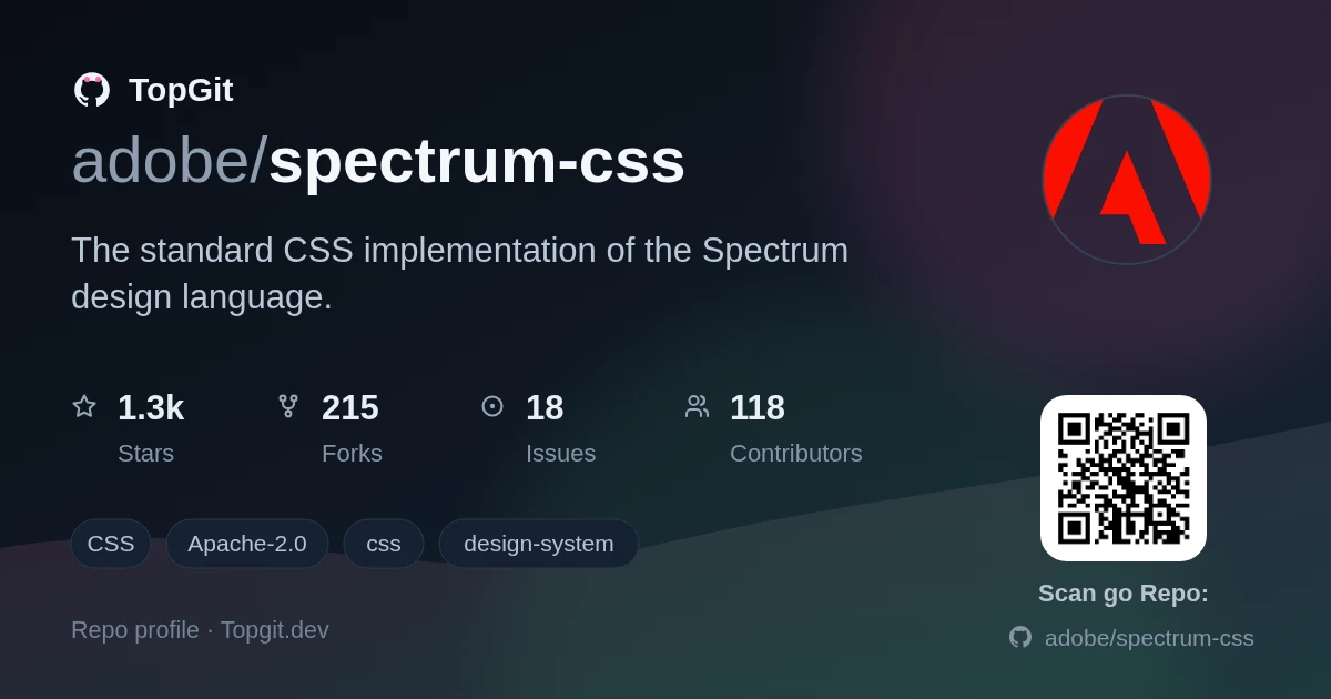
Là một dự án frontend, adobe/spectrum-css đã đạt 1.3k sao trên GitHub, ngôn ngữ CSS. The standard CSS implementation of the Spectrum design language.
Tóm tắt dựng từ metadata GitHub của chính dự án — chưa có bài review TopGit. Trang sẽ tự động cập nhật khi bài review đầy đủ được xuất bản.
TopGit viết bài đầy đủ cho repo có nhiều sao nhất và được yêu cầu nhiều nhất. Trang này là snapshot trong thời gian chờ — xem README gốc ở tab READ ME.
Snapshot
Cộng tác viên hàng đầu
Xem cộng tác viên hàng đầu


Spectrum CSS
A CSS-implementation of the Spectrum design language

Features
- 📖 Robust documentation: Spectrum CSS is designed to be used in partnership with Spectrum's detailed usage guidelines.
- 🎨 Flexible: Our CSS is customizable, powerful, and designed to work with any JavaScript framework.
- 🧪 Rigorously tested: These individually-versioned components have been vetted to be accessible and inclusive of global audiences.
- 📱 Multi-platform support: We support evergreen browsers for scalability and flexibility.

Using Spectrum CSS
The preferred method of using Spectrum CSS relies on custom properties to swap out variables for different themes and contexts. This results in the lowest bundle sizes and is one of the simpler approaches.
Want to get a component up and running as soon as possible? Check out the quick start guide.
Functionality
Spectrum CSS is CSS-only, implementing only the interactivity that can be done with pure CSS. We do include some lightweight JS-based interaction for demonstration purposes only in our Storybook. Spectrum CSS should only be used by implementations of Spectrum, or very simple applications that only need things like typography, checkboxes, text fields, etc.
Adobe maintains separate libraries written with web components and React that work in partnership with Spectrum CSS to create fully interactive Spectrum components.
The Spectrum Web Components library directly imports Spectrum CSS and optimizes it for use with web components.
Installing components
Each component is released on npm as a separate, individually versioned package inside of the @spectrum-css org.
To incorporate Spectrum CSS into your project, you install the components you need along with any peer dependencies you need for your implementation. Most peer dependencies are optional and can bring additional features when installed along with a component. For example a button can be rendered with or without an icon; so if your use-case leverages an icon with your button, you'll want to install icon as a peer dependency.
yarn add -DW @spectrum-css/tokens @spectrum-css/typography @spectrum-css/page @spectrum-css/icon @spectrum-css/button
Installed components will be available in the node_modules/@spectrum-css/ folder of your project.
All components in this library have a peer dependency on @spectrum-css/tokens, which is a local package that serves up the Spectrum design tokens as CSS custom properties (via Style dictionary). These custom properties are leveraged in all components to create a cohesive visual language and to allow for easy theming. If you choose not to use the provided @spectrum-css/tokens package, you must define your own custom properties or your components will render with a significant number of missing styles. When overriding certain styles is necessary, modifying styles is supported through the use of component-specific --mod prefixed properties. More on this below.
Using components in your project
Spectrum CSS components have build output that is designed to be used in a variety of ways:
-
index.css- Preferred and most commonly used to incorporate Spectrum CSS into a project. This file includes the component's styles and variable definitions. In this version, token-driven CSS properties1 are mapped to empty--modprefixed variables (for customization) with a fallback to variables prefixed with--spectrum(sourced from the design tokens).- This file loads the
.spectrum,.spectrum--legacy, and.spectrum--expresscontexts which are used to toggle components between different visual styles. The.spectrumcontext is the default.
- This file loads the
-
index-base.css: This file mimics theindex.cssoutput, but does not include the.spectrumor.spectrum--expresscontexts.- If your product only requires the
.spectrumcontext, you can useindex-base.cssplusthemes/spectrum-two.cssfrom thethemesdirectory to render the default Spectrum visual language.- The
.spectrum--legacycontext represents the previous version of Spectrum (also known as Spectrum 1). This means if you only want to use the legacy context, you should loadthemes/spectrum.css. deprecated - The
.spectrum--expresscontext represents the subtheme of Spectrum 1 called Express . This means if you only want to use the Express context, you should loadthemes/express.css. deprecated
- The
- This approach can also be used when you have defined and written your own visual language and only need the base component styles from Spectrum CSS. To wire up your own visual language, you would need to define your own custom properties that match those defined in the
themes/spectrum-two.cssassets.
- If your product only requires the
-
index-theme.css: This file provides only the visual language for a component. It is used in conjunction withindex-base.cssand when loaded together, provides the same result as usingindex.cssby itself.
1: Token-driven CSS properties are properties whose values are mapped to a value in the @spectrum-css/tokens package. These values represent design-language and are meant to be used across platforms. In contrast, properties specific to web-based implementations will not have a token value assigned, so not all CSS properties will use custom properties.
Including assets
Start by including the base set of variables:
/* Include tokens */
@import "node_modules/@spectrum-css/tokens/dist/index.css";

/*
  For components with no other contexts available, load the
  index.css file from the component's package. These are components
  that do not have a spectrum or express context available.
*/
@import "node_modules/@spectrum-css/page/dist/index.css";
@import "node_modules/@spectrum-css/typography/dist/index.css";
@import "node_modules/@spectrum-css/icon/dist/index.css";

/*
  Recommended: For components with multiple contexts available, if you
  want access to all contexts, load the index.css file, which includes
  all contexts and component variables.
*/
@import "node_modules/@spectrum-css/button/dist/index.css";

/*
  If you only need the spectrum visual context: For components with
  multiple contexts available, load only the spectrum context by sourcing
  index-base.css and the spectrum theme from the themes directory.
*/
@import "node_modules/@spectrum-css/button/dist/index-base.css";
@import "node_modules/@spectrum-css/button/dist/themes/spectrum.css";
Tokens values are mapped to context-specific classes which can be applied to the <html> element or any place in your DOM where you wish to encapsulate or alter the visual language of your Spectrum components.
All contexts you want to use must be defined in order to load all the appropriate custom properties for the components you are using.
Global variables
Visual language
.spectrum- The default visual language for Spectrum CSS; represents the Spectrum 2 foundations visual language..spectrum--legacy- The legacy Spectrum 1 visual language. This visual language will be deprecated in Spectrum 2..spectrum--express- A variant of the standard visual language. This visual language will be deprecated in Spectrum 2.
Scales
Scales represent the browsing context of the user. They are used to adjust the size of components to improve readability and usability on different devices.
.spectrum--medium- The default scale for Spectrum CSS, used for desktop and tablet devices.spectrum--large- A larger scale for Spectrum CSS, used for mobile devices and other small screens to create a more touch-friendly experience
Themes (colorstops)
Themes represent the color scheme of the user's browsing context. They are used to adjust the color of components to improve readability and usability in different environments.
.spectrum--light- The default theme for Spectrum CSS, used for light mode.spectrum--dark- A darker theme for Spectrum CSS, used for dark mode
Other themes are available but are in the process of being deprecated and should not be used in new projects.
Context example
Put together, we would define the context for our application in the following way:
<html class="spectrum spectrum--medium spectrum--light"></html>
To switch to Express, add the .spectrum--express class to the <html> element:
<html
	class="spectrum spectrum--medium spectrum--light spectrum--express"
></html>
Note the spectrum--legacy or spectrum--express class is added to the existing classes; spectrum should always be present to ensure the correct visual language is loaded.
Because CSS custom properties honor the cascading nature of CSS, you can infinitely nest different contexts. For example, you could have a .spectrum--dark context inside of a .spectrum--light context, and components will honor the innermost context.
Modifying components
You can override variables and modify Spectrum CSS' look and feel by re-defining the custom properties in context. Look for the Custom Property API section in each component to determine which custom properties you can override. See Action Button for a complete example.
Importing UI icons
Some components require certain "UI icons" to render. These icons are released within the @spectrum-css/ui-icons package and are used by components like @spectrum-css/icon and @spectrum-css/actionbutton.
Based on which scales you'll be using, you can choose to load different files:
-
spectrum-css-icons.svg- Both medium and large icons for responsive UIs that support both.spectrum--mediumand.spectrum--large -
spectrum-css-icons-medium.svg- Medium icons only, supports.spectrum--mediumonly -
spectrum-css-icons-large.svg- Large icons only, supports.spectrum--largeonly
Note: If you're using spectrum-css-icons.svg, be sure to add .spectrum--medium or .spectrum--large to the <html> element, or you'll see both medium and large icons at once.
Importing workflow icons
If your app has any level of complexity, you'll need "workflow" icons to indicate actions. These icons are not required to render the base components, and instead are used within buttons or menu items for actions like share, play, justify, save, etc.
These icons are released within the @adobe/spectrum-css-workflow-icons package. Visit the Spectrum workflow icon list and click on any icon to get the SVG markup.
Language support
To take advantage of locale specific changes such as placeholders not italicizing Japanese, your application should specify a Content-Language response header or set the lang attribute.
In addition, you should set the dir attribute for components to render correctly.
For English, a left-to-right language:
<html lang="en" dir="ltr"></html>
For Arabic, a right-to-left language:
<html lang="ar" dir="rtl"></html>
Browser support
We maintain a modern codebase that supports the latest two versions of evergreen web browsers. The current list of browsers officially supported by Spectrum CSS can be found in the browserslist section of the project's package.json file. This setting is used by the build tools when the source files are built. If you require additional browser support for your project, the CSS can be processed further with your chosen tools.
- latest 2 Edge versions
- latest 2 Chrome versions
- latest 2 Firefox versions
- latest 2 Safari versions
- latest 2 iOS versions
Optimizing Spectrum CSS
Spectrum CSS is designed to be as modern and flexible as possible, and as such, leaves room for consumers to optimize in their own way. There are many tools and techniques you can use to optimize CSS for your project such as tree shaking, purging, and minification. If you are loading the entire set of @spectrum-css/tokens for example, you can safely tree shake the tokens to only include the variables you are using, often leading to a significant reduction in file size.
Contributing
A very special thank you to all of our contributors without whom this project would not be possible.
Want to join the team? Check out the contributing guidelines to get started.
Tasks
The following tasks are available:
| Command | Description | Examples |
|---|---|---|
clean | Cleans all output files for the project and all components | yarn clean |
build | Performs a build of all components | yarn build |
bundle | Creates a bundled asset for use in demos or development environments | yarn bundle |
start | Performs a local development build of Storybook | yarn start |
compare | This compares the current version of components with the previous versions published to NPM and output a list of all the changes that have been made. This is useful for reviewing changes before a release. The information is provided in the command-line output as well as in a simple web page that is opened in your default browser upon completion. The web page includes links to the visual diffs for each component when the file sizes have changed.
| yarn compareyarn compare accordionyarn compare accordion actionbutton |
lint | Provides helpful updates and warnings for a component's package.json file. This helps keep all components in alignment. Use format to automatically fix any issues that are found. To run on a single component, use yarn linter accordion (where accordion is the name of the component or components you want to lint). | yarn lintyarn linter accordionyarn linter accordion actionbutton |
format | Provides helpful updates and warnings for a component's package.json file. This helps keep all components in alignment. To run on a single component, use yarn formatter accordion (where accordion is the name of the component or components you want to lint). | yarn formatyarn formatter accordionyarn formatter accordion actionbutton |
refresh:env | This copies values for the project's .env file (an asset never committed to the repo as it contains login secrets) by using the .env.example file as a template. This script is useful when you need to update the .env file with new values from the .env.example file or when you checkout or clean the repo and need to restore the .env file. | yarn refresh:env |
yarn constraints | This command will list out any changes suggested by the settings defined in yarn.config.cjs. The goal of this tool is to more easily allow us to add, update, or remove properties to/from all package assets. Add the fix flag to apply the suggested changes. | yarn constraints or yarn constraints --fix |
Troubleshooting
As of February of 2024, the Spectrum CSS project has moved to a new tokens system (@spectrum-css/tokens instead of @spectrum-css/vars). If you are using Spectrum CSS and see that your styles are off, or not applying at all, ensure that you are using the correct tokens package for the component.
Repo liên quan
Bootstrap is an open-source front-end framework maintained at twbs/bootstrap. It ships compiled and minified CSS and JavaScript for building responsive, mobile-first sites, is licensed under MIT, and the release referenced throughout the README's install instructions is v5.3.8. The project was created by Mark Otto and Jacob Thornton, and its documentation is built with Astro and hosted at getbootstrap.com.
Electron (electron/electron on GitHub) is an open-source, MIT-licensed framework for building cross-platform desktop apps with JavaScript, HTML, and CSS on top of Node.js and Chromium. The README covers installing it as a dev dependency through npm, lists platform support for macOS, Windows, and Linux, and points to a companion tool, Electron Fiddle, for trying the API before starting a full project.
App Ideas Collection is a GitHub repository maintained by Florin Pop and Jim Medlock that catalogs application ideas developers can build to practice their skills, organized into three difficulty tiers. Each entry defines an objective, user stories, optional bonus features, and resource links rather than a bare project name, and the repository is sponsored by CodeRabbit and licensed under MIT.
Web Development for Beginners - A Curriculum is Microsoft's free, MIT-licensed course of 24 lessons spread across 12 weeks, covering JavaScript, CSS, and HTML. Built by Microsoft Cloud Advocates, it pairs quizzes with five hands-on projects, a terrarium, a typing game, a browser extension, a space game, and a banking app, and ships in 50+ language translations.
Trả lời nhanh
adobe/spectrum-css có những chủ đề gì?
GitHub topics của adobe/spectrum-css: "css", "design-system". TopGit xếp repo vào nhóm Frontend.
adobe/spectrum-css có phải mã nguồn mở không?
Có — adobe/spectrum-css phát hành theo license Apache-2.0, nghĩa là mã nguồn mở để đọc, fork và (tùy license) tái sử dụng. Mã: github.com/adobe/spectrum-css.
adobe/spectrum-css có trang demo không?
Dự án có trang chủ ở http://opensource.adobe.com/spectrum-css/. Tab "Readme" ở trang này thường có ảnh chụp và hướng dẫn bắt đầu nhanh.
adobe/spectrum-css còn đang phát triển không?
Commit gần nhất trên adobe/spectrum-css là 15 ngày trước (theo timestamp GitHub). Repo có 214 fork — một chỉ báo về mức độ quan tâm của cộng đồng.
adobe/spectrum-css dùng license gì?
adobe/spectrum-css phát hành theo license Apache-2.0. Nên mở file LICENSE trên GitHub để xác nhận — license metadata đôi khi lệch với thực tế dự án.
Đọc thêm về adobe/spectrum-css ở đâu?
Trang TopGit này là một snapshot — tab "Readme" hiển thị nguyên văn README của repo (đã bỏ link, giữ ảnh). Repo GitHub ở github.com/adobe/spectrum-css là nguồn chính thức.
Đọc đầy đủ README ở tab phía trên.
spectrum-css có đáng để bạn bỏ thời gian?
ChatGPT, Claude và Perplexity đều đọc được trang này. Hỏi thử xem họ nghĩ gì về spectrum-css.