
andreamazz/AMPopTip

andreamazz/AMPopTip — dự án mã nguồn mở — đang có 3.3k sao GitHub. An animated popover that pops out a given frame, great for subtle UI tips and onboarding.
Tóm tắt dựng từ metadata GitHub của chính dự án — chưa có bài review TopGit. Trang sẽ tự động cập nhật khi bài review đầy đủ được xuất bản.
TopGit viết bài đầy đủ cho repo có nhiều sao nhất và được yêu cầu nhiều nhất. Trang này là snapshot trong thời gian chờ — xem README gốc ở tab READ ME.
Snapshot
Cộng tác viên hàng đầu
Xem cộng tác viên hàng đầu


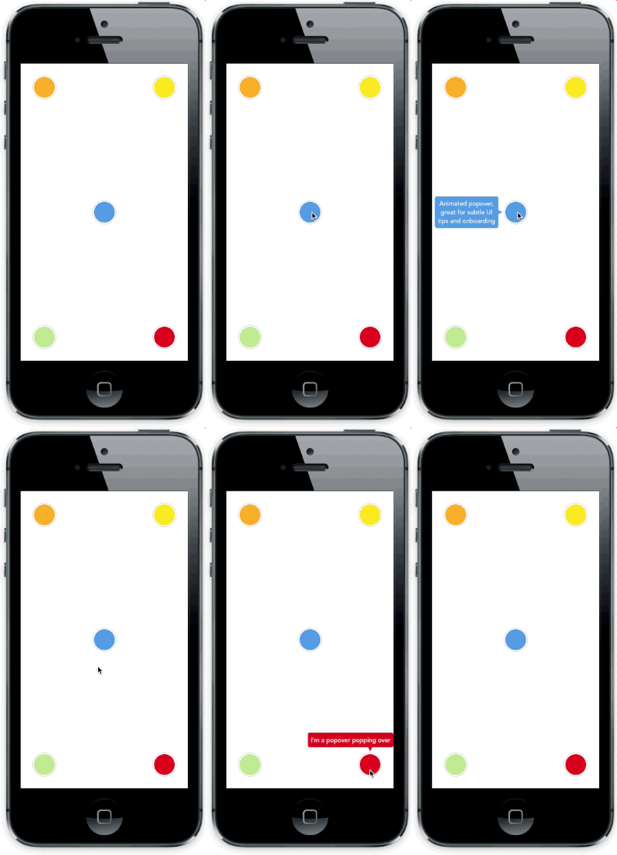
Animated popover that pops out of a frame. You can specify the direction of the popover and the arrow that points to its origin. Color, border radius and font can be easily customized. This popover can be used to leave subtle hints about your UI and provide fun looking onboarding popups.
Screenshot
Versioning notes
With version 2.0.0 the library was re-written in Swift, and the API was slightly updated. Checkout version 1.5.x for the previous Objective-C implementation.
Version 3.0.0 introduces Swift 4 support, 3.5.0 Swift 4.2.
Setup with CocoaPods
- Add
pod 'AMPopTip'to yourPodfile - Run
pod install - Run
open App.xcworkspace
Setup with Carthage
- Add
github "andreamazz/AMPopTip" - Run
carthage update - Add
AMPopTip.frameworkin your project
You can then import the framework in your project
import AMPopTip
Usage
The API is fairly straight forward, you can show and hide the popover at any time.
Showing the popover
You must specify the text that you want to display alongside the popover direction, its max width, the view that will contain it and the frame of the view that the popover's arrow will point to.
let popTip = PopTip()
popTip.show(text: "Hey! Listen!", direction: .up, maxWidth: 200, in: view, from: someView.frame)
You can also display the popover in the center, with no arrow, in this case the from can be the whole view:
popTip.show(text: "Hey! Listen!", direction: .none, maxWidth: 200, in: view, from: view.frame)
Coordinate system
Please note that the frame you are intended to provide needs to refer to the absolute coordinate system of the view you are presenting the popover in. This means that if you are presenting the popover in a view, pointing to a nested subview, you'll need to convert its frame using UIKit's convertRect(_:toView:). Read the reference here.
Direction
You can specify the direction that the tip will occupy, or you can let the library decide by using auto (all axis), autoHorizontal (only left or right) or autoVertical (only up or down). Once the popup is visible, the direction property will hold the direction that was decided.
Showing a custom view
You can provide a custom view that will be wrapped in the PopTip and presented.
let customView = UIView(frame: CGRect(x: 0, y: 0, width: 100, height: 100))
// Configure your view
popTip.show(customView: customView, direction: .down, in: view, from: someView.frame)
Showing a custom SwiftUI view
You can provide a custom SwiftUI view that will be embed in a UIHostingController, added to a parent controller and then wrapped in the PopTip and presented.
let customSwiftUIView = MySwiftUIView()
// Configure your view
popTip.show(rootView: customSwiftUIView, direction: .down, in: view, from: someView.frame, parent: someParentViewController)
Dismissing the popover
You can hide the popover by calling:
popTip.hide()
Or you can specify the duration of the popover:
popTip.show(text: "Hey! Listen!", direction: .up, maxWidth: 200, in: view, from: someView.frame, duration: 3)
You can also let the user dismiss the popover by tapping on it (default true):
popTip.shouldDismissOnTap = true
You can also let the user tap outside the popover dismiss the PopTip (default true):
popTip.shouldDismissOnTapOutside = true
You can also consider the origin frame as part of the popTip, i.e. treat the origin frame the same as tapping the popover (default false):
popTip.shouldConsiderOriginatingFrameAsPopTip = true
You can also consider the cutout as a separate tap area that will call a different callback (default false):
popTip.shouldConsiderCutoutTapSeparately = true
You can also allow the user to dismiss via swiping outside the PopTip (default false) (direction is controlled via popTip.swipeRemoveGestureDirection with UISwipeGestureRecognizer.Direction):
popTip.shouldDismissOnSwipeOutside = false
You can add a block that will be fired when the user taps the PopTip...
popTip.tapHandler = { popTip in
  print("\(popTip) tapped")
}
... when the cutout is tapped...
popTip.tapCutoutHandler = { popTip in
  print("\(popTip) cutout tapped")
}
... when the popover is shown...
popTip.appearHandler = { popTip in
  print("\(popTip) appeared")
};
... or when the popover is dismissed:
popTip.dismissHandler = { popTip in
  print("\(popTip) dismissed")
}

popTip.tapOutsideHandler = { _ in
  print("tap outside")
}

popTip.swipeOutsideHandler = { _ in
  print("swipe outside")
}
Forwarding tap gesture on dismiss
By default the "tap to dismiss" gesture recognizer cancels the taps in the view, you can enable this behaviour manually if needed:
popTip.tapToRemoveGestureRecognizer?.cancelsTouchesInView = false
Updating the PopTip
You can update the text, attributed text, or custom view to a PopTip already visible:
popTip.update(text: "New string")
popTip.update(attributedText: someAttributedString)
popTip.update(customView: someView)
The position can also be changed by updating the from property:
let here = CGRect(x: 100, 100, 10, 10)
let there = CGRect(x: 400, 400, 10, 10)

popTip.show(text: "Hey! Listen!", direction: .up, maxWidth: 200, in: view, from: here)
DispatchQueue.main.asyncAfter(deadline: .now() + 2) {
  popTip.from = there
}
Custom entrance animation
You can choose which animation should be performed when the popTip is displayed:
popTip.entranceAnimation = .scale;
Available animations:
PopTipEntranceAnimation.scale,
PopTipEntranceAnimation.transition,
PopTipEntranceAnimation.none,
PopTipEntranceAnimation.custom
PopTipEntranceAnimation.custom
You can provide your own animation block when using PopTipEntranceAnimation.custom:
popTip.entranceAnimationHandler = { [weak self] completion in
  guard let `self` = self else { return }
  self.popTip.transform = CGAffineTransform(rotationAngle: 0.3)
  UIView.animate(withDuration: 0.5, animations: {
    self.popTip.transform = .identity
  }, completion: { (_) in
    completion()
  })
}
This sample makes the PopTip rotate on entrance. Make sure to call the completion block when the animation is done. Also note that the animation is fired as soon as the PopTip is added as subview.
Action animations
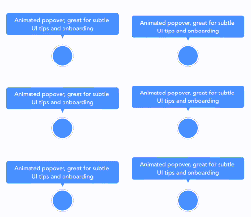
Action animations are subtle animations that can be performed to get the user's attention. Set your preferred animation:
popTip.actionAnimation = .bounce()
Available animations:
PopTipActionAnimation.bounce,
PopTipActionAnimation.float,
PopTipActionAnimation.pulse,
PopTipActionAnimation.none
The animation is fired as soon as the popover enters the scene and completes its entrance animation, if startActionAnimationOnShow is set to true.
Customize the animations
You can pass a custom value as an associated value to customize the action animation:
popTip.actionAnimation = .bounce(16) // This will bounce for 16px instead of the default value
Customizing the arrow position
The arrow is centered by default, and moves to avoid the edge of the screen. You can manually change the offset from the center using the bubbleOffset property.
A note about subviews
The popover is presented inside the view provided in the in parameter. If this view is smaller than the resulting popover, to prevent clipping set clipsToBounds = false on the presenting view, and set constrainInContainerView = false to the pop tip instance. See #175 for more context.
Customization
Use the appearance proxy to customize the popover before creating the instance, or just use its public properties:
textColor = <#UIColor#>;
textAlignment = <#NSTextAlignment#>
bubbleColor = <#UIColor#>
bubbleLayerGenerator = <#(PopTip)->Void#>
borderColor = <#UIColor#>
borderWidth = <#CGFloat#>
cornerRadius = <#CGFloat#> // Popover's border radius
isRounded = <#Bool#> // If set to YES the radius will equal frame.height / 2
offset = <#CGFloat#> // Offset between the popover and the origin
font = <#UIFont#>
padding = <#CGFloat#>
edgeInsets = <#UIEdgeInsets#>
arrowSize = <#CGSize#>
animationIn = <#TimeInterval#>
animationOut = <#TimeInterval#>
delayIn = <#TimeInterval#>
delayOut = <#TimeInterval#>
entranceAnimation = <#PopTipEntranceAnimation#>
exitAnimation = <#PopTipExitAnimation#>
actionAnimation = <#PopTipActionAnimation#>
actionAnimationIn = <#TimeInterval#>
actionAnimationOut = <#TimeInterval#>
actionDelayIn = <#TimeInterval#>
actionDelayOut = <#TimeInterval#>
edgeMargin = <#CGFloat#>
bubbleOffset = <#CGFloat#> // Offset between the bubble and the origin
arrowOffset = <#CGFloat#> // Offset between the bubble center and the arrow
arrowRadius = <#CGFloat#>
shadowOpacity = <#Float#>
shadowRadius = <#Float#>
shadowOffset = <#CGSize#>
shadowColor = <#UIColor#>
maskColor = <#UIColor#>
shouldShowMask = <#Bool#>
shouldCutoutMask = <#Bool#>
cutoutPathGenerator = <#(CGRect)->UIBezierPath#>
constrainInContainerView = <#Bool#>
Background mask
A background mask can be applied to dim the background when the PopTip is active, this can be enabeld by setting the public property to true:
popTip.shouldShowMask = true
The color is set by the maskColor property (default is UIColor(red: 0, green: 0, blue: 0, alpha: 0.6)):
popTip.maskColor = UIColor(red: 1, green: 0, blue: 0, alpha: 0.6)
Adding a cutout
A cutout can be applied to the background mask to allow the from view to be visible through the dimmed background. shouldShowMask must be true as well as shouldCutoutMask for this to work. The cutout path is supplied via a closure with a signature of (_ from: CGRect) -> UIBezierPath stored against public property cutoutPathGenerator. The closure will provide an argument which is the CGRect frame supplied to popTip.show(...).
The default generator add an 8 rounded rectangle around the from frame area which has 8 padding in the x and y directions, it is as follows but can be changed to whatever is desired:
popTip.cutoutPathGenerator = { from in
  UIBezierPath(roundedRect: from.insetBy(dx: -8, dy: -8), byRoundingCorners: .allCorners, cornerRadii: CGSize(width: 8, height: 8))
}
A seperate callback closure can be called on tapping the area defined by the cutoutPathGenerator provided both shouldShowMask and shouldCutoutMask are true, the closure is as follows:
popTip.tapCutoutHandler = { popTip in
  print("\(popTip) cutout tapped")
}
Custom bubble background
A custom CALayer can be used as the background for the PopTip bubble, this is supplied via a closure with a signauture of ((_ path: UIBezierPath) -> CALayer?)? stored against public property bubbleLayerGenerator. The closure will provide an argument which is the UIBezierPath that represents the draw path for the PopTip bubble and arrow.
If bubbleLayerGenerator is nil, then the bubbleColor will be used instead for a solid background fill. If bubbleLayerGenerator is not nil, then it will be used, providing it provides a valid CALayer, otherwise bubbleColor will be used as a solid color fallback. Example below:
popTip.bubbleLayerGenerator = { path in

  let gradient = CAGradientLayer()
  gradient.frame = path.bounds
  gradient.colors = [UIColor.black.withAlphaComponent(0.4).cgColor, UIColor.black.withAlphaComponent(0.3)]
  gradient.locations = [0, 1]
  gradient.startPoint = CGPoint(x: 0.5, y: 0.0)
  gradient.endPoint = CGPoint(x: 0.5, y: 1.0)

  let shapeMask = CAShapeLayer()
  shapeMask.path = path.cgPath
  gradient.mask = shapeMask

  return gradient
}
Author
Andrea Mazzini. I'm available for freelance work, feel free to contact me.
Want to support the development of these free libraries? Buy me a coffee ☕️ via Paypal.
Contributors
Thanks to everyone kind enough to submit a pull request.
MIT License
Copyright (c) 2017 Andrea Mazzini. All rights reserved.

Permission is hereby granted, free of charge, to any person obtaining a
copy of this software and associated documentation files (the "Software"),
to deal in the Software without restriction, including
without limitation the rights to use, copy, modify, merge, publish,
distribute, sublicense, and/or sell copies of the Software, and to
permit persons to whom the Software is furnished to do so, subject to
the following conditions:

The above copyright notice and this permission notice shall be included
in all copies or substantial portions of the Software.

THE SOFTWARE IS PROVIDED "AS IS", WITHOUT WARRANTY OF ANY KIND, EXPRESS
OR IMPLIED, INCLUDING BUT NOT LIMITED TO THE WARRANTIES OF
MERCHANTABILITY, FITNESS FOR A PARTICULAR PURPOSE AND NONINFRINGEMENT.
IN NO EVENT SHALL THE AUTHORS OR COPYRIGHT HOLDERS BE LIABLE FOR ANY
CLAIM, DAMAGES OR OTHER LIABILITY, WHETHER IN AN ACTION OF CONTRACT,
TORT OR OTHERWISE, ARISING FROM, OUT OF OR IN CONNECTION WITH THE
SOFTWARE OR THE USE OR OTHER DEALINGS IN THE SOFTWARE.
Repo liên quan
Master programming by recreating your favorite technologies from scratch.
A curated meta-list of curated lists organized by technology domain. The repository acts as a directory pointing to hundreds of specialized awesome lists covering programming languages, platforms, frameworks, and tooling. All content is community-contributed under the CC0 public domain dedication.
Public APIs is a community-curated GitHub repository listing free, publicly accessible APIs across a wide range of categories, with auth type, HTTPS, and CORS noted for each entry. It's a browsable reference, not a library to install.
REA is an MCP server and CLI that gives AI coding agents the ability to reverse engineer binaries, JavaScript apps, .NET assemblies, and websites. It hooks into Hopper, Ghidra, or IDA Pro for native binary work, or runs static JavaScript analysis with just Node.js. Every investigation returns an Evidence bundle that includes what was found, what was not, and the reasoning path. Setup registers REA with supported agents and walks you through connecting an analysis engine. The CLI also works standalone for terminal-first workflows.
Trả lời nhanh
andreamazz/AMPopTip có bao nhiêu sao?
andreamazz/AMPopTip có 3.3k sao GitHub — tải lại trang để xem số mới nhất, hoặc xem trực tiếp github.com/andreamazz/AMPopTip. TopGit phản chiếu số sao của GitHub nhưng không cam kết đến từng phút.
andreamazz/AMPopTip có phải mã nguồn mở không?
Có — andreamazz/AMPopTip phát hành theo license MIT, nghĩa là mã nguồn mở để đọc, fork và (tùy license) tái sử dụng. Mã: github.com/andreamazz/AMPopTip.
andreamazz/AMPopTip có website riêng không?
TopGit chưa ghi nhận URL trang chủ cho andreamazz/AMPopTip. Phần README ở tab phía trên thường có link demo, hoặc xem mô tả GitHub của repo.
andreamazz/AMPopTip là gì?
andreamazz/AMPopTip (andreamazz/AMPopTip) là dự án Swift trên GitHub. Theo mô tả gốc: An animated popover that pops out a given frame, great for subtle UI tips and onboarding.
Đọc thêm về andreamazz/AMPopTip ở đâu?
Trang TopGit này là một snapshot — tab "Readme" hiển thị nguyên văn README của repo (đã bỏ link, giữ ảnh). Repo GitHub ở github.com/andreamazz/AMPopTip là nguồn chính thức.
Đọc đầy đủ README ở tab phía trên.
Muốn nghe thêm một ý kiến về AMPopTip?
Hỏi một AI đọc được trang này — một cú bấm là có ngay nhận định về AMPopTip.