dvtng/react-loading-skeleton là dự án TypeScript với 4.2k sao trong nhóm Frontend. Create skeleton screens that automatically adapt to your app!
Tóm tắt dựng từ metadata GitHub của chính dự án — chưa có bài review TopGit. Trang sẽ tự động cập nhật khi bài review đầy đủ được xuất bản.
VÌ SAO CHƯA CÓ REVIEW
TopGit viết bài đầy đủ cho repo có nhiều sao nhất và được yêu cầu nhiều nhất. Trang này là snapshot trong thời gian chờ — xem README gốc ở tab READ ME.
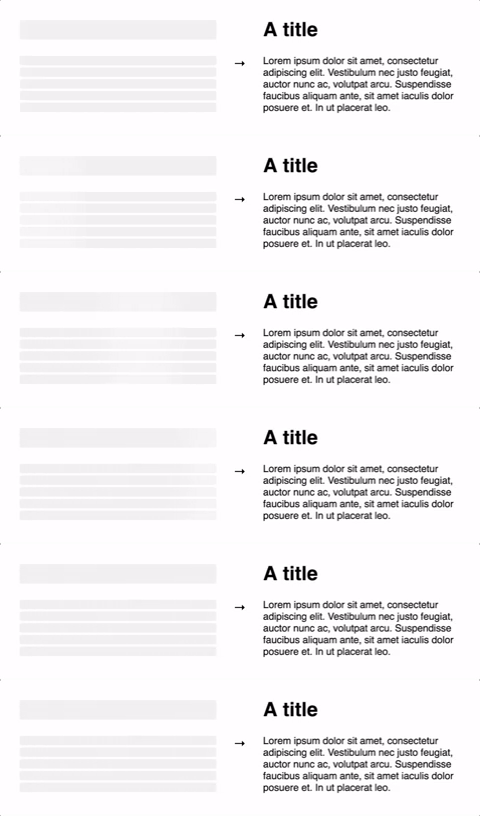
The Skeleton component should be used directly in your components in place of
content that is loading. While other libraries require you to meticulously craft
a skeleton screen that matches the font size, line height, and margins of your
content, the Skeleton component is automatically sized to the correct
dimensions.
...will produce correctly-sized skeletons for the heading and body without any
further configuration.
This ensures the loading state remains up-to-date with any changes
to your layout or typography.
Don't make dedicated skeleton screens
Instead, make components with built-in skeleton states.
This approach is beneficial because:
It keeps styles in sync.
Components should represent all possible states — loading included.
It allows for more flexible loading patterns. In the blog post example above,
it's possible to have the title load before the body, while having both
pieces of content show loading skeletons at the right time.
Theming
Customize individual skeletons with props, or render a SkeletonTheme to style
all skeletons below it in the React hierarchy:
A custom wrapper component that goes around the individual skeleton
elements.
circle?: boolean
Makes the skeleton circular by setting border-radius to
50%.
false
className?: string
A custom class name for the individual skeleton elements which is used
alongside the default class, react-loading-skeleton.
containerClassName?: string
A custom class name for the <span> that wraps the
individual skeleton elements.
containerTestId?: string
A string that is added to the container element as a
data-testid attribute. Use it with
screen.getByTestId('...') from React Testing Library.
style?: React.CSSProperties
This is an escape hatch for advanced use cases and is not the preferred
way to style the skeleton. Props (e.g. width,
borderRadius) take priority over this style object.
Skeleton and SkeletonTheme
Prop
Description
Default
baseColor?: string
The background color of the skeleton.
#ebebeb
highlightColor?: string
The highlight color in the skeleton animation.
#f5f5f5
width?: string | number
The width of the skeleton.
100%
height?: string | number
The height of each skeleton line.
The font size
borderRadius?: string | number
The border radius of the skeleton.
0.25rem
inline?: boolean
By default, a <br /> is inserted after each skeleton so
that each skeleton gets its own line. When inline is true, no
line breaks are inserted.
false
duration?: number
The length of the animation in seconds.
1.5
direction?: 'ltr' | 'rtl'
The direction of the animation, either left-to-right or right-to-left.
'ltr'
enableAnimation?: boolean
Whether the animation should play. The skeleton will be a solid color when
this is false. You could use this prop to stop the animation
if an error occurs.
true
customHighlightBackground?: string
Allows you to override the background-image property of the highlight element, enabling you to fully customize the gradient. See example below.
undefined
Examples
Custom Wrapper
There are two ways to wrap a skeleton in a container:
function Box({ children }: PropsWithChildren<unknown>) {
  return (
    <div
      style={{
        border: '1px solid #ccc',
        display: 'block',
        lineHeight: 2,
        padding: '1rem',
        marginBottom: '0.5rem',
        width: 100,
      }}
    >
      {children}
    </div>
  );
}

// Method 1: Use the wrapper prop
const wrapped1 = <Skeleton wrapper={Box} count={5} />;

// Method 2: Do it "the normal way"
const wrapped2 = (
  <Box>
    <Skeleton />
  </Box>
);
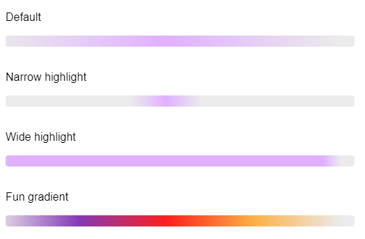
Custom Highlight Background
You may want to make the gradient used in the highlight element narrower or wider. To do this, you can set the customHighlightBackground prop. Here's an example of a narrow highlight:
If you use this prop, the baseColor and highlightColor props are ignored, but you can still reference their corresponding CSS variables as shown in the above example.
Troubleshooting
The skeleton width is 0 when the parent has display: flex!
In the example below, the width of the skeleton will be 0:
This happens because the skeleton has no intrinsic width. You can fix it by
applying flex: 1 to the skeleton container via the containerClassName prop.
For example, if you are using Tailwind, your code would look like this:
The height of my container is off by a few pixels!
In the example below, the height of the <div> will be slightly larger than 30
even though the react-loading-skeleton element is exactly 30px.
<div>
  <Skeleton height={30} />
</div>
This is a consequence of how line-height works in CSS. If you need the <div>
to be exactly 30px tall, set its line-height to 1. See
here
for more details.
Contributing
Contributions are welcome! See CONTRIBUTING.md to get started.
Acknowledgements
Our logo is based off an image from Font
Awesome. Thanks!
Trang TopGit này là một snapshot — tab "Readme" hiển thị nguyên văn README của repo (đã bỏ link, giữ ảnh). Repo GitHub ở github.com/dvtng/react-loading-skeleton là nguồn chính thức.
dvtng/react-loading-skeleton có bao nhiêu sao?
dvtng/react-loading-skeleton có 4.2k sao GitHub — tải lại trang để xem số mới nhất, hoặc xem trực tiếp github.com/dvtng/react-loading-skeleton. TopGit phản chiếu số sao của GitHub nhưng không cam kết đến từng phút.
dvtng/react-loading-skeleton có phải mã nguồn mở không?
Có — dvtng/react-loading-skeleton phát hành theo license MIT, nghĩa là mã nguồn mở để đọc, fork và (tùy license) tái sử dụng. Mã: github.com/dvtng/react-loading-skeleton.
dvtng/react-loading-skeleton còn đang phát triển không?
Commit gần nhất trên dvtng/react-loading-skeleton là 5 tháng trước (theo timestamp GitHub). Repo có 162 fork — một chỉ báo về mức độ quan tâm của cộng đồng.
dvtng/react-loading-skeleton là gì?
dvtng/react-loading-skeleton (dvtng/react-loading-skeleton) là dự án TypeScript trên GitHub. Theo mô tả gốc: Create skeleton screens that automatically adapt to your app!
dvtng/react-loading-skeleton so với các dự án Frontend khác thế nào?
dvtng/react-loading-skeleton được TopGit xếp vào nhóm Frontend, với 4.2k sao GitHub và viết bằng TypeScript. Xem trang chủ đề Frontend trên TopGit để so sánh với các dự án tương tự theo số sao và mức độ hoạt động.
Đọc đầy đủ README ở tab phía trên.
Vẫn đang phân vân về react-loading-skeleton?
Một cú bấm sẽ gửi câu hỏi kèm trang này cho AI — xem AI nói gì về react-loading-skeleton.