4.1k sao GitHub và vẫn tăng — exyte/PopupView là dự án Swift mà TopGit đang theo dõi trên nền tảng. Toasts and popups library written with SwiftUI
Tóm tắt dựng từ metadata GitHub của chính dự án — chưa có bài review TopGit. Trang sẽ tự động cập nhật khi bài review đầy đủ được xuất bản.
VÌ SAO CHƯA CÓ REVIEW
TopGit viết bài đầy đủ cho repo có nhiều sao nhất và được yêu cầu nhiều nhất. Trang này là snapshot trong thời gian chờ — xem README gốc ở tab READ ME.
Toasts, alerts and popups library written with SwiftUI
Read Article »
Update to version 5
Moved all the popup types out of the main class with generic, to allow easier storing in variables, like this Popup.DisplayMode without Popup<V>.DisplayMode
DismissSource -> Popup.DismissSource
Scroll popup is not a part of PopupType enum anymore, it is created through a separate modifier, like this:
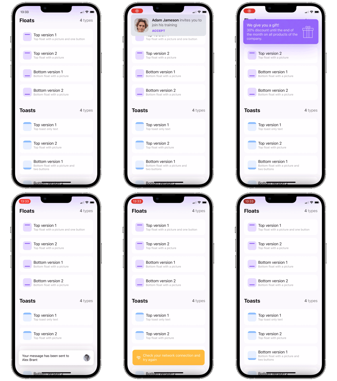
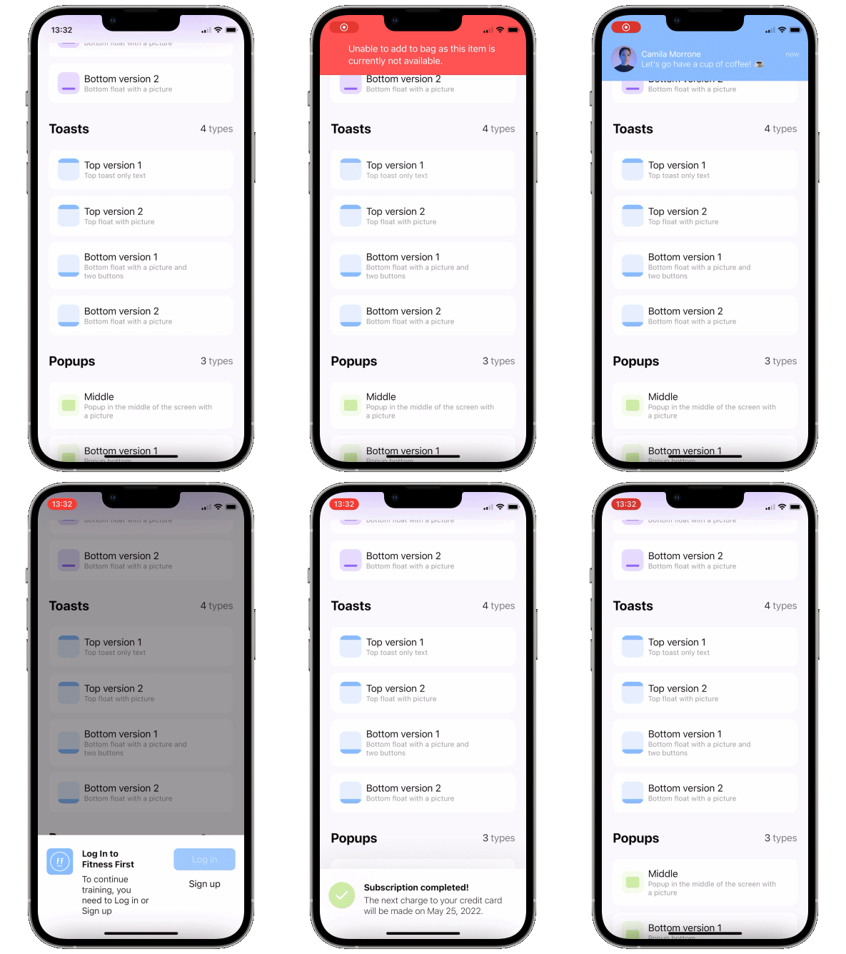
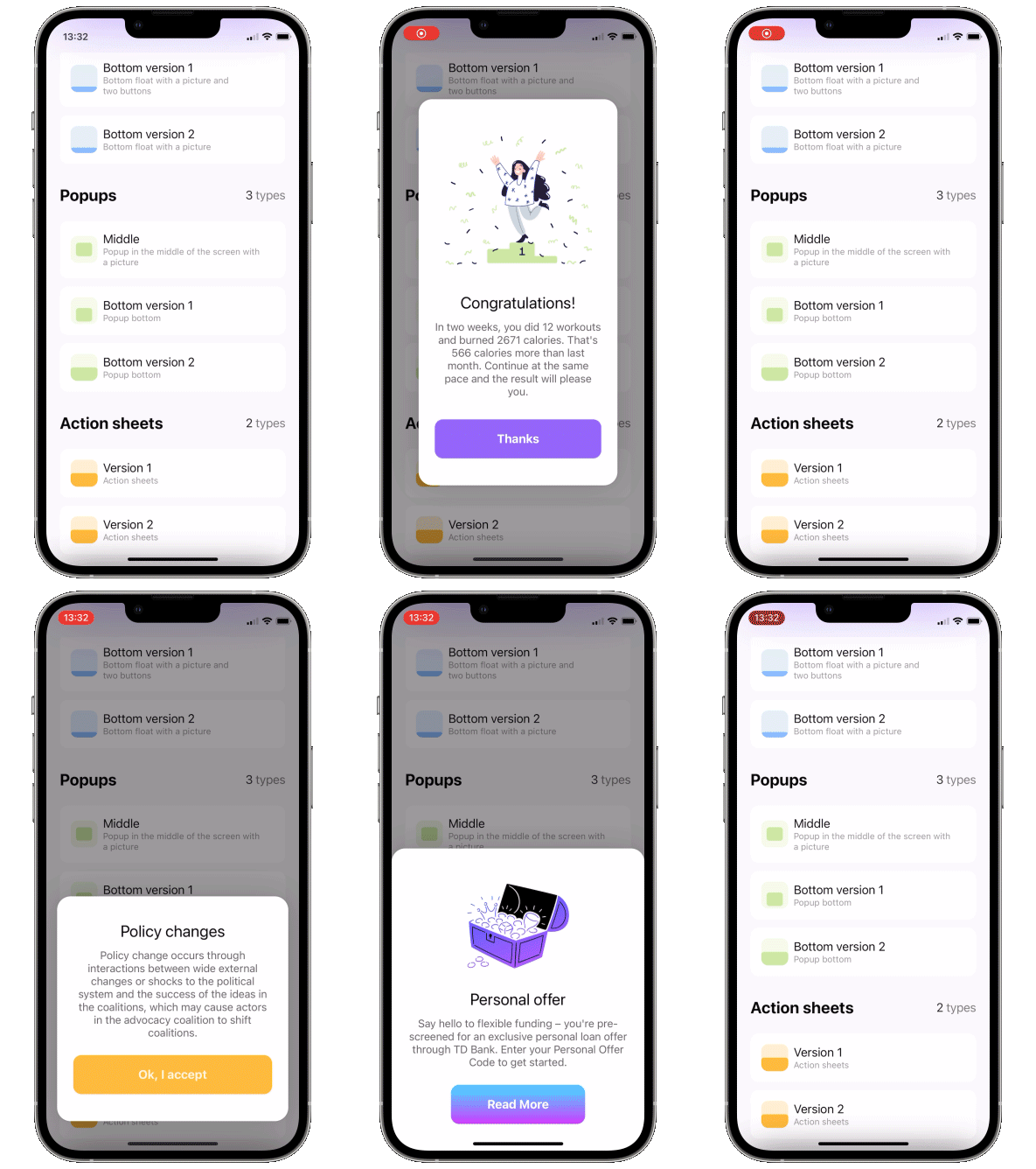
You can show multiple popups on top of anything, and they can also let the taps pass through to lower views.
There are 3 ways to display a popup: as a simple overlay, using SwiftUI's fullscreenSheet, and using UIKit's UIWindow. There are pros and cons for all of these, here is a table.
Overlay
Sheet
Window
Show on top of navbar
❌
✅
✅
Show on top of sheet
❌
❌
✅
Show multiple popups
✅
❌
✅
Taps "pass through" the transparent bg
✅
❌
✅
SwiftUI @State update mechanism works as expected
✅
✅
❌
Basically UIWindow based popup is the best option for most situations, just remember - to get adequate UI updates, use ObservableObjects or @Bindings instead of @State. This won't work:
struct ContentView: View {
    @State var showPopup = false
    @State var a = false

    var body: some View {
        Button("Button") {
            showPopup.toggle()
        }
        .popup(isPresented: $showPopup) {
            VStack {
                Button("Switch a") {
                    a.toggle()
                }
                a ? Text("on").foregroundStyle(.green) : Text("off").foregroundStyle(.red)
            }
        } customize: {
            $0
                .type(.floater())
                .closeOnTap(false)
                .position(.top)
        }
    }
}
This will work:
struct ContentView: View {
    @State var showPopup = false
    @State var a = false

    var body: some View {
        Button("Button") {
            showPopup.toggle()
        }
        .popup(isPresented: $showPopup) {
            PopupContent(a: $a)
        } customize: {
            $0
                .type(.floater())
                .closeOnTap(false)
                .position(.top)
        }
    }
}

struct PopupContent: View {
    @Binding var a: Bool

    var body: some View {
        VStack {
            Button("Switch a") {
                a.toggle()
            }
            a ? Text("on").foregroundStyle(.green) : Text("off").foregroundStyle(.red)
        }
    }
}
Update to version 4
New DisplayMode enum was introduced instead of isOpaque. isOpaque is now deprecated.
Instead of:
So, new .displayMode(.sheet) corresponds to old .isOpaque(true), .displayMode(.overlay) corresponds to .isOpaque(false).
Default DisplayMode is .window.
What's new in version 3
zoom in/out appear/disappear animations
disappearTo parameter to specify disappearing animation direction - can be different from appearFrom
Update to version 3
To include new .zoom type, AppearFrom enum cases were renamed.
Instead of:
isPresented - binding to determine if the popup should be seen on screen or hidden view - view you want to display on your popup
or
item - binding to item: if item's value is nil - popup is hidden, if non-nil - displayed. Be careful - library makes a copy of your item during dismiss animation!! view - view you want to display on your popup
Available customizations - optional parameters
use customize closure in .popup modifier:
type:
default - usual popup in the center of screen
toast - fitted to screen i.e. without padding and ignoring safe area
floater - has padding and can choose to use or ignore safe area
verticalPadding - padding from the relative vertical edge, or added to safe area if useSafeAreaInset is true
horizontalPadding - padding from the relative horizontal edge, or added to safe area if useSafeAreaInset is true
useSafeAreaInset - whether to include safe area insets in floater padding
position - topLeading, top, topTrailing, leading, center, trailing, bottomLeading, bottom, bottomTrailing appearFrom - topSlide, bottomSlide, leftSlide, rightSlide, centerScale, none: determines the direction of appearing animation. If left empty it copies position parameter: appears from .top edge if position is set to .top. .none means no animation disappearTo - same as appearFrom, but for disappearing animation. If left empty it copies appearFrom displayMode - how the popup is rendered: .overlay (placed above content), .sheet (using fullScreenCover), .window (using UIWindow, default) animation - custom animation for popup sliding onto screen autohideIn - time after which popup should disappear dismissibleIn(Double?, Binding<Bool>?) - only allow dismiss after this time passes (forbids closeOnTap, closeOnTapOutside, and drag). Pass a boolean binding if you'd like to track current status dragToDismiss - true by default: enable/disable drag to dismiss (upwards for .top popup types, downwards for .bottom and default type) dragToDismissDistance - minimum distance to drag to trigger dismiss closeOnTap - true by default: enable/disable closing on tap on popup.
NOTE: any gesture or control element you add to popup's body will override tap to close. in this case please close the popup manually if you need it to closeOnTapOutside - false by default: enable/disable closing on tap outside of popup allowTapThroughBG - false by default: should allow taps to pass "through" the popup's background down to views "below" it. .sheet popup is always allowTapThroughBG = false backgroundColor - Color.clear by default: change background color of outside area backgroundView - custom background builder for outside area (if this one is set, backgroundColor is ignored) useKeyboardSafeArea - false by default: if true popup goes up for keyboardHeight when keyboard is displayed becomesKeyWindow - true by default: only relevant for displayMode == .window. Set to false for transient, non-interactive popups (toasts/snackbars) to avoid stealing key window / first responder status — and with it the keyboard — from the presenting screen willDismissCallback - called when dismiss animation starts dismissCallback - called when dismiss animation ends
Scroll popup customizations
use customize closure in .scrollPopup modifier. In addition to all base customizations listed above:
position:
.bottom(_ topPadding: CGFloat) - default: positioned at the bottom with the specified top padding
.center(_ verticalPadding: CGFloat) - centered with the specified vertical padding
headerView - a view pinned to the top that is not part of the scroll
Draggable card - sheet
To implement a sheet (like in 4th gif) enable dragToDismiss on bottom toast (see example project for implementation of the card itself)
LazyCustomLayout - A custom layout protocol for SwiftUI, powered by a lazy scroll view
AnchoredPopup - Anchored Popup grows "out" of a trigger view (similar to Hero animation)
Grid - The most powerful Grid container
ScalingHeaderScrollView - A scroll view with a sticky header which shrinks as you scroll
AnimatedTabBar - A tabbar with a number of preset animations
MediaPicker - Customizable media picker
Chat - Chat UI framework with fully customizable message cells, input view, and a built-in media picker
CalendarView - Calendar view with fully customizable month/day cells
OpenAI Wrapper lib for OpenAI REST API
AnimatedGradient - Animated linear gradient
ConcentricOnboarding - Animated onboarding flow
FloatingButton - Floating button menu
ActivityIndicatorView - A number of animated loading indicators
ProgressIndicatorView - A number of animated progress indicators
FlagAndCountryCode - Phone codes and flags for every country
SVGView - SVG parser
LiquidSwipe - Liquid navigation animation
Trang TopGit này là một snapshot — tab "Readme" hiển thị nguyên văn README của repo (đã bỏ link, giữ ảnh). Repo GitHub ở github.com/exyte/PopupView là nguồn chính thức.
exyte/PopupView có những chủ đề gì?
GitHub topics của exyte/PopupView: "popup", "swiftui", "swiftui-components", "swiftui-framework", "toast". TopGit xếp repo vào nhóm Mobile.
exyte/PopupView có phải mã nguồn mở không?
Có — exyte/PopupView phát hành theo license MIT, nghĩa là mã nguồn mở để đọc, fork và (tùy license) tái sử dụng. Mã: github.com/exyte/PopupView.
exyte/PopupView có website riêng không?
TopGit chưa ghi nhận URL trang chủ cho exyte/PopupView. Phần README ở tab phía trên thường có link demo, hoặc xem mô tả GitHub của repo.
exyte/PopupView còn đang phát triển không?
Commit gần nhất trên exyte/PopupView là 11 ngày trước (theo timestamp GitHub). Repo có 316 fork — một chỉ báo về mức độ quan tâm của cộng đồng.
exyte/PopupView dùng license gì?
exyte/PopupView phát hành theo license MIT. Nên mở file LICENSE trên GitHub để xác nhận — license metadata đôi khi lệch với thực tế dự án.
Đọc đầy đủ README ở tab phía trên.
Muốn nghe thêm một ý kiến về PopupView?
Hỏi một AI đọc được trang này — một cú bấm là có ngay nhận định về PopupView.

 /PopupView