Trên GitHub, Grouper/FlatUIKit đã đạt 7.7k sao, ngôn ngữ Objective-C. A collection of awesome flat UI components for iOS.
Tóm tắt dựng từ metadata GitHub của chính dự án — chưa có bài review TopGit. Trang sẽ tự động cập nhật khi bài review đầy đủ được xuất bản.
VÌ SAO CHƯA CÓ REVIEW
TopGit viết bài đầy đủ cho repo có nhiều sao nhất và được yêu cầu nhiều nhất. Trang này là snapshot trong thời gian chờ — xem README gốc ở tab READ ME.
FlatUIKit was originally written by Jack Flintermann in March of 2013, before iOS7 had even come out. The idea was to give a nice flat look to some of the native iOS components. Then iOS7 came along and introduced a decent API to do most of these tasks.
However, for backwards compatability, we will be attempting to maintain iOS6 compatability, as long as feasabilty possible. If we find a reason to move to iOS7 only support, we will leave a branch for remaining iOS6 support, and move forward.
FlatUIKit
FlatUIKit is a collection of iOS components styled with the "Flat UI" aesthetic that we created while building Grouper for iPhone. Its design inspiration comes from Flat UI and Kyle Miller. Styling is implemented via categories on/drop-in replacements for existing UIKit components, so integrating it into your project is very straightforward.
Installation
FlatUIKit can be installed via CocoaPods. Simply add
pod 'FlatUIKit'
to your Podfile. If you don't use CocoaPods you're welcome to use git submodules, or simply download it and include it in your project manually.
Note that FlatUIKit requires the CoreText framework as well as iOS > 6.0.
The Components
Buttons
FUIButton is a drop-in subclass of UIButton that exposes the additional properties buttonColor, shadowColor, cornerRadius, and shadowHeight. Note that if you set any of these, you have to set all of them.
FUITextField is a drop-in subclass of UITextField that exposes the additional properties edgeInsets, textFieldColor, borderColor, borderWidth and cornerRadius. Note that if you set any of these, you have to set all of them.
FUISegmentedControl is a drop-in subclass of UISegmentedControl that exposes the additional properties selectedColor, deselectedColor, selectedFont, deselectedFont, selectedFontColor, deselectedFontColor, dividerColor and cornerRadius. Note that if you set any of these, it is recommended that you set all of them.
FUISwitch is not a subclass of UISwitch (UISwitch is too inflexible to subclass), but rather a reimplementation that exposes all of the methods of UISwitch. In addition, it also provides access to its underlying on/off UILabels and other subviews.
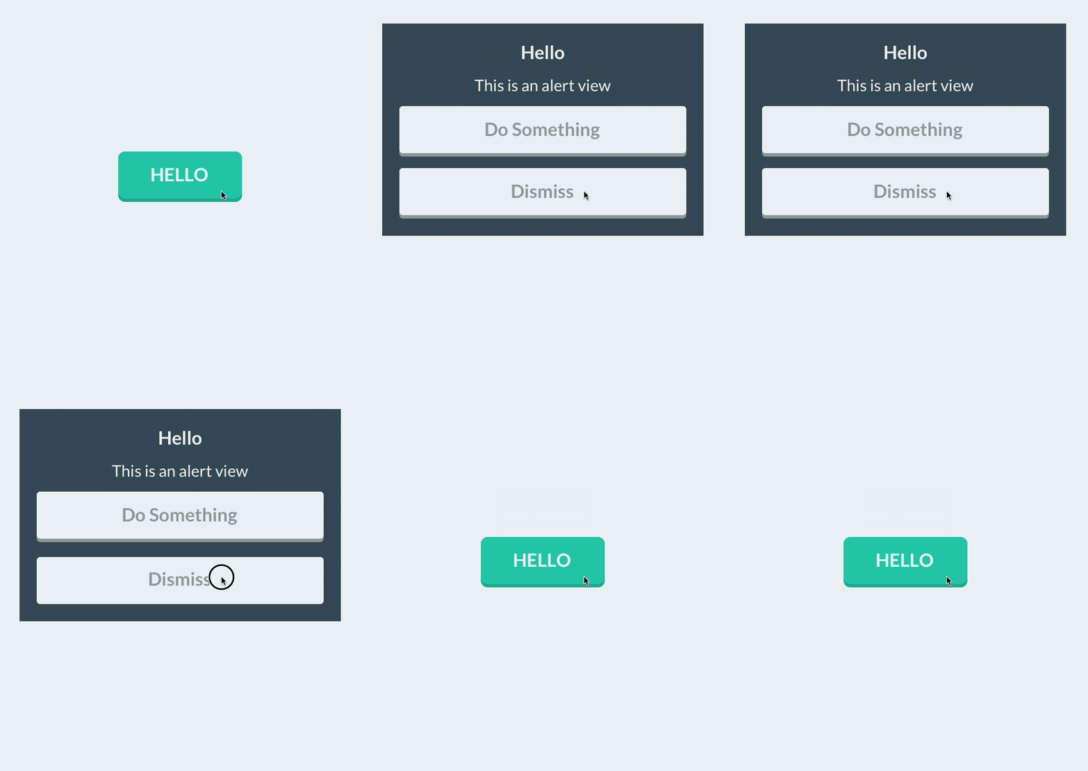
Similar to FUISwitch, FUIAlertView is a reimplemenation of UIAlertView that exposes all of UIAlertView's methods (and delegate methods, with the FUIAlertViewDelegate protocol), but with far greater flexibility in UI customization. All of its child UILabels, UIViews, and FUIButtons can be customized at will.
NOTE: to create FUIAlertView instance in Swift please use default initializer
s
let alertView = FUIAlertView()
Sliders/Steppers/Progress Views
To provide flat UISliders, UIProgressViews and UISteppers, we simply provide categories on UISlider/ProgressView/UIStepper to automatically configure their appearance with appropriate colors/corner radii. This makes for zero-friction integration with your existing project:
To customize bar button items for your entire application (including back buttons), UIBarButtonItem+FlatUI provides a class method which leverages the UIBarButtonItem appearance proxy to do this in one step:
However, this might cause rendering issues with controllers that are pushed from actionsheets, sharesheets or links in webviews. To prevent this behavior, scope the customized bar buttom items to your controllers:
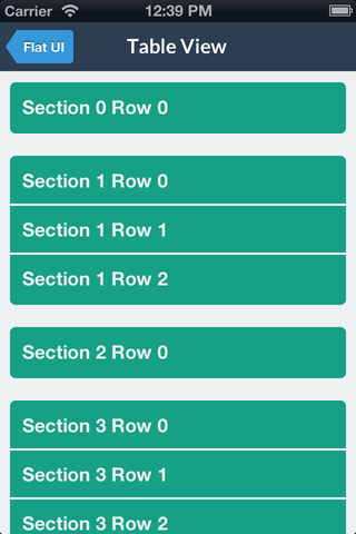
You can modify the backgroundColor and selectedBackgroundColor of a UITableViewCell without losing the rounded corners. The cell will copy the UITableView's separator color. The separator height is exposed as separatorHeight and the radius as cornerRadius.
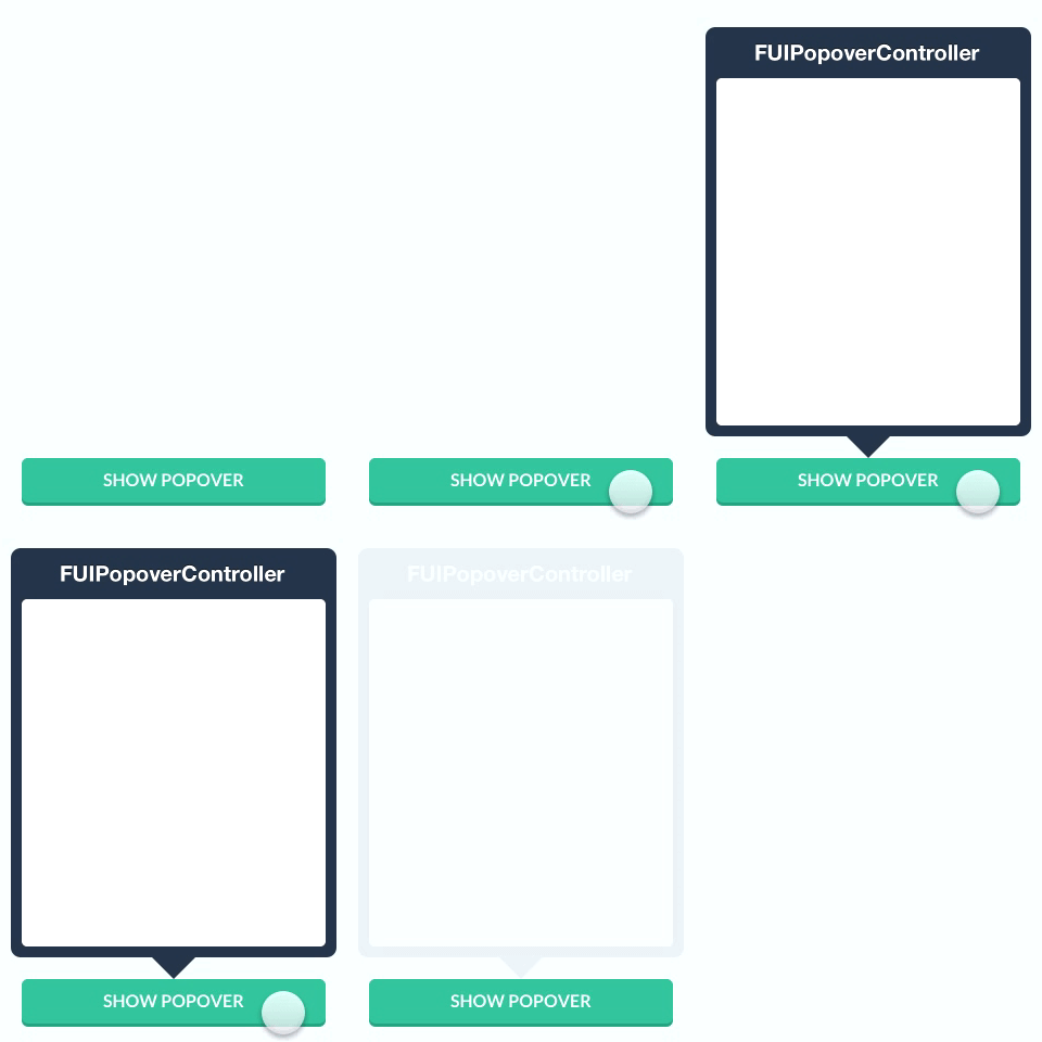
Like some other flat components, we simply provide a category to automatically configure a popover appearance for iPad by only having to set a background color.
For convenience, FlatUIKit includes the colors defined at Flat UI Colors. You can see examples of these colors in the code/components above. Using them is as simple as:
FlatUIKit comes bundled with Lato, a clean, beautiful open font. More info on Lato can be found here. It is included in FlatUIKit automatically; you can use it as follows:
You can now use the great icons provided by FlatUIKit in your app. The easiest way is to use a label, but I will be adding support to use them in buttons, ImageViews, and other conveniences.
The icons follow roughly the same naming scheme as FlatUI, but you can look up the enumeration in NSString+Icons.h
Contributions
Contributions are totally welcome. We'll review all pull requests and if you send us a good one/are interested we're happy to give you push access to the repo.
Trang TopGit này là một snapshot — tab "Readme" hiển thị nguyên văn README của repo (đã bỏ link, giữ ảnh). Repo GitHub ở github.com/Grouper/FlatUIKit là nguồn chính thức.
Grouper/FlatUIKit có phải mã nguồn mở không?
Có — Grouper/FlatUIKit phát hành theo license MIT, nghĩa là mã nguồn mở để đọc, fork và (tùy license) tái sử dụng. Mã: github.com/Grouper/FlatUIKit.
Grouper/FlatUIKit có website riêng không?
TopGit chưa ghi nhận URL trang chủ cho Grouper/FlatUIKit. Phần README ở tab phía trên thường có link demo, hoặc xem mô tả GitHub của repo.
Grouper/FlatUIKit dùng license gì?
Grouper/FlatUIKit phát hành theo license MIT. Nên mở file LICENSE trên GitHub để xác nhận — license metadata đôi khi lệch với thực tế dự án.
Grouper/FlatUIKit là gì?
Grouper/FlatUIKit (Grouper/FlatUIKit) là dự án Objective-C trên GitHub. Theo mô tả gốc: A collection of awesome flat UI components for iOS.
Đọc đầy đủ README ở tab phía trên.
Vẫn đang phân vân về FlatUIKit?
Một cú bấm sẽ gửi câu hỏi kèm trang này cho AI — xem AI nói gì về FlatUIKit.

 /FlatUIKit