kepano/obsidian-minimal — dự án UI/UX — đang có 5.3k sao GitHub trong nhóm UI / UX. A distraction-free and highly customizable theme for Obsidian.
Tóm tắt dựng từ metadata GitHub của chính dự án — chưa có bài review TopGit. Trang sẽ tự động cập nhật khi bài review đầy đủ được xuất bản.
VÌ SAO CHƯA CÓ REVIEW
TopGit viết bài đầy đủ cho repo có nhiều sao nhất và được yêu cầu nhiều nhất. Trang này là snapshot trong thời gian chờ — xem README gốc ở tab READ ME.
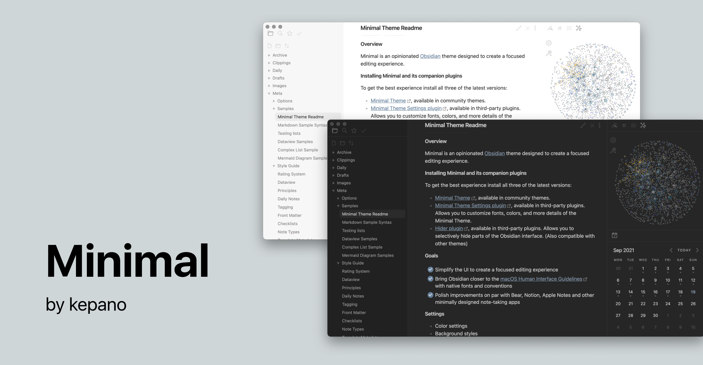
Minimal is an Obsidian theme for desktop, mobile and tablet. Customize colors, fonts and more with the companion plugins Minimal Theme Settings and Hider. Winner of Obsidian's official Best Theme award ✨
About Minimal
Screenshots
Installation
Companion plugins
Settings
Color schemes
Plugin support
Helper classes
Alternate checkboxes
Hotkeys
Contributing
Developers
License
Disclaimer
Screenshots
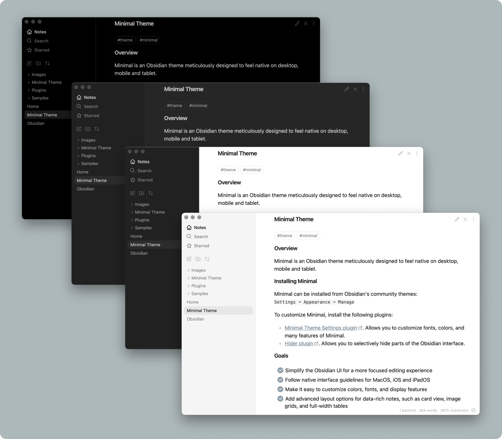
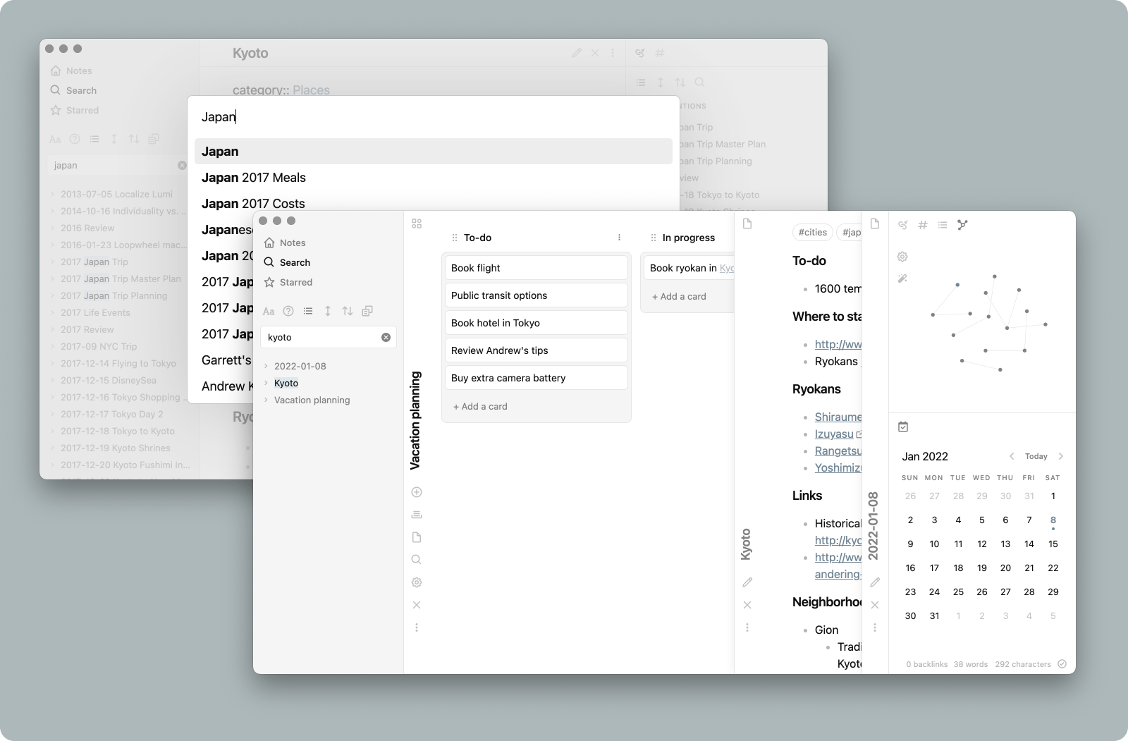
Background styles include low contrast, high contrast, and a true black option ideal for OLED devices
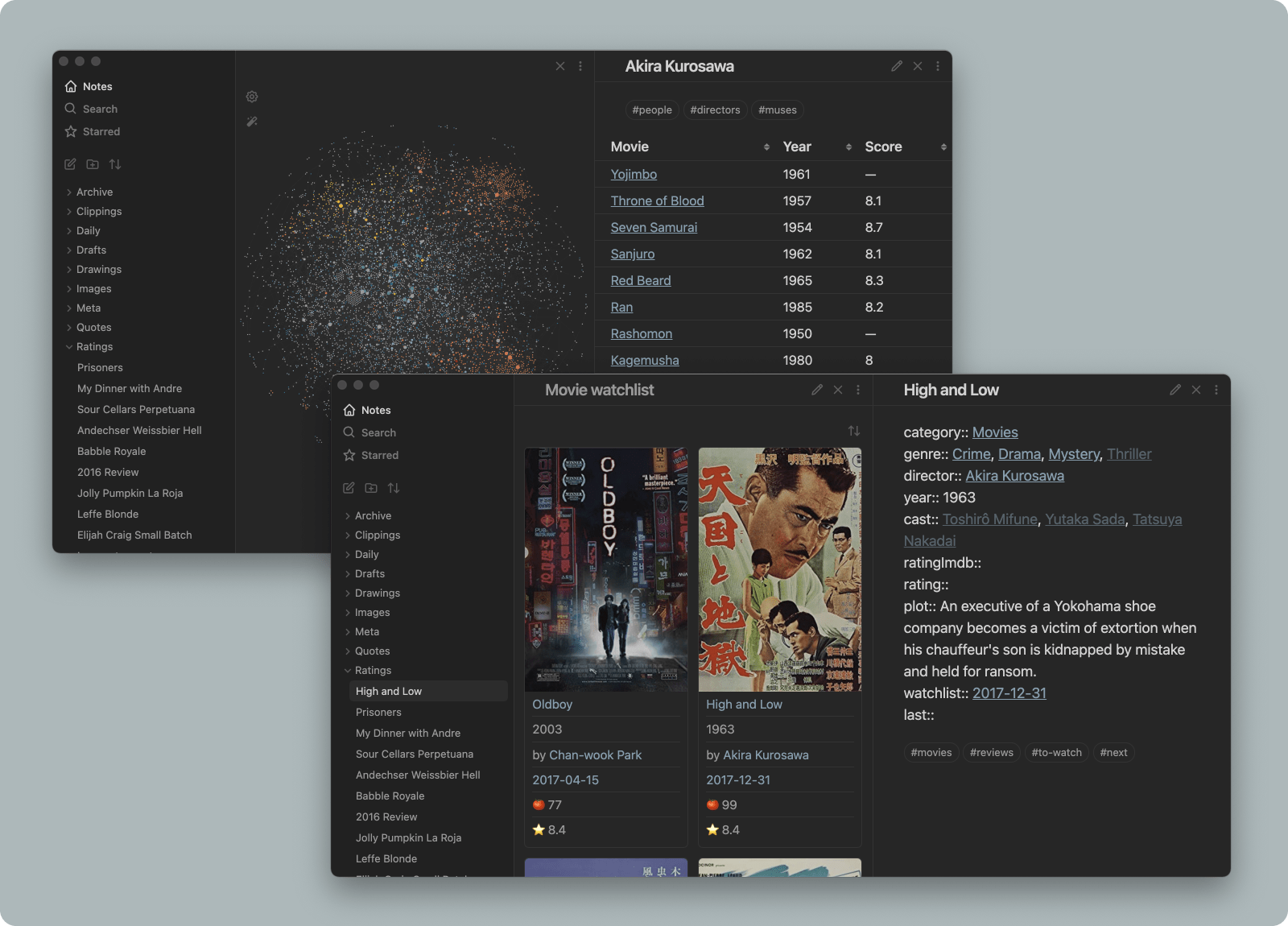
Helper classes for tables and card layouts allow you to create powerful workflows
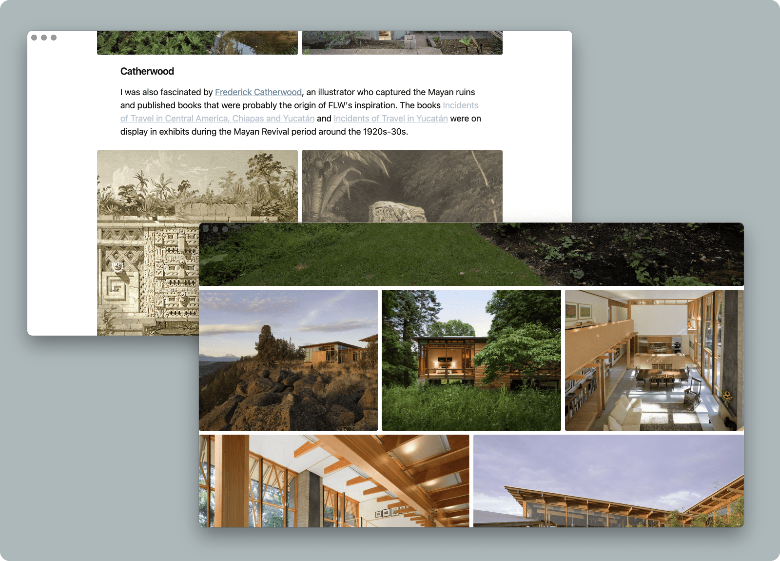
Combining focus mode with image grid and image width options allows you to immerse yourself in visual projects
Minimal includes support for popular plugins like Calendar, Dataview, Kanban, Outliner, and more
Installation
To install the theme
Open Obsidian Settings
Go to Appearance and click Manage
Under community themes search for "Minimal" and click Use
To install the companion plugin
Go to Community plugins and turn off Restricted mode
Under community plugins search for "Minimal Theme Settings" and click Install, then Enable
Have a question? Join the Minimal channel on the official Obsidian Discord.
Companion plugins
Minimal Theme Settings plugin allows you to customize color schemes, fonts, hotkeys, and access the main feature toggles. This plugin is highly recommended for all users of Minimal.
Hider plugin is recommended to hide Obsidian UI elements such as window frame, scrollbars, tooltips, etc. When using Hider to turn off the main toolbar (AKA app ribbon), it can be accessed by hovering over the bottom left edge of the window.
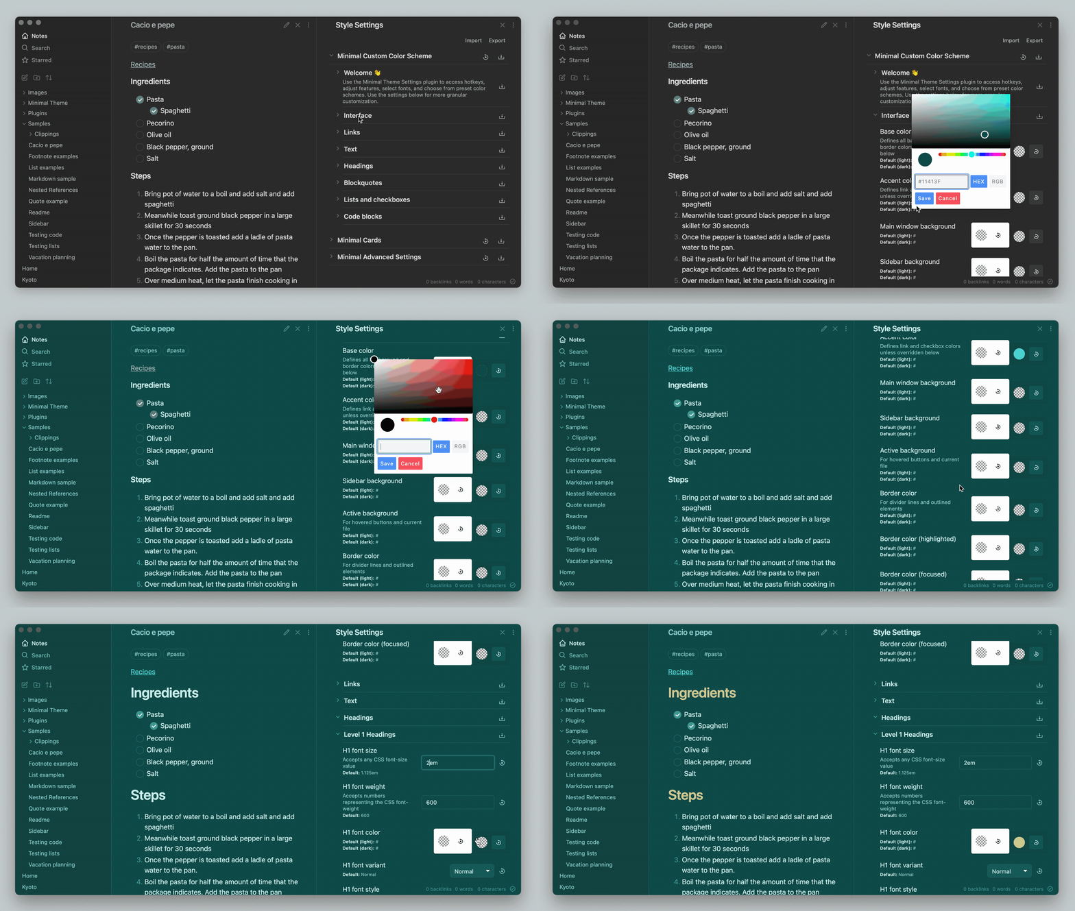
Style Settings plugin allows you to create a custom color scheme. This plugin is optional.
Settings
The following settings can be accessed using Minimal Theme Settings plugin. Many of these settings below can be toggled with hotkeys.
Interface colors and fonts
Background contrast — includes true black dark mode for OLED devices
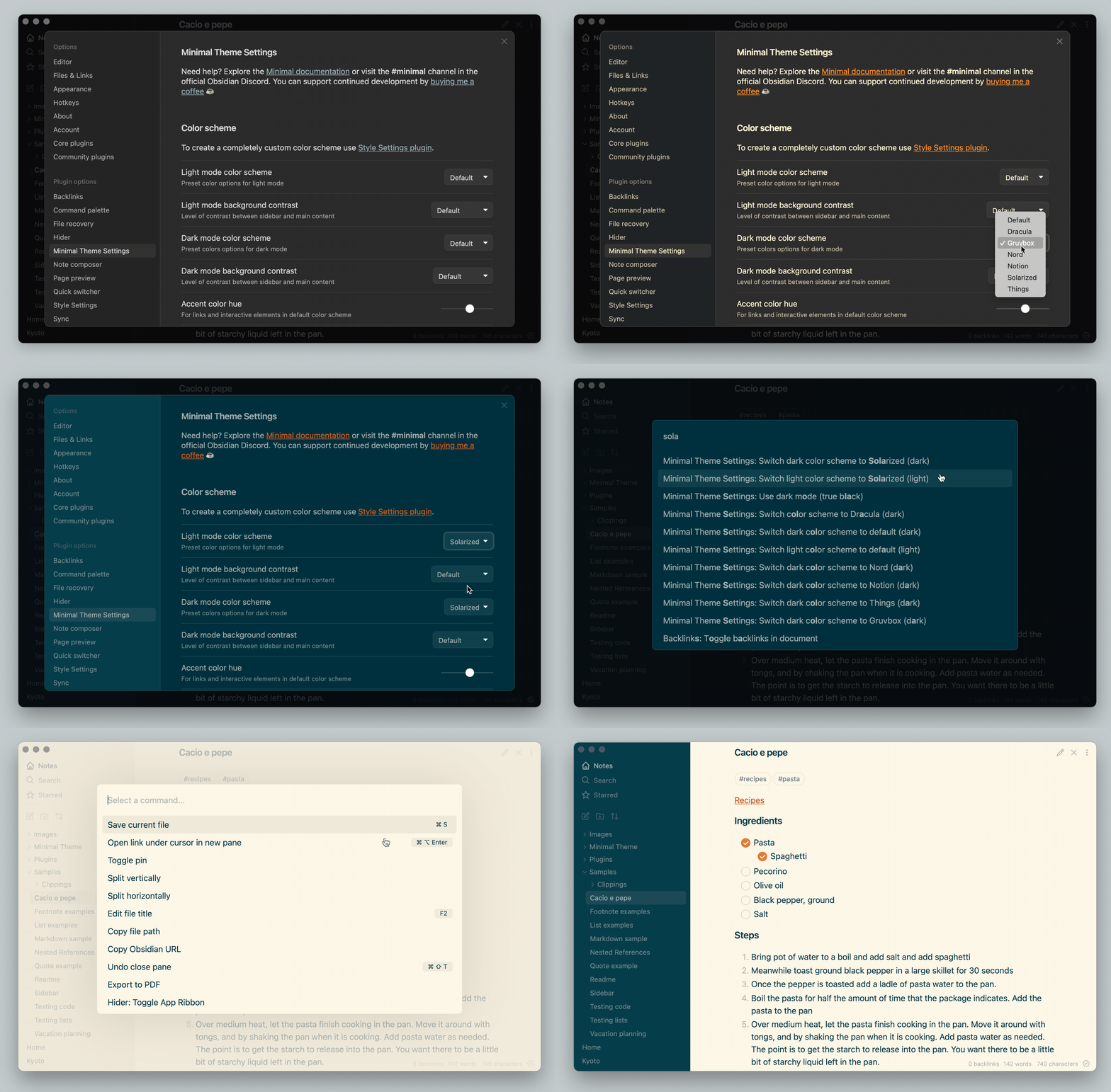
Color scheme — includes Catppuccin, Dracula, Everforest, Gruvbox, macOS, Nord, Solarized, and more
Line width — set normal line width and maximum width within a pane
You can also use the Style Settings plugin for even deeper customization
Features
Text labels for primary navigation — adds text labels the top left navigation, note that a translation snippet is necessary for languages other than English more on localization
Focus mode — hides title bar and status bar
Colorful frame — use accent color for the top area of the app window
Colorful headings — use different colors for each heading
Hide workspace borders — removes dividing lines for a more minimal appearance
Trim filenames — file names are trimmed to a single line
Layout options
Controls images, tables and iframes. These settings can also be enabled on a per-file basis using helper classes.
Image grids — turns consecutive images into columns. To make a new row, add an extra line break between images.
Block widths — controls the width of elements by type.
Color schemes
Preset color schemes
Minimal offers color schemes that can be separately selected for light and dark mode using the Minimal Theme Settings plugin. Color schemes include Dracula, Everforest, Gruvbox, macOS, Nord, Notion, Solarized, and Things.
Custom color schemes
You can use the Style Settings plugin to customize your color scheme. To see your changes more easily, open Style Settings in a new pane by using the command palette (CMD + P by default). Using Style Settings you can customize Minimal's colors, font sizes, font styles, and many more details.
Plugin support
Most plugins work well with Minimal, but the following plugins have received special love and attention:
Calendar
Charts
Checklist
Dataview
Dictionary
Excalidraw
Git
Hider
Kanban
Outliner
QuickAdd
Helper filters and classes
Image filters
Image filters can be added to create the following effects. Use them by adding the filter name at the end of the image link, e.g. ![[image.jpeg#invert]]
Filter
Description
#invert
Invert images in dark mode — ideal for charts and handwriting on light backgrounds
#invertW
Invert images in light mode — ideal for charts and handwriting on dark backgrounds
#circle
Crop image to a circle
#outline
Add outline around image
CSS helper classes
CSS helper classes can be added on a per-file basis using the cssClasses YAML front matter key. These classes are composable, so you can include more than one to combine effects.
For example, use the following code at the top of your file to enable cards layout:
---
cssClasses: cards
---
Image grids
Turns consecutive images into columns. To make a new row, add an extra line break between images. Learn more.
Class
Description
img-grid
Activate image grids
Line width control for tables, images and iframes
Controls the width of elements by type. Learn more.
Class
Description
table-100, img-100, iframe-100
Fill 100% of the pane width
table-max, img-max, iframe-max
Fill the max line width (default 88%)
table-wide, img-wide, iframe-wide
Fill the wide line width
Cards
Using cards transforms Dataview tables into cards. Compatible with table width classes. Note that cards must be present for the other classes to work. Learn more.
Class
Description
cards (required)
Set all Dataview tables to card layout
cards-align-bottom
Align the last element of a card to the bottom
cards-cover
Images are resized to fill the defined space
cards-16-9
Fit images in cards to 16:9 ratio
cards-1-1
Fit images in cards to 1:1 ratio (square)
cards-2-1
Fit images in cards to 2:1 ratio
cards-2-3
Fit images in cards to 2:3 ratio
cards-cols-1 to 8
Force a specific number of columns (from 1 to 8)
Tables and Dataview
Controls the row and column styling for tables. Learn more.
Class
Description
table-nowrap
Disable line wrapping in table cells
table-wrap
Force line wrapping in table cells
table-numbers
Add row numbers to tables
table-tabular
Use tabular figures in tables
table-small
Use small font size in tables
table-tiny
Use tiny font size in tables
table-lines
Add borders around all table cells
row-lines
Add borders between table rows
col-lines
Add borders between table columns
row-alt
Add striped background to alternating table rows
col-alt
Add striped background to alternating table columns
Embeds and transclusions
Class
Description
embed-strict
Transclusions appear seamlessly in the flow of text
Alternate checkboxes
Minimal supports a wide number of checkbox styles. These allow you to call out tasks that are incomplete, canceled, rescheduled, etc. See screenshots and details
Syntax
Description
- [ ]
to-do
- [/]
incomplete
- [x]
done
- [-]
canceled
- [>]
forwarded
- [<]
scheduling
- [?]
question
- [!]
important
- [*]
star
- ["]
quote
- [l]
location
- [b]
bookmark
- [i]
information
- [S]
savings
- [I]
idea
- [p]
pros
- [c]
cons
- [f]
fire
- [k]
key
- [w]
win
- [u]
up
- [d]
down
Hotkeys
Hotkeys are only available when using the Minimal Theme Settings plugin.
Background and borders
Switch between light and dark mode
Cycle between light mode styles
Cycle between dark mode styles
Toggle sidebar borders
Layout control
Toggle image grids
Cycle between image width options
Cycle between table width options
Cycle between iframe width options
Misc
Toggle focus mode
Toggle colorful headings
Increase and decrease body font size
Contributing
If you would like add support for a plugin, or have found a bug you'd like to help fix, don't hesitate to open a pull request. Have a question? Join the Minimal channel on the official Obsidian Discord.
Plugin support
Plugin authors and developers can add support for Minimal theme by submitting a pull request. See the src/scss/plugins folder with examples of snippets for plugins that are currently supported.
Developers
Build instructions
Set up
npm install
Define local path
To build directly into your Obsidian vault rename .env.example to .env and update OBSIDIAN_PATH to the local path of your Obsidian theme folder.
To run
npm run dev    # watch and rebuild on changes
npm run build  # one-off build
This builds two files: theme.css, the minified distribution file (for the community themes store) which is also copied to your vault for live reload, and Minimal.css, an unminified copy saved to the project root.
License
Minimal for Desktop and Mobile
Minimal for Obsidian apps is licensed under the MIT License which allows you to modify and redistribute the code, however you must preserve the copyright and license notice in your CSS file. This includes any code you may extract as standalone snippets.
If you would like to distribute a fork of Minimal or part of its code, please keep my Buy me a coffee link present in your Readme.
Minimal is frequently updated to stay current with the latest version of Obsidian. To make it easy to stay current with the latest improvements, I recommend using Github's fork feature so that you can merge the latest changes into your fork. If you have any questions don't hesitate to reach me in the Obsidian Discord group.
Minimal for Obsidian Publish
Minimal for Obsidian Publish is a separate version of Minimal which follows the same design principles but is optimized for web. It is also MIT licensed and available at minimal.guide or the obsidian-minimal-publish repo.
Disclaimer
This theme is provided as is, and is designed for my personal use of Obsidian on macOS. As such it is not thoroughly tested across all operating systems and use cases.
This theme modifies significant parts of the Obsidian interface, so it may break with future updates. It may also be incompatible with other bits of custom CSS you have.
Trang TopGit này là một snapshot — tab "Readme" hiển thị nguyên văn README của repo (đã bỏ link, giữ ảnh). Repo GitHub ở github.com/kepano/obsidian-minimal là nguồn chính thức.
kepano/obsidian-minimal có bao nhiêu sao?
kepano/obsidian-minimal có 5.3k sao GitHub — tải lại trang để xem số mới nhất, hoặc xem trực tiếp github.com/kepano/obsidian-minimal. TopGit phản chiếu số sao của GitHub nhưng không cam kết đến từng phút.
kepano/obsidian-minimal có phải mã nguồn mở không?
Có — kepano/obsidian-minimal phát hành theo license MIT, nghĩa là mã nguồn mở để đọc, fork và (tùy license) tái sử dụng. Mã: github.com/kepano/obsidian-minimal.
kepano/obsidian-minimal còn đang phát triển không?
Commit gần nhất trên kepano/obsidian-minimal là 25 ngày trước (theo timestamp GitHub). Repo có 270 fork — một chỉ báo về mức độ quan tâm của cộng đồng.
kepano/obsidian-minimal là gì?
kepano/obsidian-minimal (kepano/obsidian-minimal) là dự án CSS trên GitHub. Theo mô tả gốc: A distraction-free and highly customizable theme for Obsidian.
kepano/obsidian-minimal so với các dự án UI / UX khác thế nào?
kepano/obsidian-minimal được TopGit xếp vào nhóm UI / UX, với 5.3k sao GitHub và viết bằng CSS. Xem trang chủ đề UI / UX trên TopGit để so sánh với các dự án tương tự theo số sao và mức độ hoạt động.
Đọc đầy đủ README ở tab phía trên.
obsidian-minimal có đáng để bạn bỏ thời gian?
ChatGPT, Claude và Perplexity đều đọc được trang này. Hỏi thử xem họ nghĩ gì về obsidian-minimal.
 /obsidian-minimal