kyleduo/SwitchButton là dự án Mobile trên GitHub, viết chủ yếu bằng Java, với 4.7k sao. A cute widget of Switch Button for you to create beautiful and friendly UI.
Tóm tắt dựng từ metadata GitHub của chính dự án — chưa có bài review TopGit. Trang sẽ tự động cập nhật khi bài review đầy đủ được xuất bản.
VÌ SAO CHƯA CÓ REVIEW
TopGit viết bài đầy đủ cho repo có nhiều sao nhất và được yêu cầu nhiều nhất. Trang này là snapshot trong thời gian chờ — xem README gốc ở tab READ ME.
To get a quick preview, you can get Demo apk in Google Play or Directly download.
This project provides you a convenient way to use and customise a SwitchButton widget in Android.
Change Log
All Change Log
Some attributes are changed in 2.0.0 and you need to update them to the new ones, since the measurement logic has been totally changed. (Default behavior and style does not change.)
因为2.0.0测量逻辑的改变,部分属性已经做了修改,请更新到新的属性。(默认行为和样式并没有变化)
Re-clarify the meaning of some params.
Update the measurement of SwitchButton and the logic becomes more clear, especially the text part.
Support config SwitchButton's size by setting a exact width and height. There are now TWO mainly method to control it's size.
When use SwitchButon in a scrollable view, SwitchButton consume scroll gestures only horizontal. This means the when you want to scroll the scrollable view vertically and start your touch on a SwitchButton, it will not stop you now.
There is a big diagram below to show how SwitchButton measure it self in 2.0.0. It is strongly recommended that you should check it out.
kswBackMeasureRatio has been removed from SwitchButton attributes since it has an ambiguous meaning. I've add the new kswThumbRangeRatio attribute to represent how much multiple the scroll range of thumb than the width of thumb.
kswTextMarginH and kswAutoAdjustTextPosition have been removed from SwitchButton attributes since I updated the measurement logic of text part. And these two attributes do not represent the back meaning well. kswTextThumbInset, kswTextExtra and kswTextAdjust was introduced to represent "how much the text go under thumb", "how much extra space do you want around the text" and "how much to move the text from the center of text area to adjust the text's position". There are all shown on the diagram.
Setters and getters are also changed due to the change of attributes.
This diagram shows how SwitchButton measure itself and what does those nouns mean. To measure width is much complex than the height, so if you know how to measure width, you know how to measure height. And text measurement and location increase the complexity.
Demo
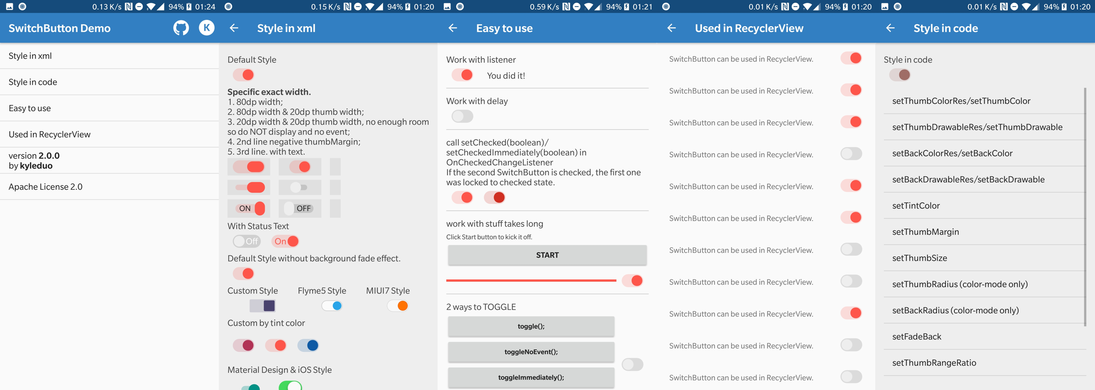
I create a new demo apk to show you how to style the cute widget and use it. There's some screenshots of the new demo.
Usage
The usage of SwitchButton is just like CheckBox. The basic control APIs of SwitchButton.
setChecked(boolean)
toggle()
Since SwitchButton has addition animation when checked status changed, there are two addition methods for disable animation for single operation.
setCheckedImmediately(boolean): like setChecked but NO animation.
toggleImmediately(): like toggle but NO animation.
From version 1.4.1 on, SwitchButton support operation without onCheckedChanged callback. It makes changing state in code more convenient. Using these methods to achieve that feature.
setCheckedNoEvent(boolean)
setCheckedImmediatelyNoEvent(boolean)
toggleNoEvent()
toggleImmediatelyNoEvent()
Style
In 1.3.0, I updated the usage of SwitchButton library. To make it more Android way to use, I've combined the thumb and back style each to StateListColor/StateListDrawable. So you are free to create styles in different states.
In xml layout file, you can configure the face of switch button using these attrs.
kswThumbDrawable: drawable for thumb
kswThumbColor: color for thumb
kswThumbMargin: margin from thumb to back, can be negative. maybe cover by single direction margins
kswThumbMarginTop: same to kswThumbMargin, just top
kswThumbMarginBottom: same to kswThumbMargin, just bottom
kswThumbMarginLeft: same to kswThumbMargin, just left
kswThumbMarginRight: same to kswThumbMargin, just right
kswThumbWidth: width of thumb
kswThumbHeight: height of thumb
kswThumbRadius: radius of thumb rect, only work with kswThumbColor
kswBackRadius: radius of background rect, only work with kswBackColor
kswBackDrawable: drawable for background
kswBackColor: color for background
kswFadeBack: fade background color/drawable when drag or animate between on/off status or not
kswAnimationDuration: duration of animation between 2 status
kswTintColor: change SwitchButton's style just by one property, all relevant color will be generate automatically. Do not support SwitchButtonMD or other style created by xml resources.
kswTextOn: text for checked status.
kswTextOff: text for unchecked status.
kswTextThumbInset (since 2.0.0): length of the part of text under the thumb.
kswTextExtra (since 2.0.0): extra space needed by background besides the actual text width.
kswTextAdjust (since 2.0.0): move the text after position text on the center of text area.
kswThumbRangeRatio (since 2.0.0): (thumb move range width / thumb's width). float value. see measure diagram
kswBackMeasureRatio: (background's width / thumb's width). float value.Removed since 2.0.0
kswTextMarginH: horizontal margin of text.Removed since 2.0.0
kswAutoAdjustTextPosition: (since 1.4.4) whether auto adjust text position to make them looks centered (NOT really centered) when there are round corners. You should set this to false when you don't need this feature.Removed since 2.0.0
You can alse change the configuration of SwitchButton in code. You can find the api from Demo apk. There's a glance.
If you're using SwitchButton in your app, wish you can email me these infomation of your app and I'll create a list here. And that should be an utmost encouragement to me. :-) [email protected]
App
Name
Description
Markets
Developer
Headlines
Headlines is a news dashboard for your smart TV.
MYSTRAL
懒投资
专业安全的投资理财平台
官方网站
懒投资 lantouzi.com
Notifications in bubble
Access all notifications from a floating bubble.
BestAppzz
License
Licensed under the Apache License, Version 2.0 (the "License");
you may not use this file except in compliance with the License.
You may obtain a copy of the License at

   http://www.apache.org/licenses/LICENSE-2.0

Unless required by applicable law or agreed to in writing, software
distributed under the License is distributed on an "AS IS" BASIS,
WITHOUT WARRANTIES OR CONDITIONS OF ANY KIND, either express or implied.
See the License for the specific language governing permissions and
limitations under the License.
kyleduo/SwitchButton thuộc nhóm Mobile trên TopGit, cùng 3 topic GitHub. Trang Trending và Topics liệt kê các repo cùng số sao và cùng ngôn ngữ để so sánh.
Đọc thêm về kyleduo/SwitchButton ở đâu?
Trang TopGit này là một snapshot — tab "Readme" hiển thị nguyên văn README của repo (đã bỏ link, giữ ảnh). Repo GitHub ở github.com/kyleduo/SwitchButton là nguồn chính thức.
kyleduo/SwitchButton có phải mã nguồn mở không?
TopGit chưa ghi nhận license cho kyleduo/SwitchButton. Phần lớn repo public trên GitHub là mã nguồn mở, nhưng điều khoản khác nhau từng repo — mở file LICENSE để xác nhận.
kyleduo/SwitchButton có website riêng không?
TopGit chưa ghi nhận URL trang chủ cho kyleduo/SwitchButton. Phần README ở tab phía trên thường có link demo, hoặc xem mô tả GitHub của repo.
kyleduo/SwitchButton là gì?
kyleduo/SwitchButton (kyleduo/SwitchButton) là dự án Java trên GitHub. Theo mô tả gốc: A cute widget of Switch Button for you to create beautiful and friendly UI.
Vì sao kyleduo/SwitchButton được xếp vào nhóm Mobile?
TopGit xếp kyleduo/SwitchButton vào nhóm Mobile dựa trên GitHub topics và mô tả của repo (gắn thẻ: "android", "switchbutton", "widget"). Việc phân loại dựa trên metadata thật của repo, không phải đoán theo cảm tính biên tập.
Đọc đầy đủ README ở tab phía trên.
Vẫn đang phân vân về SwitchButton?
Một cú bấm sẽ gửi câu hỏi kèm trang này cho AI — xem AI nói gì về SwitchButton.
 /SwitchButton