twbs/rfs

twbs/rfs là một trong những repo tập trung giao diện mà TopGit theo dõi, hiện có 3.4k sao, viết chủ yếu bằng CSS. ✩ Automates responsive resizing ✩
Tóm tắt dựng từ metadata GitHub của chính dự án — chưa có bài review TopGit. Trang sẽ tự động cập nhật khi bài review đầy đủ được xuất bản.
TopGit viết bài đầy đủ cho repo có nhiều sao nhất và được yêu cầu nhiều nhất. Trang này là snapshot trong thời gian chờ — xem README gốc ở tab READ ME.
Snapshot
Cộng tác viên hàng đầu
Xem cộng tác viên hàng đầu

RFS is a unit resizing engine which was initially developed to resize font sizes (hence its abbreviation for Responsive Font Sizes). Nowadays RFS is capable of rescaling basically every value for any css property with units, like margin, padding, border-radius or even box-shadow.
The mechanism automatically calculates the appropriate values based on the dimensions of the browser viewport. It's available in one of your favourite preprocessors or postprocessor: Sass, Less, Stylus or PostCSS.
RFS



- Demos
- Advantages
- Installation
- Usage
- Visualisation
- Configuration
- Creator
- Copyright and license
Demos
- Card example (Sass)
- Card example (Sass, with custom properties)
- Card example (PostCSS)
- Card example (PostCSS, with custom properties)
- Simple font rescaling Codepen Demo
- RFS in Bootstrap demo
Advantages
- No need to rescale paddings or margins anymore.
- Text won't be chopped off in smaller viewports when RFS is applied to font sizes.
- RFS will prevent the font size from rescaling too small, so readability can be assured.
- The font sizes of all text elements will always remain in relation with each other.
Fluid rescaling in action
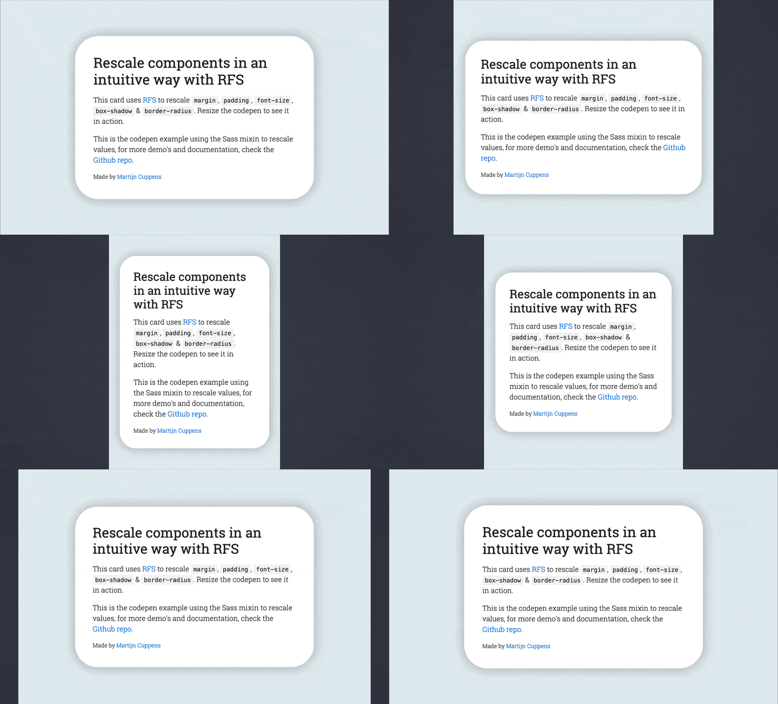
The following example shows the effect of RFS on font sizes:
Installation
RFS can be installed using a package manager (recommended):
- npm:
npm install rfs - yarn:
yarn add rfs - bower (deprecated):
bower install rfs --save
Copy/paste (not recommended):
The source files can also be downloaded manually and used in a project. This method is not recommended because you lose the ability to easily and quickly manage and update RFS as a dependency.
Usage
Sass (.scss syntax)
project/
├── node_modules/
│   └── rfs
│        └── ...
└── scss/
    └── main.scss
Input
// scss/main.scss

@import "../node_modules/rfs/scss";

.title {
  @include font-size(4rem);

  // The font-size mixin is a shorthand which calls
  // @include rfs(4rem, font-size);

  // Other shorthand mixins that are available are:
  // @include padding(4rem);
  // @include padding-top(4rem);
  // @include padding-right(4rem);
  // @include padding-bottom(4rem);
  // @include padding-left(4rem);
  // @include margin(4rem);
  // @include margin-top(4rem);
  // @include margin-right(4rem);
  // @include margin-bottom(4rem);
  // @include margin-left(4rem);

  // For properties which do not have a shorthand, the property can be passed:
  // @include rfs(4rem, border-radius);

  // Whenever a value contains a comma, it should be escaped with `#{}`:
  // @include rfs(0 0 4rem red #{","} 0 0 5rem blue, box-shadow);

  // Custom properties (css variables):
  // @include rfs(4rem, --border-radius);
}
If you're using Webpack, you can simplify the @import using the ~ prefix:
@import "~rfs/scss";
Generated css
.title {
  font-size: calc(1.525rem + 3.3vw);
}

@media (min-width: 1200px) {
  .title {
    font-size: 4rem;
  }
}
!important usage
Input
.label {
  @include font-size(2.5rem !important);
}
Output
.label {
  font-size: calc(1.375rem + 1.5vw) !important;
}

@media (min-width: 1200px) {
  .label {
    font-size: 2.5rem !important;
  }
}
Sass (.sass syntax)
project/
├── node_modules/
│   └── rfs
│        └── ...
└── sass/
    └── main.sass
Input
// sass/main.sass

@import "../node_modules/rfs/sass"

.title
  +font-size(4rem)

  // The font-size mixin is a shorthand which calls
  // +rfs(4rem, font-size)

  // Other shorthand mixins that are available are:
  // +padding(4rem)
  // +padding-top(4rem)
  // +padding-right(4rem)
  // +padding-bottom(4rem)
  // +padding-left(4rem)
  // +margin(4rem)
  // +margin-top(4rem)
  // +margin-right(4rem)
  // +margin-bottom(4rem)
  // +margin-left(4rem)

  // For properties which do not have a shorthand, the property can be passed:
  // +rfs(4rem, border-radius)

  // Whenever a value contains a comma, it should be escaped with `#{}`:
  // +rfs(0 0 4rem red #{","} 0 0 5rem blue, box-shadow)

  // Custom properties (css variables):
  // +rfs(4rem, --border-radius)
If you're using Webpack, you can simplify the @import using the ~ prefix:
@import "~rfs/scss"
Generated css
.title {
  font-size: calc(1.525rem + 3.3vw);
}

@media (min-width: 1200px) {
  .title {
    font-size: 4rem;
  }
}
!important usage
Input
.label
  +font-size(2.5rem !important)
output
.label {
  font-size: calc(1.375rem + 1.5vw) !important;
}

@media (min-width: 1200px) {
  .label {
    font-size: 2.5rem !important;
  }
}
PostCSS
project/
├── postcss/
│   └── main.css
└── node_modules/
    └── rfs
         └── ...
Have a look at the examples folder to find examples on how your PostCSS setup can be configured.
// postcss/main.css

.title {
  font-size: rfs(4rem);

  // Or use it with any other property, for example
  // padding: rfs(4rem);

  // It's also possible to pass multiple values
  // padding: rfs(3rem 4rem);

  // or even
  // box-shadow: rfs(0 3px 4rem red);

  // or even comma seperated values
  // box-shadow: rfs(0 3px 4rem red, 3px 0 4rem blue);

  // To combine it with !important, use
  // box-shadow: rfs(0 3px 4rem red) !important;

  // Custom properties (css variables):
  // --border-radius: rfs(4rem);
}
Generated css
.title {
  font-size: calc(1.525rem + 3.3vw);
}

@media (min-width: 1200px) {
  .title {
    font-size: 4rem;
  }
}
Less
project/
├── less/
│   └── main.less
└── node_modules/
    └── rfs
         └── ...
// less/main.less

@import "../node_modules/rfs/less";

.title {
  .font-size(4rem);

  // The font-size mixin is a shorthand which calls
  // .rfs(4rem, font-size);

  // Other shorthand mixins that are available are:
  // .padding(4rem);
  // .padding-top(4rem);
  // .padding-right(4rem);
  // 'padding-bottom(4rem);
  // .padding-left(4rem);
  // .margin(4rem);
  // .margin-top(4rem);
  // .margin-right(4rem);
  // .margin-bottom(4rem);
  // .margin-left(4rem);

  // For properties which do not have a shorthand, the property can be passed as:
  // .rfs(4rem, border-radius);

  // Whenever a value contains a comma, it should be escaped with a tilde(~):
  // .rfs(0 0 4rem red ~"," 0 0 5rem blue, box-shadow)

  // Custom properties (css variables):
  // .rfs(4rem, --border-radius)
}
If you're using Webpack, you can simplify the @import using the ~ prefix:
@import "~rfs/less"
Generated css
.title {
  font-size: calc(1.525rem + 3.3vw);
}

@media (min-width: 1200px) {
  .title {
    font-size: 4rem;
  }
}
!important usage
Less still has a bug for native !important support, and !important can not be accepted as a parameter, so you 'll need to pass important as a flag:
Input
.label {
  .font-size(2.5rem important);
}
output
.label {
  font-size: calc(1.375rem + 1.5vw) !important;
}

@media (min-width: 1200px) {
  .label {
    font-size: 2.5rem !important;
  }
}
Stylus
project/
├── node_modules/
│   └── rfs
│        └── ...
└── stylus/
    └── main.styl
// stylus/main.styl

@import "../node_modules/rfs/stylus";

.title
  rfs-font-size(64px)

  // The font-size mixin is a shorthand which calls
  // rfs(4rem, font-size)

  // Other shorthand mixins that are available are:
  // rfs-padding(4rem)
  // rfs-padding-top(4rem)
  // rfs-padding-right(4rem)
  // rfs-padding-bottom(4rem)
  // rfs-padding-left(4rem)
  // rfs-margin(4rem)
  // rfs-margin-top(4rem)
  // rfs-margin-right(4rem)
  // rfs-margin-bottom(4rem)
  // rfs-margin-left(4rem)

  // For properties which do not have a shorthand, the property can be passed as:
  // rfs(4rem, border-radius)

  // Whenever a value contains a comma, it should be escaped with a backslash:
  // rfs(0 0 4rem red \, 0 0 5rem blue, box-shadow)

  // Custom properties (css variables):
  // rfs(4rem, --border-radius)
Note the font-size mixin can not be used to set the font size. That is because a font-size() mixin would override the font-size property. See 129#issuecomment-477926416 for more info.
If you're using Webpack, you can simplify the @import using the ~ prefix:
@import "~rfs/stylus"
Generated css
.title {
  font-size: calc(1.525rem + 3.3vw);
}

@media (min-width: 1200px) {
  .title {
    font-size: 4rem;
  }
}
!important usage
Input
.label
  rfs-font-size(2.5rem important)
output
.label {
  font-size: calc(1.375rem + 1.5vw) !important;
}

@media (min-width: 1200px) {
  .label {
    font-size: 2.5rem !important;
  }
}
Visualisation
If you wonder how the values are rescaled, wonder no more and stare at this graph which might clarify things a bit:
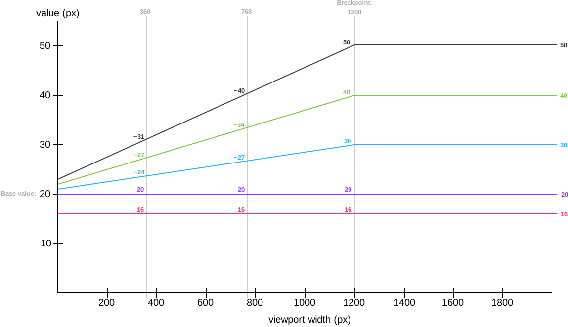
Each color represents another value being rescaled. For example:
.title {
  @include font-size(40px);
}
This is the green line. A font size of 40px stays 40px in viewports with a size larger than 1200px. Below 1200px, the font size is rescaled and at viewport of 360px, the font size is about 27px. Note that every font size is generated in a combination of rem and vw units, but they are mapped to px in the graph to make it easier to understand.
Configuration
RFS works out of the box without any configuration tweaks, but if you feel the urge to go loco and fine tune the way values are rescaled, you can:
Base value (unit in px or rem)
- SCSS, Sass & Stylus:
$rfs-base-value - Less:
@rfs-base-value - PostCSS:
baseValue
The option will prevent the value from becoming too small on smaller screens. If the font size which is passed to RFS is smaller than this value, no fluid rescaling will take place.
Default value: 1.25rem
Unit (px or rem)
- SCSS, Sass & Stylus:
$rfs-unit - Less:
@rfs-unit - PostCSS:
unit
The output value will be rendered in this unit. Keep in mind configuring this value to px will disable the ability for users to change the font size in their browser.
Default value: rem
Breakpoint (in px, em or rem)
- SCSS, Sass & Stylus:
$rfs-breakpoint - Less:
@rfs-breakpoint - PostCSS:
breakpoint
Above this breakpoint, the value will be equal to the value you passed to RFS; below the breakpoint, the value will dynamically scale.
Default value: 1200px
Breakpoint unit (px, em or rem)
- SCSS, Sass & Stylus:
$rfs-breakpoint-unit - Less:
@rfs-breakpoint-unit - PostCSS:
breakpointUnit
The width of the max width in the media query will be rendered in this unit.
Default value: px
Factor (number)
- SCSS, Sass & Stylus:
$rfs-factor - Less:
@rfs-factor - PostCSS:
factor
This value determines the strength of font size resizing. The higher the factor, the less difference there is between values on small screens. The lower the factor, the less influence RFS has, which results in bigger values for small screens. The factor must be greater than 1.
Default value: 10
Rem value (number)
- SCSS, Sass & Stylus:
$rfs-rem-value - Less:
@rfs-rem-value - PostCSS:
remValue
The value of 1rem in px. The value of 1rem is typically 16px but if the font size is changed for html the value of 1rem changes. This variable can be used to change the default value but be careful with it because changing it could lead to unexpected behaviour, for example if additional CSS is loaded which expects 1rem to be 16px.
Default value: 16
Two dimensional (boolean)
- SCSS, Sass & Stylus:
$rfs-two-dimensional - Less:
@rfs-two-dimensional - PostCSS:
twoDimensional
Enabling the two dimensional media queries will determine the value based on the smallest side of the screen with vmin. This prevents values from changing if the device toggles between portrait and landscape mode.
Default value: false
Class (boolean)
- SCSS, Sass & Stylus:
$rfs-class - Less:
@rfs-class - PostCSS:
class
RFS can be enabled or disabled with a class. There are 3 options:
falseNo extra classes are generated.disableWhen the disable classes are generated you can add the.disable-rfsclass to an element to disable responsive value rescaling for the element and its child elements.enableRFS is disabled by default in this case. The.enable-rfsclass can be added to an element to enable responsive value rescaling for the element and its child elements.
Default value: false
Safari iframe resize bug fix (boolean)
- SCSS, Sass & Stylus:
$rfs-safari-iframe-resize-bug-fix - Less:
@rfs-safari-iframe-resize-bug-fix - PostCSS:
safariIframeResizeBugFix
Safari doesn't resize its values in an iframe if the iframe is resized. To fix this min-width: 0vw can be added and that's what happens if this option is enabled. See #14.
Default value: false
Best practices
- Don't set RFS on the
htmlelement, because this influences the value ofremand could lead to unexpected results. - Always set your line-heights relative (in
emor unitless) to prevent interline issues with font sizes.
Browser support
RFS is supported by all browsers that support media queries and viewport units.
Creator
Martijn Cuppens
- https://twitter.com/Martijn_Cuppens
- https://github.com/MartijnCuppens
Copyright and license
Code released under the MIT license.
Repo liên quan
Bootstrap is an open-source front-end framework maintained at twbs/bootstrap. It ships compiled and minified CSS and JavaScript for building responsive, mobile-first sites, is licensed under MIT, and the release referenced throughout the README's install instructions is v5.3.8. The project was created by Mark Otto and Jacob Thornton, and its documentation is built with Astro and hosted at getbootstrap.com.
Front-End Checklist is a rule-by-rule audit checklist, not a linter. 385 rules. Eleven categories. Each rule has its own page with an explanation, a priority tag, and remediation steps — built for humans doing a manual pass and, more recently, for MCP-compatible agents doing the same audit automatically.
Vue 2, also known as Vue.js 2, is the earlier major version of the Vue JavaScript framework, hosted at vuejs/vue on GitHub under an MIT license. Per the repository's own README, Vue 2 hit End of Life on December 31, 2023, is no longer actively maintained, and the project now directs users toward vuejs/core (Vue 3) and an official migration guide, while leaving Vue 2 itself installable through CDNs, package managers, and GitHub.
Electron (electron/electron on GitHub) is an open-source, MIT-licensed framework for building cross-platform desktop apps with JavaScript, HTML, and CSS on top of Node.js and Chromium. The README covers installing it as a dev dependency through npm, lists platform support for macOS, Windows, and Linux, and points to a companion tool, Electron Fiddle, for trying the API before starting a full project.
Trả lời nhanh
Cùng nhóm Frontend còn repo nào?
twbs/rfs thuộc nhóm Frontend trên TopGit, cùng 9 topic GitHub. Trang Trending và Topics liệt kê các repo cùng số sao và cùng ngôn ngữ để so sánh.
Đọc thêm về twbs/rfs ở đâu?
Trang TopGit này là một snapshot — tab "Readme" hiển thị nguyên văn README của repo (đã bỏ link, giữ ảnh). Repo GitHub ở github.com/twbs/rfs là nguồn chính thức.
twbs/rfs có phải mã nguồn mở không?
Có — twbs/rfs phát hành theo license MIT, nghĩa là mã nguồn mở để đọc, fork và (tùy license) tái sử dụng. Mã: github.com/twbs/rfs.
twbs/rfs là gì?
twbs/rfs (twbs/rfs) là dự án CSS trên GitHub. Theo mô tả gốc: ✩ Automates responsive resizing ✩
twbs/rfs so với các dự án Frontend khác thế nào?
twbs/rfs được TopGit xếp vào nhóm Frontend, với 3.4k sao GitHub và viết bằng CSS. Xem trang chủ đề Frontend trên TopGit để so sánh với các dự án tương tự theo số sao và mức độ hoạt động.
Vì sao twbs/rfs được xếp vào nhóm Frontend?
TopGit xếp twbs/rfs vào nhóm Frontend dựa trên GitHub topics và mô tả của repo (gắn thẻ: "css", "font-size", "frontend"). Việc phân loại dựa trên metadata thật của repo, không phải đoán theo cảm tính biên tập.
Đọc đầy đủ README ở tab phía trên.
Vẫn đang phân vân về rfs?
Một cú bấm sẽ gửi câu hỏi kèm trang này cho AI — xem AI nói gì về rfs.