Một mục tập trung di động trong kho dữ liệu GitHub của TopGit: zhanghai/MaterialRatingBar, 2.0k sao, nhóm Mobile, Java. Material Design RatingBar with better appearance
Tóm tắt dựng từ metadata GitHub của chính dự án — chưa có bài review TopGit. Trang sẽ tự động cập nhật khi bài review đầy đủ được xuất bản.
VÌ SAO CHƯA CÓ REVIEW
TopGit viết bài đầy đủ cho repo có nhiều sao nhất và được yêu cầu nhiều nhất. Trang này là snapshot trong thời gian chờ — xem README gốc ở tab READ ME.
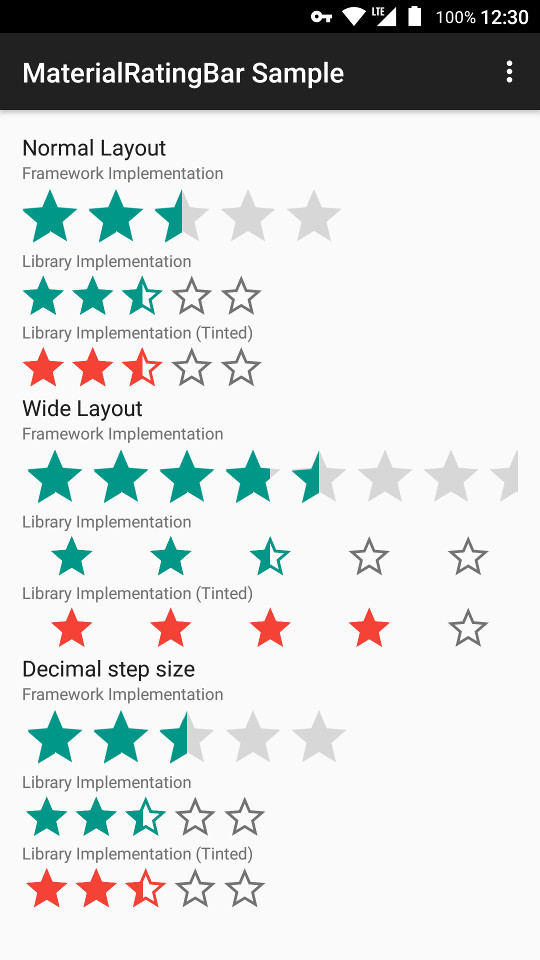
In order to make your RatingBar take the correct and consistent size on all versions, you will always need to use one of the styles from this library. The trick inside it is android:minHeight and android:maxHeight that controls the drawable height.
You can checkout more small or indicator variants in styles.xml.
You can use app:mrb_fillBackgroundStars to control whether background stars are filled, otherwise it defaults to the same value as android:isIndicator which is the behavior of Google apps.
8 tint-related attributes such as app:mrb_progressTint and app:mrb_progressTintMode are also supported so that they can control the tinting of rating drawables. The default tint color is ?colorControlActivated, and the default tint mode is src_in.
An OnRatingChangeListener interface is also added to MaterialRatingBar, which enables callback while user is dragging, just as the listener in SeekBar.
For a detailed example, you can refer to the sample app's layout, where you can find examples such as tinting and wide layout.
Design
Filled star or star border
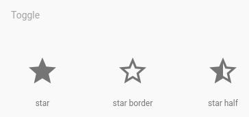
The framework's RatingBar uses filling stars with grey color as track, however as per the Material Icons site, star border icons are given.
And as for the Google Play Store and Google I/O app, they are both using the star borders as track.
With Google's design practice and aesthetic considerations taken into account, I decided to use the star border style.
Star size
Google Play Store has stars of optical size 24dp, while Google I/O app and framework Widget.Material.RatingBar.Indicator have stars of size 36dp (which are of optical size 30dp). (The framework's default size of 64dp is ridiculously large and thus not taken into consideration.)
Also noticing that the Material Icons site gives icons of 24dp (optical 20dp) and 36dp (optical 30dp), I decided to stick to the 36dp approach which is also visually pleasant.
Star border width
The ring for radio button in Material Design has a width of 2dp, and with experiments on other border widths, I decided to adopt the 2dp border width.
The star border icon is drawn with the help of Inkscape, by downloading the star icon SVG from Material Icons, duplicating the outer border path of the star, setting a stroke of 4dp, running stroke to path on it, extracting the inner border path, and finally combining this path and the original outer border path.
Wide layout
Framework RatingBar gives erroneous rendering for RatingBar when layout_width is set to match_parent by tiling the stars without any gap. Since Google Play Store employed the wide design, I implemented it inside this library as well, so that match_parent will work properly for MaterialRatingBar.
Dragging
Google Play Store and Google I/O app both used an implementation other than RatingBar, which means dragging on the bar across stars won't work (it is the functionality of AbsSeekBar). I think this is a handy way of interaction for users, and it enables the setting of 0 star which can be useful if you want to enable users to reset their rating to unrated.
License
Copyright 2016 Zhang Hai

Licensed under the Apache License, Version 2.0 (the "License");
you may not use this file except in compliance with the License.
You may obtain a copy of the License at

   http://www.apache.org/licenses/LICENSE-2.0

Unless required by applicable law or agreed to in writing, software
distributed under the License is distributed on an "AS IS" BASIS,
WITHOUT WARRANTIES OR CONDITIONS OF ANY KIND, either express or implied.
See the License for the specific language governing permissions and
limitations under the License.
zhanghai/MaterialRatingBar thuộc nhóm Mobile trên TopGit, cùng 4 topic GitHub. Trang Trending và Topics liệt kê các repo cùng số sao và cùng ngôn ngữ để so sánh.
Đọc thêm về zhanghai/MaterialRatingBar ở đâu?
Trang TopGit này là một snapshot — tab "Readme" hiển thị nguyên văn README của repo (đã bỏ link, giữ ảnh). Repo GitHub ở github.com/zhanghai/MaterialRatingBar là nguồn chính thức.
zhanghai/MaterialRatingBar có bao nhiêu sao?
zhanghai/MaterialRatingBar có 2.0k sao GitHub — tải lại trang để xem số mới nhất, hoặc xem trực tiếp github.com/zhanghai/MaterialRatingBar. TopGit phản chiếu số sao của GitHub nhưng không cam kết đến từng phút.
zhanghai/MaterialRatingBar có phải mã nguồn mở không?
TopGit chưa ghi nhận license cho zhanghai/MaterialRatingBar. Phần lớn repo public trên GitHub là mã nguồn mở, nhưng điều khoản khác nhau từng repo — mở file LICENSE để xác nhận.
zhanghai/MaterialRatingBar có website riêng không?
TopGit chưa ghi nhận URL trang chủ cho zhanghai/MaterialRatingBar. Phần README ở tab phía trên thường có link demo, hoặc xem mô tả GitHub của repo.
zhanghai/MaterialRatingBar là gì?
zhanghai/MaterialRatingBar (zhanghai/MaterialRatingBar) là dự án Java trên GitHub. Theo mô tả gốc: Material Design RatingBar with better appearance
zhanghai/MaterialRatingBar so với các dự án Mobile khác thế nào?
zhanghai/MaterialRatingBar được TopGit xếp vào nhóm Mobile, với 2.0k sao GitHub và viết bằng Java. Xem trang chủ đề Mobile trên TopGit để so sánh với các dự án tương tự theo số sao và mức độ hoạt động.
Đọc đầy đủ README ở tab phía trên.
Chưa chắc MaterialRatingBar có hợp với bạn?
Để ChatGPT, Claude hoặc Perplexity tìm hiểu giúp — bấm bên dưới và xem AI nói gì về MaterialRatingBar.

 /MaterialRatingBar