123 GitHub stars and counting — webpro/component-styleguide is a JavaScript project TopGit is tracking across repositories on the platform. Simple styleguide framework
Snapshot summary built from the project's own GitHub metadata — there's no written TopGit review yet. The page will update automatically when a full review is published.
WHY NO REVIEW YET
TopGit writes full reviews for the most-starred, most-requested repositories. This page is a snapshot until then — see the READ ME tab for the original README in full.
Simple styleguide framework. Install component-styleguide into your styleguide project, and it will stay out of your way. It's inspired by http://patternlab.io, but is fundamentally different. And, I would say, much more flexible.
What is it?
Simple. You start out with a blank project. Your codebase contains just your own HTML templates and CSS stylesheets (and JavaScript if you want to). Put your files in some (configurable) directories, and there you have it.
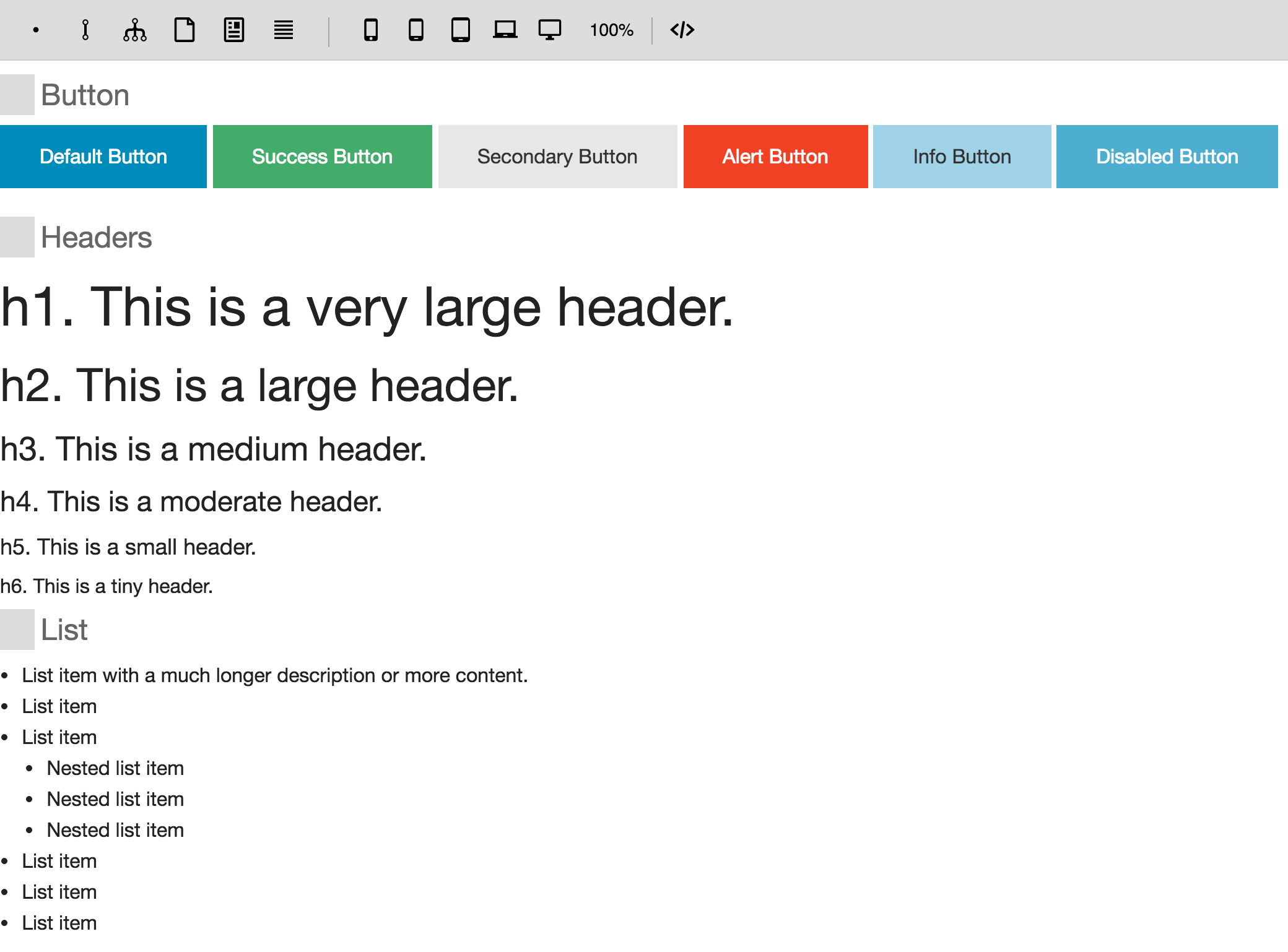
See component-styleguide-example for an example setup (you could use this project as a boilerplate), and a live running example.
You can use it as a development server, and/or host it somewhere as a Node service.
var styleguide = require('component-styleguide');
styleguide();
And run it: node index.js.
The styleguide is now running at http://localhost:3000.
4. Build Components
Put templates and partials in the components directory and subdirectories (e.g. atoms, molecules, and organisms, but this is not mandatory). They should be files ending with .html and contain HTML snippets or Handlebars templates.
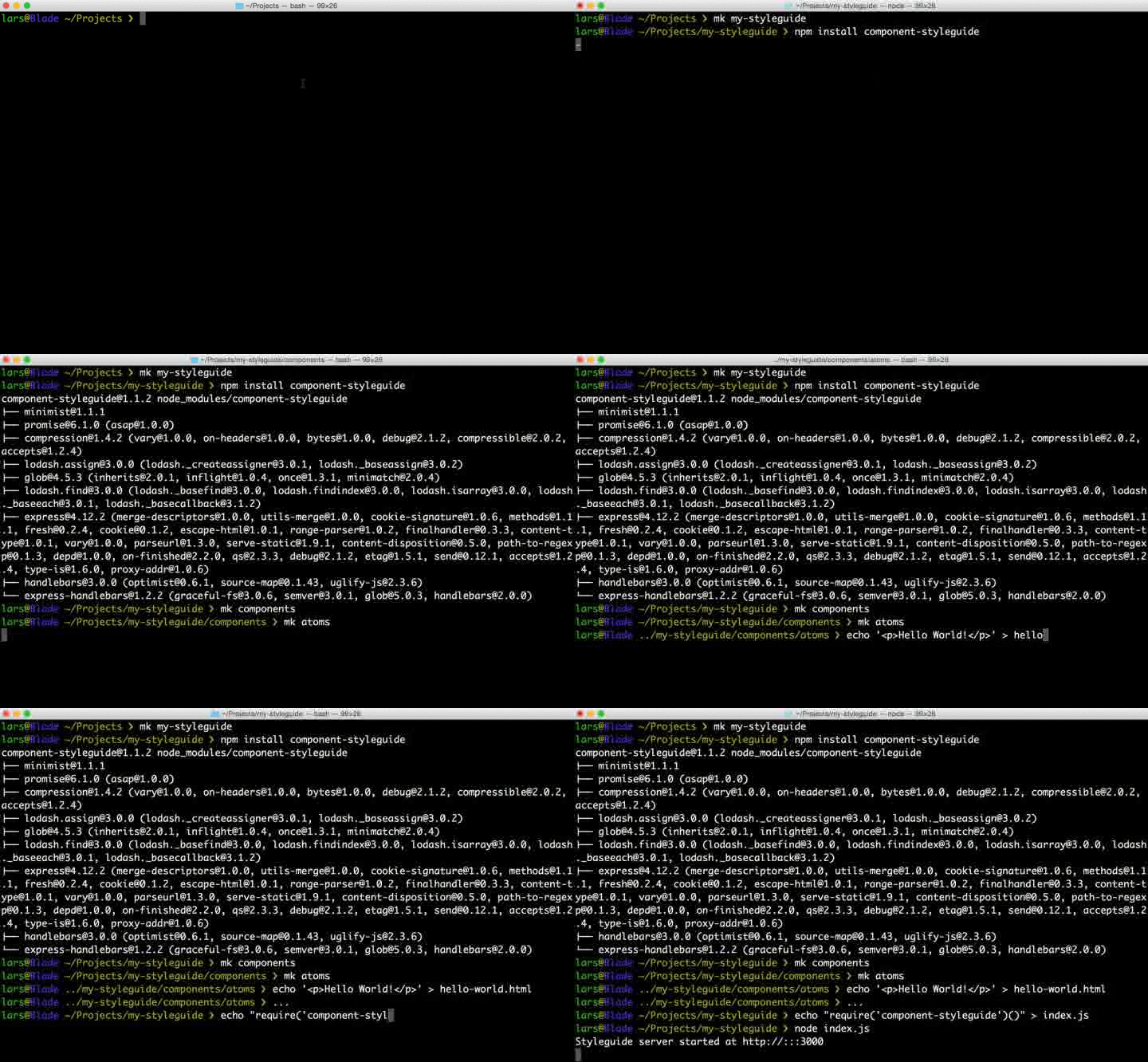
Here is a screencast of a quick & dirty installation:
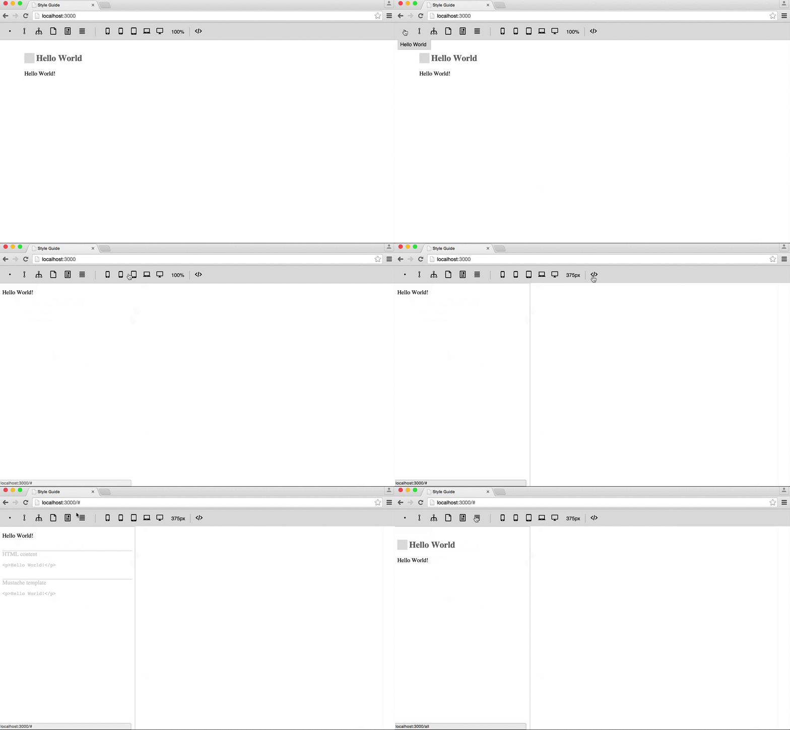
And here's the result in the browser:
Configuration
You can work with the default settings straight away, but you might want to customize some things. By default:
Use atoms, molecules, and organisms, templates and pages, and they will show up in that order and as an icon. But you can name the directories any way you like.
The extension html is expected, but you can configure any other extension.
If you need stub data to feed to your templates, you can put *.json files in the /data directory.
To use your stylesheets, put filenames in the stylesheets array, and make sure these files are/end up in the /compiled directory (also configurable).
Same for scripts.
To specify alternative settings (showing default values here):
Alternatively, the styleguide can be started directly from the CLI without any scripting involved:
styleguide
Here's an example with default settings:
styleguide --components components --ext html --data data
You would need to either install it globally (i.e. npm install -g component-styleguide), or use it from a package.json script.
Details
Handlebars
Handlebars is used as the template engine.
Partials
Each template is automatically registered as a partial (e.g. you can reuse your {{> atoms/component}} in templates).
Stub data
All "data" files are concatenated into one "context" for the templates. E.g. users.json containing [] and profile.json containing {} will result in context data for the templates:
{
   "users": [],
   "profile": {}
}
Now, the {{#users}} collection can be iterated over in any template.
If a there is a JSON file with the same name as the HTML file next to it, its data will be loaded
in context data in priority over other data.
In this example, header.html will get data from header.json:
molecules
  header.html
  header.json
CSS & JS
You can organize and compile your CSS and JavaScript in any way you want, as long as they end up in e.g. /compiled (the staticLocalDir) to serve them with the components. I think it's a good idea to work directly in this folder, or compile SASS/LESS/... source files into e.g. compiled/stylesheet.css and configure it as stylesheets: ['stylesheet.css'].
Doh, yet another styleguide framework!?
Since I didn't like the approach of most styleguide tools, I created something I actually enjoy to use. It stays out of my way, so I can focus on the components.
Some solutions generate a styleguide from comments in the CSS. But I like to have separate templates, maybe some stub data, maybe some JavaScript. Other tools provide a boilerplate project, which may work fine at first, but it is hard to change or update the underlying styleguide framework later on.
As a Node.js dependency, features and bugs can be dealt with separately. You only need to update the component-styleguide dependency (npm update), without having to fork a repository and/or merge upstream changes, and it will happily continue to just serve your templates and static assets. Simple.
TopGit's last sync did not record any GitHub topics for webpro/component-styleguide. GitHub topics appear in the right sidebar of a repository page; that's the authoritative place to check.
How active is development on webpro/component-styleguide?
The most recent commit recorded on webpro/component-styleguide was 8.8 years ago, based on the GitHub push timestamp. The repository has 18 forks — one of the better signals of community interest.
How many stars does webpro/component-styleguide have?
webpro/component-styleguide has 123 GitHub stars — refresh the page for the live number, or check github.com/webpro/component-styleguide. TopGit mirrors GitHub's count but does not claim minute-by-minute accuracy.
What language is webpro/component-styleguide written in?
webpro/component-styleguide is written primarily in JavaScript. GitHub's language field is based on the largest share of bytes in the default branch.
Where do I read more about webpro/component-styleguide?
This TopGit page is a snapshot — the READ ME tab shows the project's own README content (links stripped, images preserved). The GitHub repository at github.com/webpro/component-styleguide is the definitive source.
Read full README in the tab above.
Still deciding about component-styleguide?
One click hands the question to an AI along with this page — see what it says about component-styleguide.
 /component-styleguide